- May 28, 2010
- 1,709
- 2,132
- AFL Club
- West Coast
The glorious, glorious burger player issue.


Follow along with the video below to see how to install our site as a web app on your home screen.
Note: This feature may not be available in some browsers.
Not AGL?The Eagles' 2019 shorts need updating too.
Not AGL?
Thanks.AGL is correct, the Eagles logo on the player’s left side was flipped back to normal in 2019 (not mirrored like 2018).

POTYDidn't I?
View attachment 788665
looks like a hint of yellow might be back by the old school pictures they put up on their story
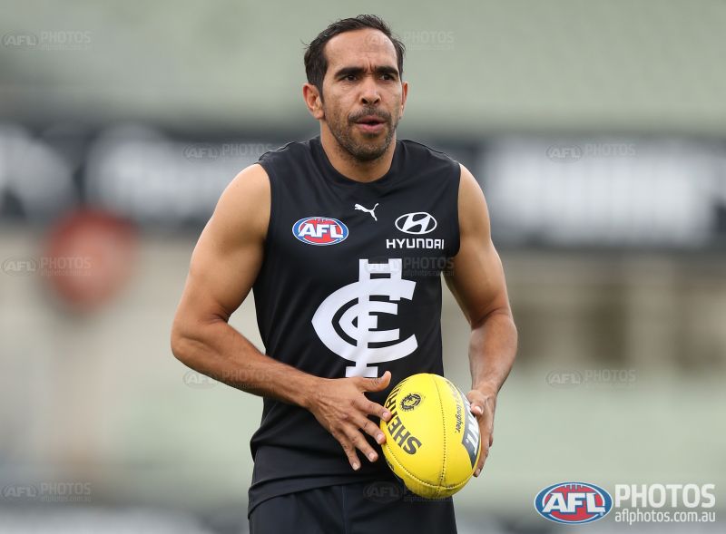
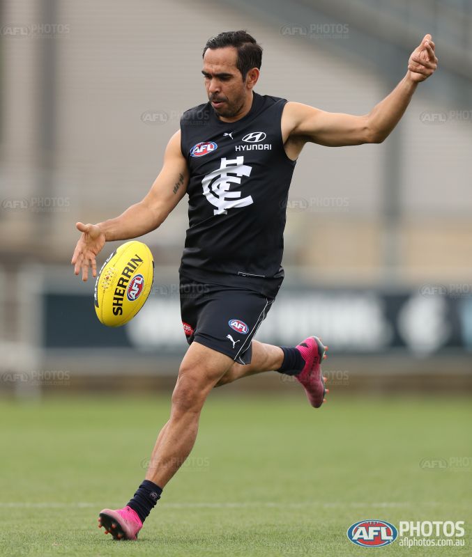
he wears baggy guernsey and shortsEither this guernsey is too big for Eddie, or these new Puma guernseys are sack-like.


I think someone at the club may have finally looked at the guernsey's and realised that nothing was aligned properly.The official release from St Kilda never happened, but they posted this in reply to a comment overnight.View attachment 788816
Maybe something is up with ISC?

So they did it on purpose?And Ice Man I don't think ISC are that slack
I don't think that's why it has been delayedSo they did it on purpose?
In case anyone asks, I don't know you and we are not friends.Also that Richmond PS isn't terrible... I've seen gradients done worse so I think they have pulled it off
Name it the indominous rex guernsey then - remember in the movie Jurassic world the scratches inside the dinosaurs paddock to look like it had scratched the concrete in order to make a distraction? They were just paintIn case anyone asks, I don't know you and we are not friends.
PS I hate it. It has everything I hate in a footy jumper.
Unnecessary Gradient
Part of club logo, not all of it
Club logo in different colours
Fake scratch that looks nothing like a scratch
In case anyone asks, I don't know you and we are not friends.
PS I hate it. It has everything I hate in a footy jumper.
Unnecessary Gradient
Part of club logo, not all of it
Club logo in different colours
Fake scratch that looks nothing like a scratch
Yes, I agree - but we have seen worseIn case anyone asks, I don't know you and we are not friends.
PS I hate it. It has everything I hate in a footy jumper.
Unnecessary Gradient
Part of club logo, not all of it
Club logo in different colours
Fake scratch that looks nothing like a scratch
And will continue til I die
I bet the kiddies will love it thoughIn case anyone asks, I don't know you and we are not friends.
PS I hate it. It has everything I hate in a footy jumper.
Unnecessary Gradient
Part of club logo, not all of it
Club logo in different colours
Fake scratch that looks nothing like a scratch

.gif")