- Mar 14, 2014
- 39,325
- 72,374
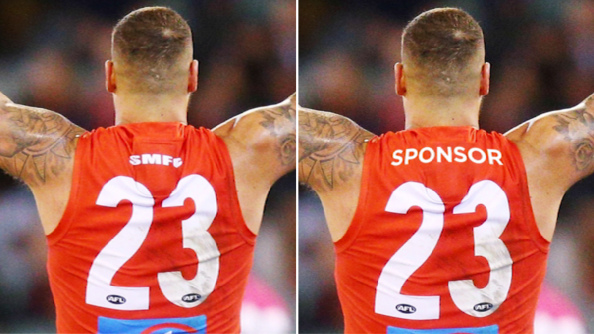
- AFL Club
- Gold Coast
- Other Teams
- Las Vegas Bears
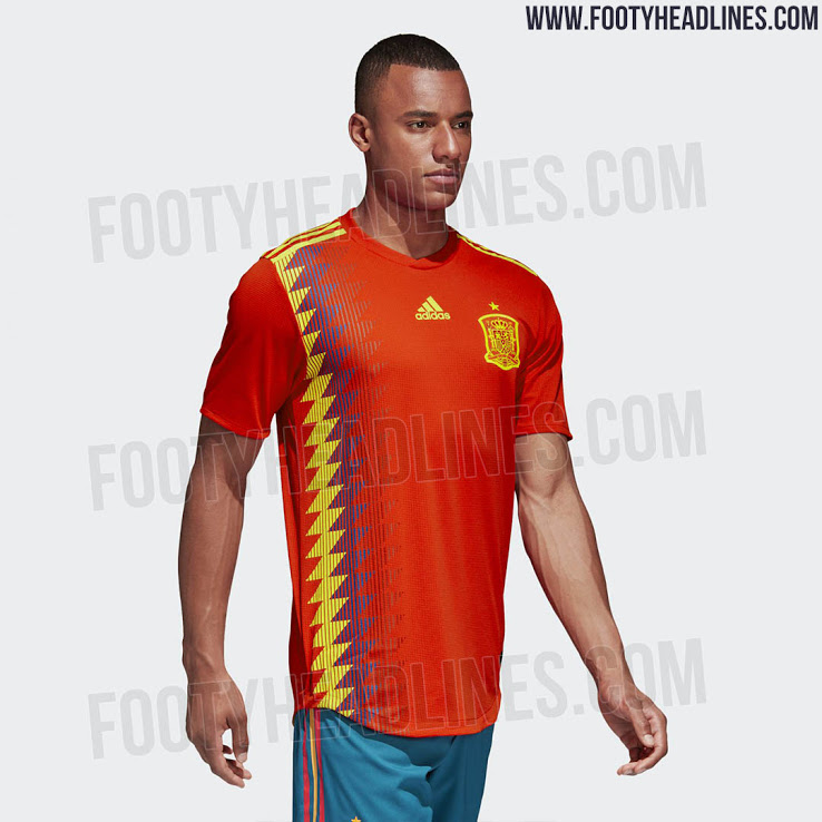
Similar to St Kildas away jersey in 09-10 i love itThanks for sharing. The pattern is the same as the one on Spain's 2018 World Cup shirt.

If I was making a proper Suns jumper I reckon I'd just extend the sidepanels to go the length of the jumper, like Ajax or something. Would be a unique look. Also flatten that logo already.
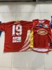
View attachment 857149