- Mar 30, 2014
- 2,599
- 4,259
- AFL Club
- Brisbane Lions
- Other Teams
- Dolphins, Seattle Kraken
Official Seattle Kraken Website | Seattle Kraken
The official National Hockey League website including news, rosters, stats, schedules, teams, and video.
 www.nhl.com
New NHL franchise
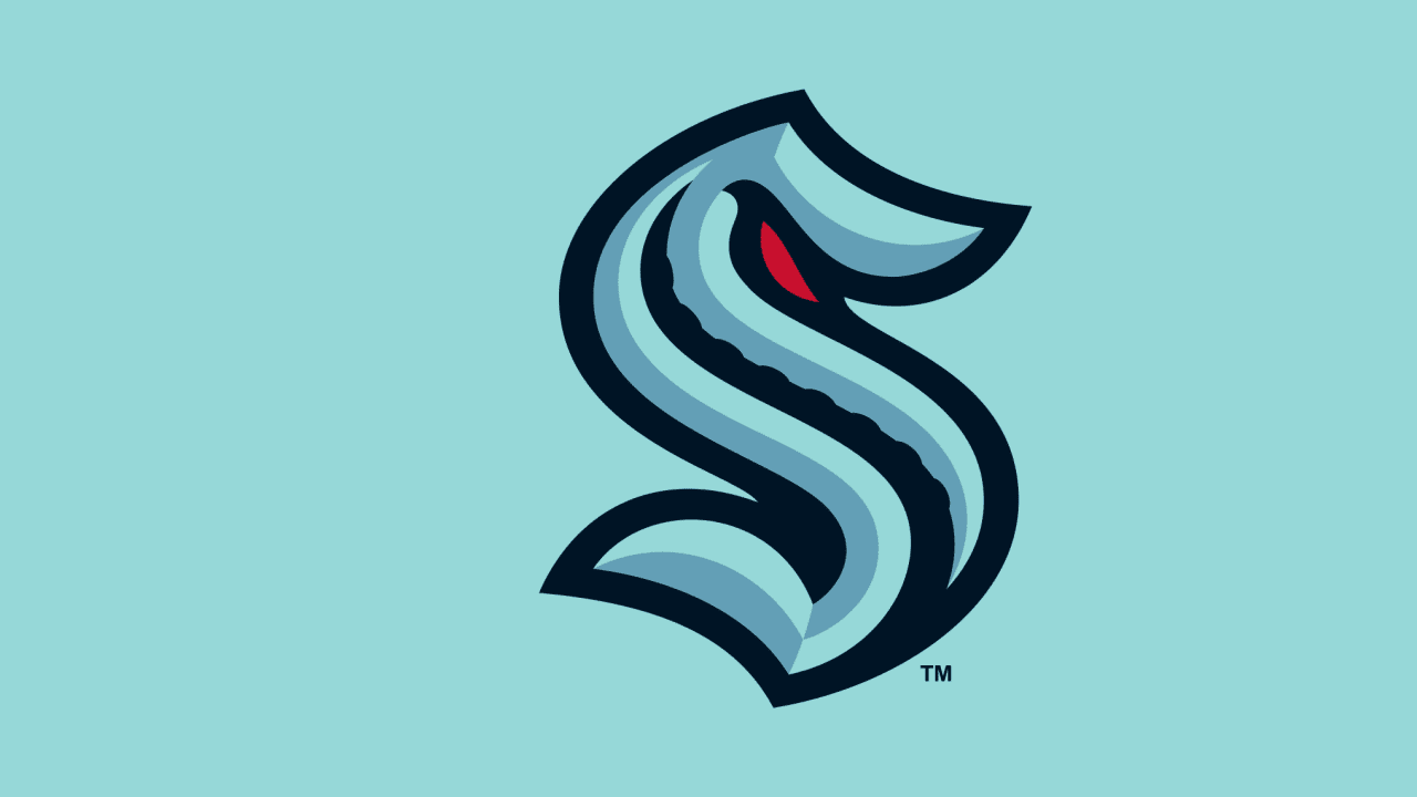
Uniforms

Logos

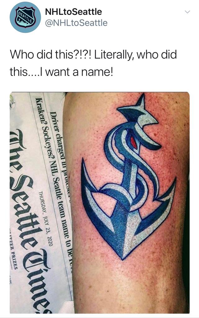
Thoughts?


 I highly doubt they have copied, but it's interesting to see a professional team use the same exact idea as a semi-pro team to highlight their cities' most iconic towers.