Art Vandelay_
TheBrownDog
- Oct 28, 2012
- 104,285
- 141,972
- AFL Club
- Geelong
- Other Teams
- Bushrangers - Tottenham
Almost a 40yoChampions logo look fire though.")

Follow along with the video below to see how to install our site as a web app on your home screen.
Note: This feature may not be available in some browsers.
Almost a 40yoChampions logo look fire though.
it's barely even noticeableChampions logo look fire though.
Bet you're fun at parties.Almost a 40yo
That's a lovely compliment.Really, genuinely thought he was early 20s.
View attachment 934807This is interesting. I’m sure I’m supposed to hate it but...I kind of love it


Parties? What are those?Bet you're fun at parties.
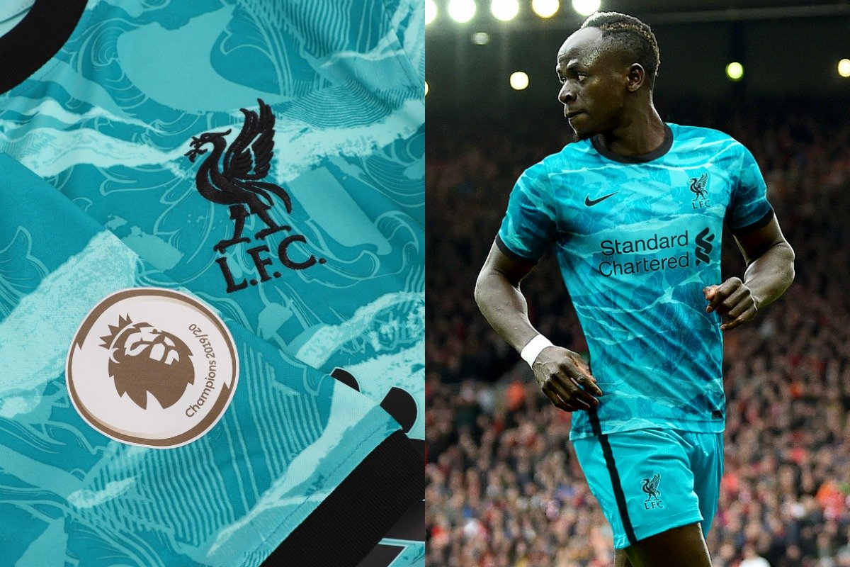
The home kit is just ruined the giant bright blue sponsor.Not sure if been posted yetView attachment 935048View attachment 935049
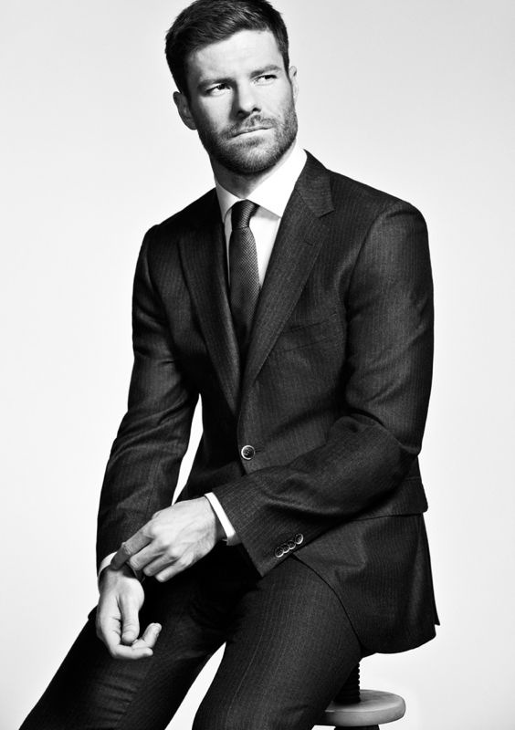
It looks great on him. Would be an horrendous look on fat pot bellied men.It looks better on Sadio.
Maybe instead of white and black stripes, they could do black and white stripesToon home kit is so boring. hate the lack of proper collars that's crept in since Nike's template a few years ago, looks cheap and unimaginative.
kinda sick of the pattern approach too. it's also lazy. good kit design used to come down to colours, secondary elements, cuffs, and the balance of it all – now you can get some hype on a polyester crew neck so long as it's got a print. the third kit is alright tho, makes me wanna go to the Cluny and walk along the Quayside and threaten to get pushed in with a broon in my hand.
Thank god I'm as sexy as Sadio.It looks great on him. Would be an horrendous look on fat pot bellied men.
Umm... Okay.Thank god I'm as sexy as Sadio.
What?Thank god I'm as sexy as Sadio.
I dont mind it. Kind of annoys me that the points don't form a perfect circle around the logo. Also the sleeves would look much better plain blackView attachment 934807This is interesting. I’m sure I’m supposed to hate it but...I kind of love it
Still got my Man U one in that photo just still fits as well