Navigation
Install the app
How to install the app on iOS
Follow along with the video below to see how to install our site as a web app on your home screen.
Note: This feature may not be available in some browsers.
More options


You are using an out of date browser. It may not display this or other websites correctly.
You should upgrade or use an alternative browser.
You should upgrade or use an alternative browser.
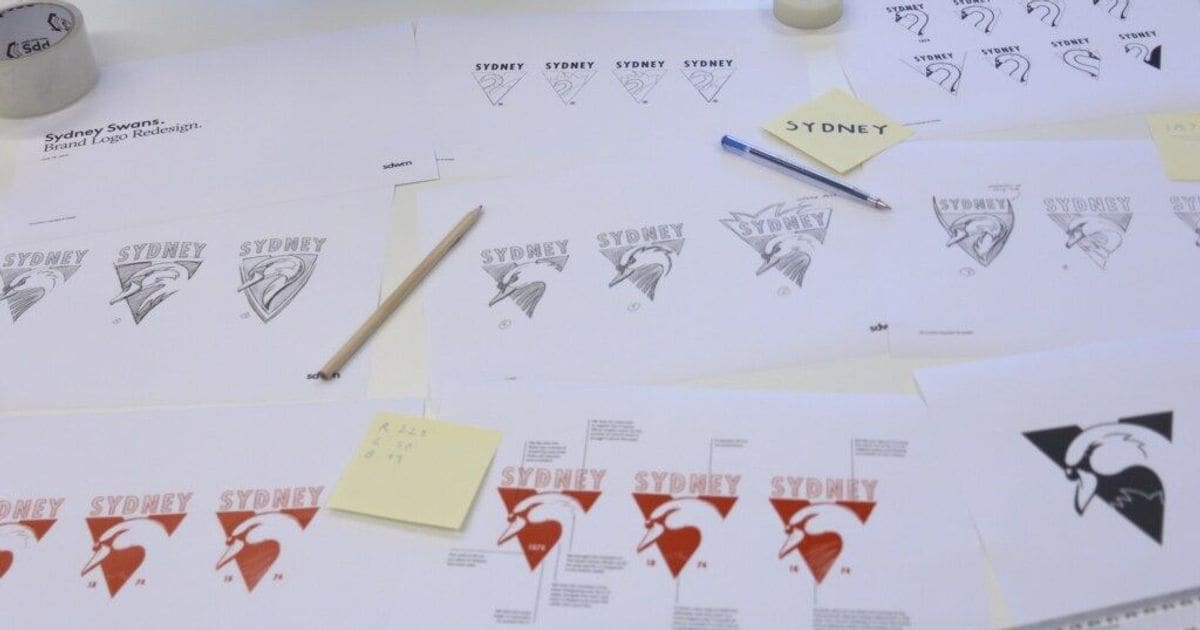
News New Sydney logo leaked
- Thread starter SC26
- Start date
- Tagged users None
cogs2hawks
Team Captain
- Jul 30, 2019
- 311
- 518
- AFL Club
- Hawthorn
The more I now look at the old logo, the more outdated it looks.
On iPhone using BigFooty.com mobile app
On iPhone using BigFooty.com mobile app
Heardy_101
LET'S GO BRANDON
How the f*** does it take two years to design that.
Also funny how they called the Opera House sails on their old logo "feathers"
Also funny how they called the Opera House sails on their old logo "feathers"
Take out the swan, and it’s still good too. Still think they should just do the Red V with white background ala South Melbourne.looks like a good run out or training kit imo. From the article nothing will change on the kit .
cannavo
LFG #16
No change to the jumper, with specific reference to the Opera House
2:15 "Importantly, our jumper is not changing"
Have they sorted the whole Opera house logo $50k a year thingy?
As opposed to...?Same reason why Melbourne changed their logo to say MELBOURNE
must be thinking of North Melbourne then!As opposed to...?
- Mar 30, 2014
- 2,600
- 4,260
- AFL Club
- Brisbane Lions
- Other Teams
- Dolphins, Seattle Kraken
Some cool designs in the clipAll but confirmed in a members email,
featuring this clip
A new chapter
We're launching a new logo as we embark on the next exciting chapter in our club's history.www.sydneyswans.com.au
Don’t get it. Now would be a great time to change it.2:15 "Importantly, our jumper is not changing"
Have they sorted the whole Opera house logo $50k a year thingy?
- Aug 21, 2007
- 31,651
- 98,923
- AFL Club
- Port Adelaide
- Other Teams
- Aston Villa, San Antonio Spurs
I don't think it's too bad, but the overall aesthetic of the logo has gone from classy and timeless to bush league, IMO.
I'd have gone for a much more abstract, stylised swan including the neck, and a classier(for lack of a better word) font.
I don't think a Swan is an animal that is overly recognisable based on it's head only and the need to add the pronounced ballsack on the nose to get it to read properly makes that even worse. Just zoom out a bit and add the neck and that immediately reads as a swan.
- Jun 3, 2015
- 737
- 754
- AFL Club
- Port Adelaide
I really like the logo. As said in a previous post. The old one is great but the new one is wearing off, well done swans. They are a successful club, with a new logo and are about to start a new era with a lot of young talent which could possibly take them to their next premiership
Xanthippus
Team Captain
- Oct 7, 2020
- 478
- 297
- AFL Club
- Collingwood

the logo is great imo.
- Oct 27, 2016
- 5,942
- 10,636
- AFL Club
- Collingwood
- Other Teams
- Packers, Raptors, Renegades
Some concepts. That one with the Opera house on top is elite but couldn't be used for reasons we now know.

Zoops
Club Legend
- Apr 20, 2017
- 1,406
- 5,414
- AFL Club
- Melbourne
- Other Teams
- Vancouver Canucks, Southampton FC
I didn't hate the old one, I doubt anyone did. Although, I did think and update could work. What they've gone with is pretty neat. If they could've had the Opera House above the 'SYDNEY' wordmark, it would've been elite.

- May 23, 2016
- 713
- 836
- AFL Club
- St Kilda
- Other Teams
- Port Melbourne; Kalkee; Horsham Demons
Not really sold on Sydneys new logo, it wasn't really a change anyone asked for, and it's not that much different to the old one.
I don't see why a logo absolutely HAS to have minor changes made to it just because it's been around for a while. Either leave it alone and build a brand or burn it to the ground and start properly fresh.
I don't see why a logo absolutely HAS to have minor changes made to it just because it's been around for a while. Either leave it alone and build a brand or burn it to the ground and start properly fresh.
Mero
Norm Smith Medallist
Jumpers staying the same as is
Rubber Arm
AFL Sucks
Really thought a white Guernsey with a curved Vee would be beautiful. Would have also possibly made Geelong wear their beautiful clash Guernsey when they went up against them.Jumpers staying the same as is
fegz222
Senior List
- Aug 6, 2020
- 225
- 189
- AFL Club
- Richmond
I think the change is a little more than minor imo - the swan has moved, been enlarged, and redesigned, no opera house silhouette, the establishment year has been added, the font has changed and the word 'swans' has been removed.Not really sold on Sydneys new logo, it wasn't really a change anyone asked for, and it's not that much different to the old one.
I don't see why a logo absolutely HAS to have minor changes made to it just because it's been around for a while. Either leave it alone and build a brand or burn it to the ground and start properly fresh.
Apple iCup
Imposter
Some cool designs in the clip
I thought this one looked incredible;

- May 23, 2016
- 713
- 836
- AFL Club
- St Kilda
- Other Teams
- Port Melbourne; Kalkee; Horsham Demons
The design elements are identical - a stylistic swans head inside a vee. Nobody was calling for the old logo to be changed, and it didn't look dated or tired, either.I think the change is a little more than minor imo - the swan has moved, been enlarged, and redesigned, no opera house silhouette, the establishment year has been added, the font has changed and the word 'swans' has been removed.
I stand by my point that change for the sake of it is pointless unless it's a complete overhaul (Port Adelaide or Fremantle, for example)
- Oct 30, 2014
- 4,171
- 8,154
- AFL Club
- Western Bulldogs
I don’t mind the new logo. Does anyone else see the heart in the middle?
I also love the slightly smaller, wider, curved V on their traditional woollen jumpers. Also the off white/cream colour of white wool is much better than the stark white of modern jumpers, especially a recent apparel sponsor of the Swans whose jumpers were so thin, that when they got wet they become slightly transparent and looked so cheap and crap.
I also love the slightly smaller, wider, curved V on their traditional woollen jumpers. Also the off white/cream colour of white wool is much better than the stark white of modern jumpers, especially a recent apparel sponsor of the Swans whose jumpers were so thin, that when they got wet they become slightly transparent and looked so cheap and crap.
dylben01
Debutant
- Jan 1, 2017
- 70
- 56
- AFL Club
- North Melbourne
- Other Teams
- Chicago Bulls
I agree mate, I personally like the new logo, but seeing some of the other options they passed up (such as this one) feels like a real missed opportunity
On iPhone using BigFooty.com mobile app
Interesting though it still isn’t on the swans website other than the article, AFL website, the socials profile pic, not even on IP Aus
Similar threads
- Replies
- 8
- Views
- 538
- Replies
- 15
- Views
- 2K
