Workshop 2021 Jumper Ideas thread

Remove this Banner Ad

Status
Not open for further replies.
Richmond copied Essendon's sash, Hawthorn copied Collingwood's stripes, Brisbane Bears copied Fitzroy's yoke, West Coast copied St Kilda's tri-panel, Port copied the SA double chevron. Gold Coast would at least be copying a design no longer in use.
A few of these were back in the day, where there was a limited amount you could do with a jumper (pre printed stuff), so naturally you are going to have teams wearing the same design in different colours. West Coast did add the massive eagle to their jumper and had the tripanel continue to the back, so it was a different look, which is exactly what I am trying to say here, just change one of the elements on the jumper and all of a sudden it feels more unique.
 
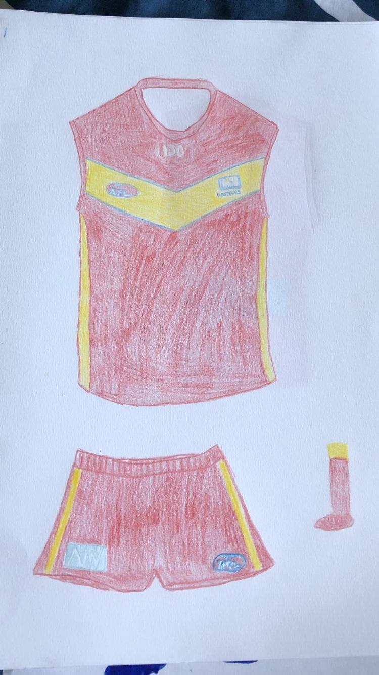
Due to me not being able to use photoshop to design Guernseys. I drew up this quick design not too long ago. I know the logos aren’t great because I tried to do it quickly but I thought it would be an awesome look for a more traditional looking Gold Coast kit. Only downfall with the kit, is that it is kind of like the Brisbane Bears old kit and the South Australian State jumper had a baby. Other then that, I think it would work quite well.
313051298912113cfff53dcc30a0b11c.jpg


On iPhone using BigFooty.com mobile app
V_Design.png
 

Log in to remove this ad.

I was pretty skeptical about the blue outline on the V but that actually looks pretty good.
Why is this the only few Gold Coast Proposed Jumper designs that are actually good? What a sick Design!
That's a big call... There are like 20 unique designs I have seen on not only this forum but the GC section which are good enough to be a GC jumper - better than their current plain jane design.
 
I was pretty skeptical about the blue outline on the V but that actually looks pretty good.

That's a big call... There are like 20 unique designs I have seen on not only this forum but the GC section which are good enough to be a GC jumper - better than their current plain jane design.
Yeah I think everyone under the.. Sun has done a GC jumper here
 
The gold is my favourite one. I maintain gold should be the main colour for a Gold Coast team, and it's a good identity to look even more like surf lifesavers.


I agree, but the colour should be gold. Not yellow or orange.
Using gold will introduce a new unique colour. Also darkening the red a few shades will make the jumper more attractive.
1248C8C0-9C87-4EF8-A467-036AEF5692E3.jpeg
 
"Gold" in the sense of colours can be used to refer to yellow, certainly the Suns (and Lions) refer to it that way. And that is the colour I mean. The dark golden colour moves away from the surf lifesaver angle which I think would be a mistake.

Either way they need gold to be the dominant colour to avoid looking too McShit.
 
Due to me not being able to use photoshop to design Guernseys. I drew up this quick design not too long ago. I know the logos aren’t great because I tried to do it quickly but I thought it would be an awesome look for a more traditional looking Gold Coast kit. Only downfall with the kit, is that it is kind of like the Brisbane Bears old kit and the South Australian State jumper had a baby. Other then that, I think it would work quite well.
313051298912113cfff53dcc30a0b11c.jpg


On iPhone using BigFooty.com mobile app

How old are you? Lol
 

(Log in to remove this ad.)

Yeah I've never really liked a Gold Coast design that's included the blue with the red and gold. It just doesn't work aesthetically.
If they do decide to rebrand one day and keep blue in the scheme, keep it separate from the red and gold.
Otherwise just drop the blue for maybe charcoal.
 
Due to me not being able to use photoshop to design Guernseys. I drew up this quick design not too long ago. I know the logos aren’t great because I tried to do it quickly but I thought it would be an awesome look for a more traditional looking Gold Coast kit. Only downfall with the kit, is that it is kind of like the Brisbane Bears old kit and the South Australian State jumper had a baby. Other then that, I think it would work quite well.
313051298912113cfff53dcc30a0b11c.jpg


On iPhone using BigFooty.com mobile app


Too close to the Bears design they used on the last year playing at Carrara for my liking.
 
Yeah I've never really liked a Gold Coast design that's included the blue with the red and gold. It just doesn't work aesthetically.
If they do decide to rebrand one day and keep blue in the scheme, keep it separate from the red and gold.
Otherwise just drop the blue for maybe charcoal.
I like blue as the clash colour on a white base with some yellow as they have done in the past, but all three very bright colours on the one jumper doesn't work for me either.
 
One thing that is slightly annoying is the choice for GC's colours to be that of their state rivals. What dingus thought it was a good idea to copy the red (maroon, eh), yellow and blue of Brissy?
We should have been the Gold Coast Pirates, wearing Gold and black
 
Status
Not open for further replies.

Remove this Banner Ad

Back
Top