Saintos The ITK
Premium Platinum
I’d like that exact same jersey but wit a yellow sash to honour our old colours.
Would look really good.
Would look really good.
Follow along with the video below to see how to install our site as a web app on your home screen.
Note: This feature may not be available in some browsers.
I’d like that exact same jersey but wit a yellow sash to honour our old colours.
Would look really good.

I'd love the AFL to bring back heritage rd to see every club pull out an old school jumper.I’d like that exact same jersey but wit a yellow sash to honour our old colours.
Would look really good.
It’s a no brainer to me. Even if not all clubs have a heritage jumper to choose from, give them the opportunity to sell one that resembles a more retro style that could have been used by them if they existed 40 years ago.I'd love the AFL to bring back heritage rd to see every club pull out an old school jumper.

Love the new polo’s
View attachment 1025245


I used to wonder the same, but maybe it's a little too perfect? Maybe we don't want everyone thinking of fried chicken-based junk food everytime they see our crest. Maybe we want to distance the association as much as possible, otherwise we'd have been all over that years ago.How did we miss in the KFC sponsorship? Colours and acronym all work perfectly. Bloody Port
So instead we have the delivery company delivery the KFC and the other junk food.Maybe we don't want everyone thinking of fried chicken-based junk food everytime they see our crest. Maybe we want to distance the association as much as possible, otherwise we'd have been all over that years ago.
Still I'd like to see a mock KFC logo with a cheeky "St" at the start and a stylised vector illustration of Ratts in the style of Cnl. Sanders.
")
Does anyone know or heard who our second sponsor may be?
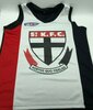
Uhh yeah, pretty sure that is a knock off.It is interesting that we are one of the few clubs that have our emblem on our guernsey. Granted a few have the large image in the middle but very few are small and on the heart.
Have we ever had our emblem in the middle of the three stripes? I remember the full white clash strip with the large emblem but not a three stripe with it in the middle.
Similar to this that I grabbed off google but the more traditional stripe widths. I assume this is a knock off
Uhh yeah, pretty sure that is a knock off.
We wore a clash strip in 2007 that had the logo in the middle.
I actually like it. I can't remember the Vodafone sponsorship thoughUhh yeah, pretty sure that is a knock off.
We wore a clash strip in 2007 that had the logo in the middle.
I actually like it. I can't remember the Vodafone sponsorship though
Yeah that was the one I was referring to that I remembered.Uhh yeah, pretty sure that is a knock off.
We wore a clash strip in 2007 that had the logo in the middle.
Its a shame Deliveroo wont invert their colours as it isn't quite so offensive on the media polo's someone posted earlier.At least BillExpress and Vodaphone were red. Deliveroo is just ugh!
Definitely missed an opportunity with (St.)KFC. Marketing could have been great.
We are the only club who has had a consistent logo since our inception. That fact by itself is pretty harmless, but thinking about it more deeply it's something that I am very proud of and has the ability to immediately identify your brand. Every knows the red white and black cross and crest, fortius quo fidelius, the lot.It is interesting that we are one of the few clubs that have our emblem on our guernsey. Granted a few have the large image in the middle but very few are small and on the heart.
Have we ever had our emblem in the middle of the three stripes? I remember the full white clash strip with the large emblem but not a three stripe with it in the middle.
Similar to this that I grabbed off google but the more traditional stripe widths. I assume this is a knock off
The crest wasn’t on the jumper until 1933.We are the only club who has had a consistent logo since our inception. That fact by itself is pretty harmless, but thinking about it more deeply it's something that I am very proud of and has the ability to immediately identify your brand. Every knows the red white and black cross and crest, fortius quo fidelius, the lot.
But it has never left since. It's an integral and iconic part of the guernsey at this point.The crest wasn’t on the jumper until 1933.