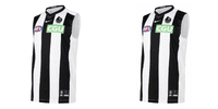
Workshop 2021 Jumper Ideas thread

Remove this Banner Ad

Status
Not open for further replies.
So reports are GWS have a new jumper coming out soon and I have been always annoyed by the fact the balance is off from the front to the back. The numbers should be white so the three colours match the front, or the no brainer is that it needs a charcoal back with an orange number. Anyhow for those reason I actually think the colours go best in a Tri colours format. The simple tri colours work well and if you use the more blueish charcoal and more vibrant orange is really strikes a cord imo.

I personally like the first one with the orange at the bottom option better as it creates a contrast between that and the shorts and would allow for orange numbers on the charcoal and white background. Interested to hear peoples thoughts on which they prefer. I will post ones with a G logo inserted soon too.

View attachment 1035846View attachment 1035847
Could the new jumper the one the one that was floating around the board a month or two ago?
 

Log in to remove this ad.

So reports are GWS have a new jumper coming out soon and I have been always annoyed by the fact the balance is off from the front to the back. The numbers should be white so the three colours match the front, or the no brainer is that it needs a charcoal back with an orange number. Anyhow for those reason I actually think the colours go best in a Tri colours format. The simple tri colours work well and if you use the more blueish charcoal and more vibrant orange is really strikes a cord imo.

I personally like the first one with the orange at the bottom option better as it creates a contrast between that and the shorts and would allow for orange numbers on the charcoal and white background. Interested to hear peoples thoughts on which they prefer. I will post ones with a G logo inserted soon too.

View attachment 1035846View attachment 1035847
There was a cheap afl store with the team logo on the sponsor side of the jumper. They had a GWS jumper that was not their current jumper. Unfortunately can not find it anywhere
 
They never had the best Jumpers
I agree with nato in an aspect. They're not 'the best' but, they're something new. A yoke and logo beneath is a common distinctive 'footy' design. However, what makes it unique is the vibrant orange and charcoal, with the 'G' emblem in the corner, not directly underneath in the middle. It's a blend of tradition mixed with a breath of fresh air. A modern footy jumper which only needs a number panel, nothing else.

On Pixel 2 XL using BigFooty.com mobile app
 

(Log in to remove this ad.)

I think that's just the sekem site though if you look at the previous ones the pictures look equally as s**t. I'd imagine the actual design will look better despite still being underwhelming, if this is the so called 're-design'.
 
I think that's just the sekem site though if you look at the previous ones the pictures look equally as sh*t. I'd imagine the actual design will look better despite still being underwhelming, if this is the so called 're-design'.
AFL Evolution to kinda save the day.
Still looks terrible
 

Attachments

  • 20210107_112923.jpg
    20210107_112923.jpg
    322.1 KB · Views: 288
They never had the best Jumpers
Yeah in your opinion. To me the design is just the epitome of a contemporary Australian Rules jumper. Sure it doesn't doesn't quite fit in with the older clubs designs, but that's because it isn't meant to. It's just an evolution of the yoke design. The only gripe I have with it is the back being orange but other than that it is up there.
 
Pinstripe would be fantastic as well for the 2022 home

Mate....

giphy.gif


The traditional Collingwood jumper is a classic. It does not need, nor should it have, pinstripes.
 
A bit early but I had an idea for Essendon's 150th anniversary guernsey in 2022.

Essendon 150 Full Kit Fixed.png

This jumper takes inspiration from the 140 year jumper with every logo being featured along the sash but I have also taken inspiration from Collingwood's 125th year anniversary jumper with every logo being completely red and black, along with the numbers which are a call back to our 1911 finals guernseys.

The sash is thin like it was until the 70's and the red shorts are a call back to our 75-82 era, marking the biggest changes to our uniform until the introduction of clash jumpers. I don't have a sock template but the socks would have 5 red hoops instead of 3, like our original uniforms had until 1918.

Overall, I wanted to celebrate the consistency of our home jumper by highlighting the minor changes that have been made to it while also pushing the red and black colour palette as far as it can go with no compromises of white or grey.

Please let me know if I haven't got the logos in their proper order. I couldn't find any dates for them online.
Thanks to Mero for supplying the logos.
 
Last edited:
Status
Not open for further replies.

Remove this Banner Ad

Back
Top