full colour bar for each team actually makes it easier
during the AFLW season, 7 matched the colour of the jumper and the score. So they should do the same with the men’s, which will make identifying teams more easier

Last edited:
Follow along with the video below to see how to install our site as a web app on your home screen.
Note: This feature may not be available in some browsers.
full colour bar for each team actually makes it easier
during the AFLW season, 7 matched the colour of the jumper and the score. So they should do the same with the men’s, which will make identifying teams more easier
Love the full score being shown. It’s probably the only sport where seeing the breakdown of a total score actually paints an immediate picture for the viewer.
only potential issue is going to be when two dark teams play

Using cinematic/photographic cameras with high resolution sensors (a lot of them are running 8K cameras - UFC, WWE). At these resolutions, frame rate is generally much lower (probably 24-30fps: 24 is cinema film, 29.97 is North American and Japanese TV). Depth of field/focus issues are related to the lenses used on these cameras - with sports broadcasting you generally use apertures that need a lot of light to drive the sensor but the trade off is your focal depth is much larger. In cinema, often apertures are opened up with the opposite effect - image is much brighter but the focal depth is much shallower (creating bokeh-like effects outside of that focal range). The other thing I have noticed is that cameramen using these cameras are struggling with focus because cinematic and photographic lenses differ from broadcast lenses - broadcast lenses are generally "parfocal" which means if you zoom the focus automatically moves with the zoom. Cinema and photographic lenses generally keep the focus when zoom is adjusted if zoom is a feature on the lens. It's a completely different ballgame moving from traditional broadcast/EFP cameras to these, especially when it comes to low-light performance, optical stabilisation, etc.Can someone explain this camera that 7 were running with last night? I’m presuming it was supposed to copy the one used in the Super Bowl this year. Pretty sure that Fox called the setup their “Megaladon”
Super large aperture, short depth, but the frame rate was incredibly low. Felt like I was watching a video game for parts.
twitter.com/thecheckdown/status/1348390735507148802?s=20

during the AFLW season, 7 matched the colour of the jumper and the score. So they should do the same with the men’s, which will make identifying teams more easier
Yes, I’m pretty sure Sydney, Port, GWS are the othersHawthorn and Essendon haven’t had their graphics appear on the new channel 7 look so far, tonight is the first look for both
Yes, I’m pretty sure Sydney, Port, GWS are the others


Brisbane Lions scorebug looks good. Nice to see they’re going with the jumper colours for scorebug so far this season.

Brisbane Lions scorebug looks good. Nice to see they’re going with the jumper colours for scorebug so far this season.

Would be nice if they coloured the other graphics the same. Looks weird when they have a player stats box up when someone is lining up for goal for Brisbane in maroon when the scorebug below is red
View attachment 1086681

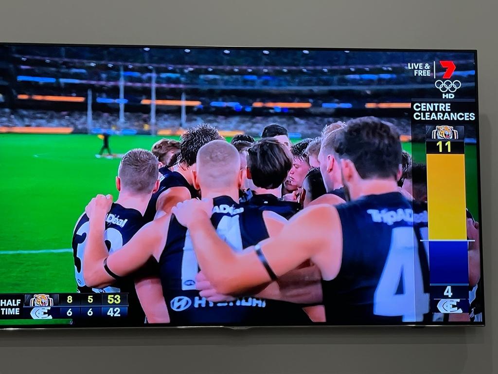
Would I be correct to assume that changing these graphics for every game would be quite an effort?So following on from this, here is a really good example from today of where the colour coding needs to apply to more than just the scorebug. Given this clearance graphic appears right on top of the colour coded scorebug, then at first glance all five players appear to be Bulldogs.
View attachment 1088156
Would I be correct to assume that changing these graphics for every game would be quite an effort?
Would be nice if they coloured the other graphics the same
Would I be correct to assume that changing these graphics for every game would be quite an effort?
You’d think logically if they can differentiate from Adelaide stat colour scheme and Brisbane stat colour scheme, they could differentiate between Adelaide colours and Adelaide alternative colours, especially if they’re already used for scoreboard? Though maybe I’m assuming a lot that the back end is set up ‘logically.’No idea to be honest. I feel like in this digital age it could be as simple as programming each team twice, once in each colour, then just telling the program which one to use each game. But I could be way off and I’ll happily concede to anyone who knows different.
You’d think logically if they can differentiate from Adelaide stat colour scheme and Brisbane stat colour scheme, they could differentiate between Adelaide colours and Adelaide alternative colours, especially if they’re already used for scoreboard? Though maybe I’m assuming a lot that the back end is set up ‘logically.’
I doubt there's even a truck anymore!Thats basically my assumption but yeah, who know how it all operates in the truck.