- Aug 21, 2007
- 31,651
- 98,918
- AFL Club
- Port Adelaide
- Other Teams
- Aston Villa, San Antonio Spurs
Forgive the delays, welcome to Round 1!
Greenwith

v
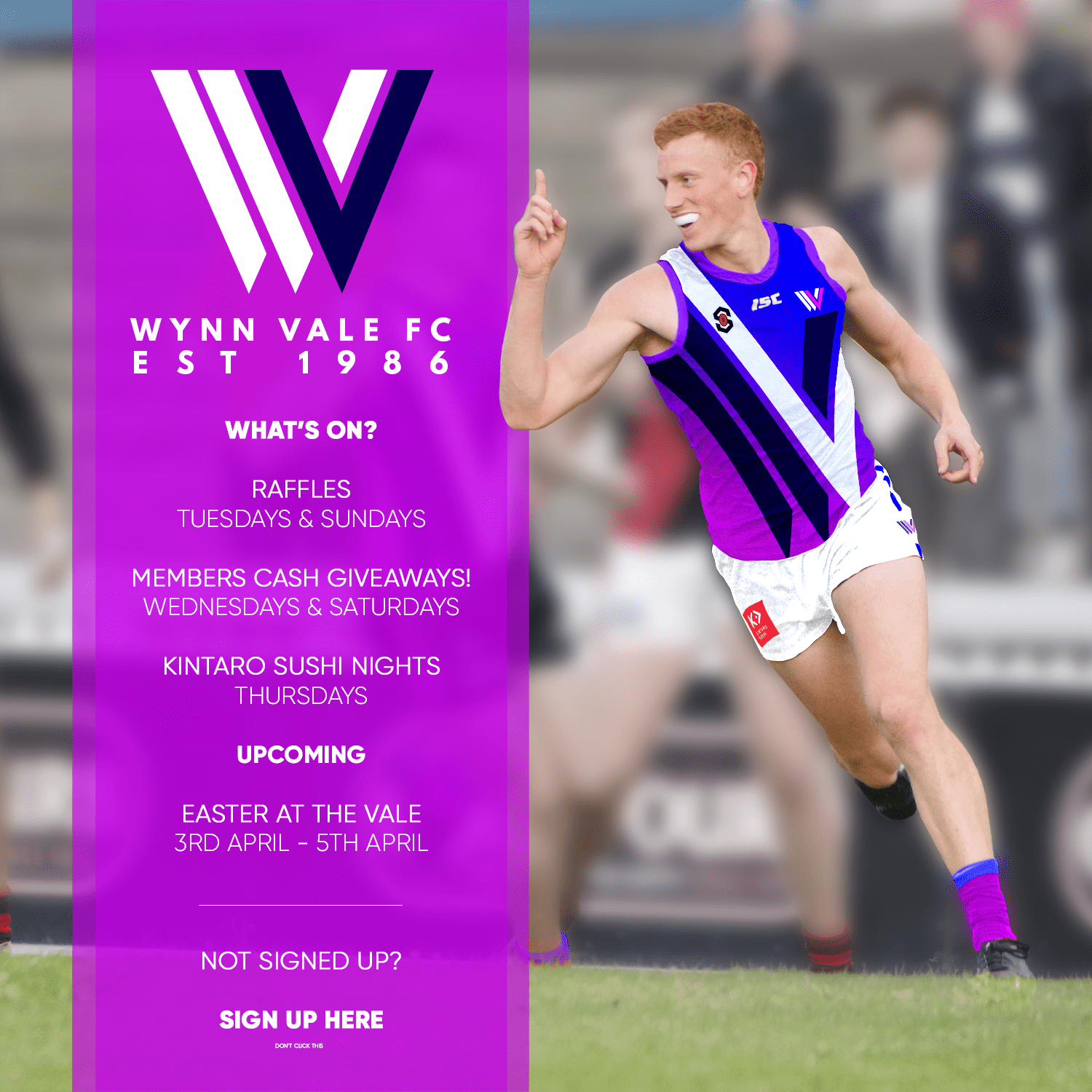
Wynn Vale
Kensington
v
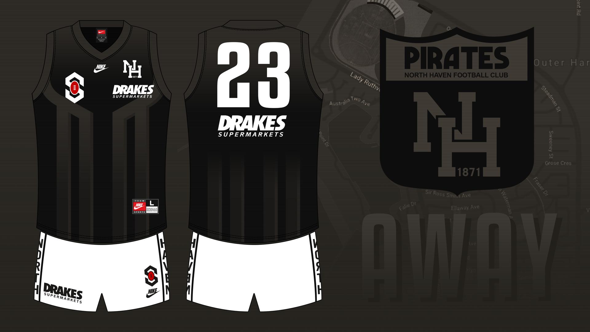
North Haven
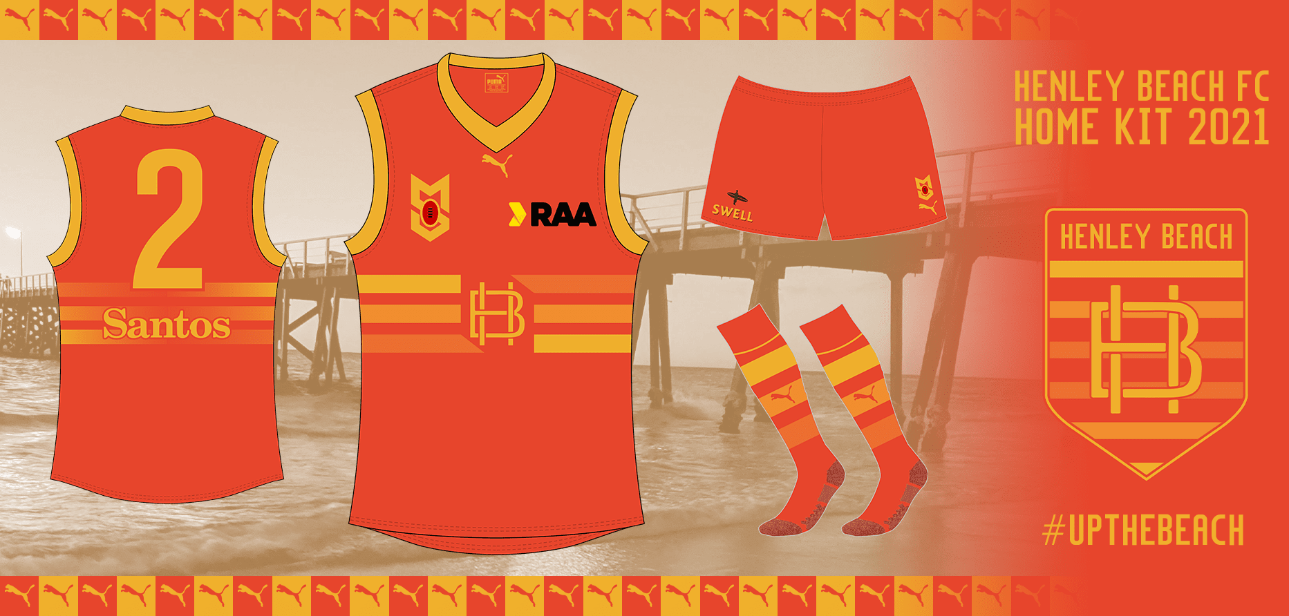
Henley Beach
v
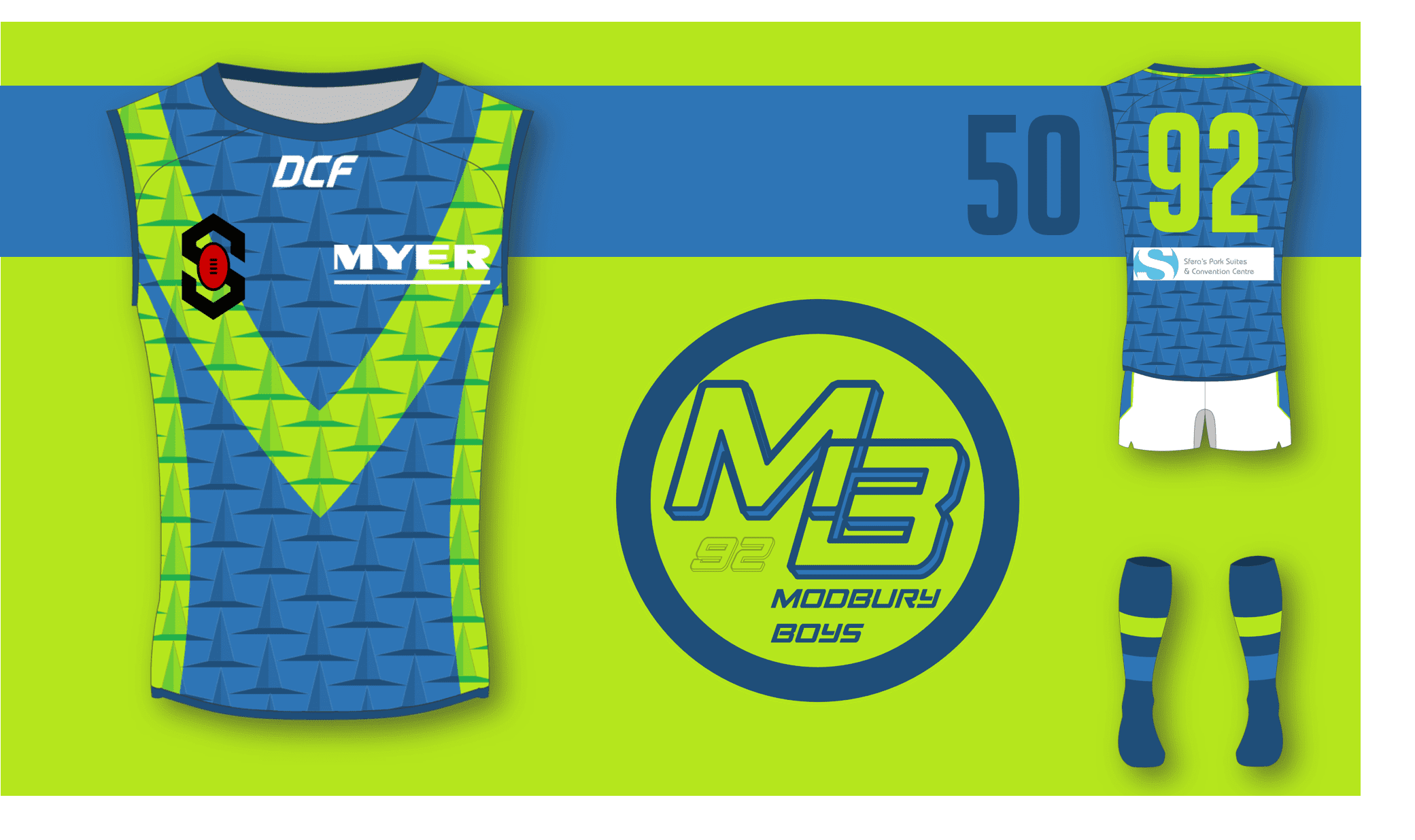
Modbury
Tea Tree Gully
v
Lonsdale
Seacliff
v
Belair
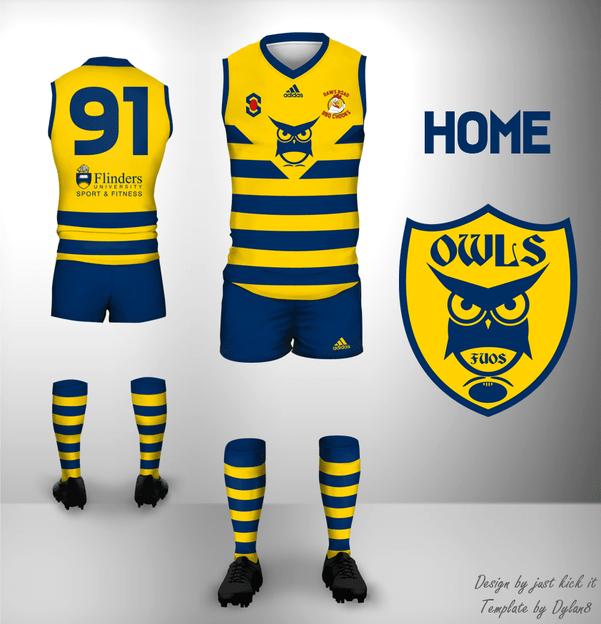
Flinders Uni OS
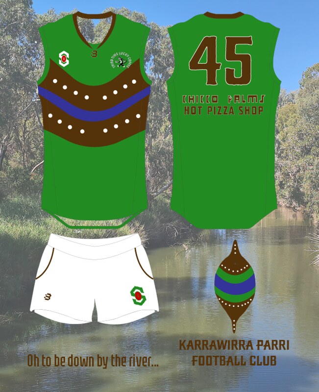
v
Karrawirra Parri
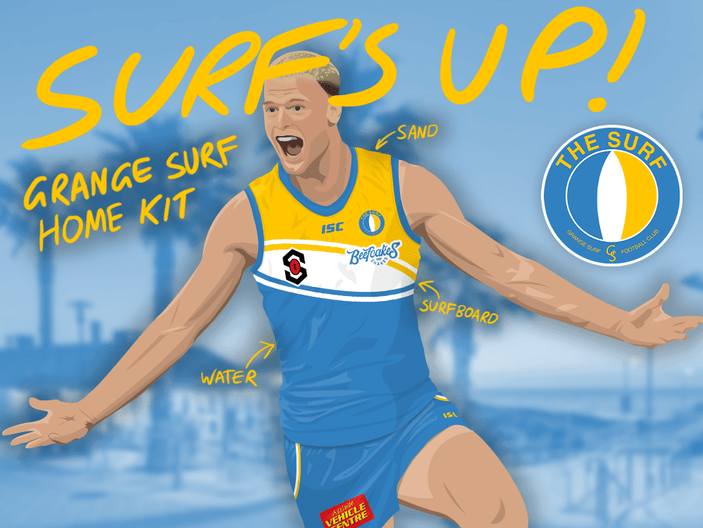
Grange
v
Taperoo
Greenwith

v
Wynn Vale
Kensington

v
North Haven
Henley Beach
v
Modbury
Tea Tree Gully

v
Lonsdale

Seacliff

v
Belair

Flinders Uni OS
v
Karrawirra Parri
Grange
v
Taperoo