Discussion Round 4, 2021 - Photos and Discussion

Remove this Banner Ad

Jul 17, 2006
5,272
9,848
Victoria
AFL Club
Adelaide
Other Teams
Liverpool FC, Melbourne Victory
Thursday, April 8
Sydney v Essendon (SCG) (N)

Friday, April 9
Port Adelaide v Richmond (AO) (N)

Saturday, April 10
Western Bulldogs v Brisbane Lions (MARS)
St Kilda v West Coast (MRVL) (T)
Gold Coast v Carlton (MS) (N)
Collingwood v Greater Western Sydney (MCG) (N)

Sunday, April 11
North Melbourne v Adelaide (MRVL)
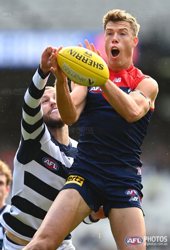
Melbourne v Geelong (MCG)
Fremantle v Hawthorn (OS) (T)
 
i know crows having clash socks is kind of redundant anyway as their home socks are quite unique but these ones are almost identical to the home socks, so why bother?

espically seeing as most players have them at there ankles anyway.
 

Log in to remove this ad.

Noticed this during the game yesterday but is jake waterman wearing puma socks? look closely at the logo on the right sock 829970.jpeg
 
I just realised, Cotton On have navy underarm panels. Interesting.
I think you misspelled "ugly".

831036.jpg
 
Noticed this during the game yesterday but is jake waterman wearing puma socks? look closely at the logo on the right sock View attachment 1099735

This reminds of where some Crows player was wearing a BLK training vest over three seasons after we left BLK in a Making Their Mark scene :drunk:
Its bizarre that West Coast aren't wearing Castore shorts and socks though, surely Castore would have delivered those? Castore must've ****ed up with the design of them or something.
 
Crows yellow strip looks great. Navy shorts would also be OK for this match up.

Umpires need more coloured strips to avoid clashes. All white would have been fine today. Or pink.
Why should umpires have to manufacture/wear all different colours of the rainbow while clubs only have 2 jumpers in most cases
 
Have the Hawks worn their clash against Freo in recent times? It’s a fantastic colour combo with large amounts of Gold up against the full Purple. Would be better without the Hawks side panels.
 
Have the Hawks worn their clash against Freo in recent times? It’s a fantastic colour combo with large amounts of Gold up against the full Purple. Would be better without the Hawks side panels.

Not the current “Mustard Pot” design; they wore the white with monogram guernsey in Round 18 2017.

And Carlton wore their full yellow “CheatStrong” uniform against Fremantle in Round 14 2009.
 

(Log in to remove this ad.)

Even though it is obvious what they are talking about, a quick look at one of the twitter users posts in the video leads to this.


How many kits do they need? They should have used the orange against Collingwood. That lightning bolt kit doesn't look that good imo. It's a decent training kit, but bland.
 
Because umpires are meant to be neutral. They should not be wearing similar colours to either of the teams playing.
Well clubs aren't meant to clash either. If you are suggesting umpires take up say pink and green as their two colours then that's fine, but please don't expect umpires to have every shade of the rainbow ready for every game
 
Well clubs aren't meant to clash either. If you are suggesting umpires take up say pink and green as their two colours then that's fine, but please don't expect umpires to have every shade of the rainbow ready for every game
OK, assuming that AFL umpires are paying for their kit somehow (which they'd have to waste money a kit with a slightly different shade of yellow because Chemist Warehouse, so why not multiple clash kits?), teams with yellow clash jumpers don't wear them against teams in white (Geelong), have umpires second kit be white (like last year's) instead of light blue which does clash with the Kangaroos, the Eagles and the Bulldogs. Done.

The problem with Hawthorn vs Geelong still exists but they don't do anything to remedy the clash with Hawthorn's home jumper anyway.
 
I wonder if we’ll see “TASMANIAN” rather than “Tasmania” on future Hawks jumpers.

This is what the Magpies netball team are rolling with this year – seemingly using the new “Buy Something Tasmanian” branding from Tourism Tasmania.

32BE717B-9CAD-441C-B0E5-9208F968FF5E.jpeg
 
Adelaide's home strip will always be one of the worst in the league but it looks pretty good inverted. Seems like a no brainer but I think the best thing about it is that vibrant gold. O'Neill's done great.
You’re Joking right? 😆 it’s more iconic then your strip
 

Remove this Banner Ad

Back
Top