Fizzler
BBTB
- Dec 26, 2013
- 12,748
- 16,332
- AFL Club
- Port Adelaide
- Other Teams
- OKC, Coburg, Werribee, Storm, QPR
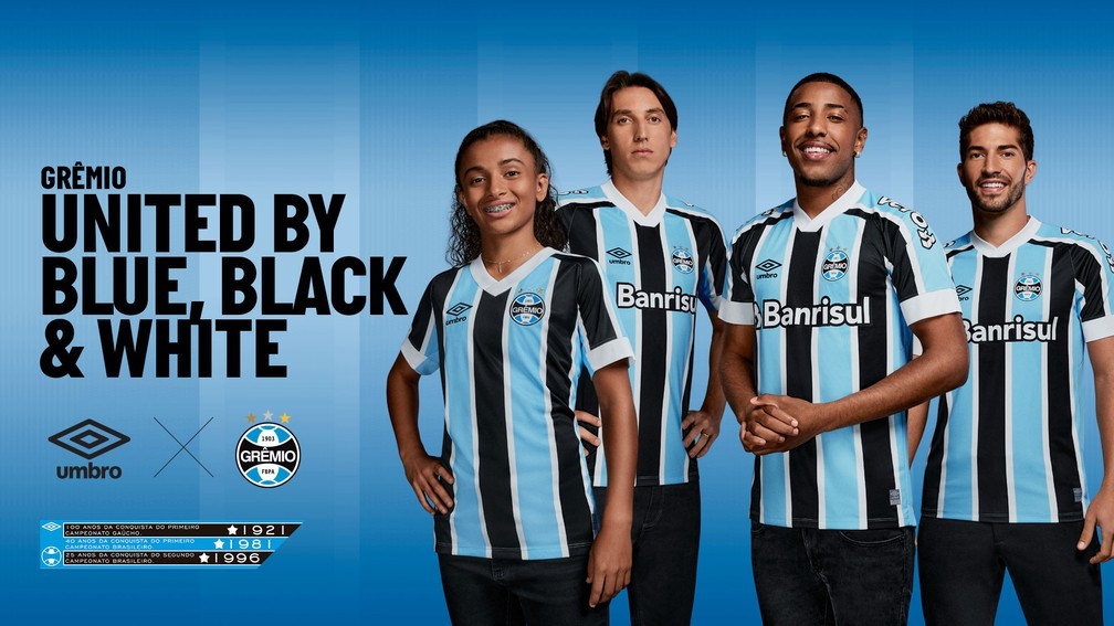
Oooooft these are nice right here, love itGrêmio FBPA's 2021-season jersey:
Home

Away
Follow along with the video below to see how to install our site as a web app on your home screen.
Note: This feature may not be available in some browsers.
LIVE: St Kilda v Western Bulldogs - 7:30PM Thu
Squiggle tips Saints at 51% chance -- What's your tip? -- Team line-ups »
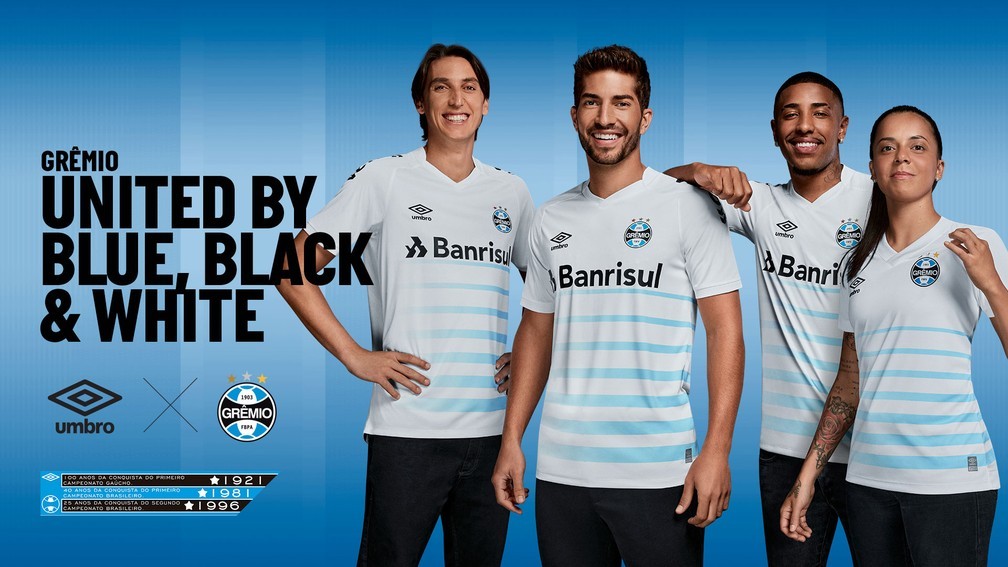
Oooooft these are nice right here, love itGrêmio FBPA's 2021-season jersey:
Home
Away
Oooooft these are nice right here, love it
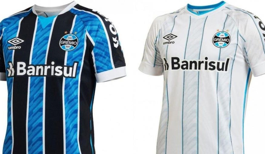
Inter Milan just happens to be one of the word's biggest clubs wearing black and blue stripes but that doesn't detract from the fact that the Gremio home kit is a nice play on your typical striped jersey. The white pinstrips are a little thick for mine but its a nice kit.The away kit is new. Grêmio has never worn anything similar before; at least, not that I am aware of it.
Umbro has taken a more traditional route with the primary shirt, after going "fancy" last season:
I love Grêmio's stripes. They are not unusual in South America, but one practically doesn't see it in Europe.
I didn't say there weren't striped clubs in Europe. The 3 biggest Italian clubs are striped. I was talking about the three-colour striped shirt. Check Fluminense, São Paulo, and Bahia, for instance.Inter Milan just happens to be one of the word's biggest clubs wearing black and blue stripes but that doesn't detract from the fact that the Gremio home kit is a nice play on your typical striped jersey. The white pinstrips are a little thick for mine but its a nice kit.

Arent inter owned by Evergrande?also it seems Pirelli will be replaced with China Evergrande Group. not the best lookView attachment 1113449
On SM-G991B using BigFooty.com mobile app
they're owned by Suning Holdings Group. I'm not sure if Evergrande is part of Suning or not thoughArent inter owned by Evergrande?
Doesn't seem to have any specific relationship.they're owned by Suning Holdings Group. I'm not sure if Evergrande is part of Suning or not though
On SM-G991B using BigFooty.com mobile app
I do like the back of the Newcastle kit though. Front is pretty bad, and I'm not sure about these new third kits they are going with.Puma may be good in the AFL but boy oh boy they've had some stinkers of late in the round ball.
Man City's kits since switching from Nike have all been absolute bombs.
The biggest thing Newcastle can do to improve their kit is cut the stripes off on the back or use a number panel so they can stop using red numbers on a black/white background.I do like the back of the Newcastle kit though. Front is pretty bad, and I'm not sure about these new third kits they are going with.
Really? I reckon their set this year are all fantastic, particularly the away and third shirts. Puma overall are probably my brand of the season this year with so many banging shirts (Palmeiras home, Marseille away, Dortmund Home and the neon, and the City kits I've mentioned).Puma may be good in the AFL but boy oh boy they've had some stinkers of late in the round ball.
Man City's kits since switching from Nike have all been absolute bombs.
Maybe it’s just me then, but I’m yet to see a man city puma kit that I like. Maybe it’s because I’m the furthest thing from a fan of the club and don’t really know the context behind their kits this year (the cracked home one etc).Really? I reckon their set this year are all fantastic, particularly the away and third shirts. Puma overall are probably my brand of the season this year with so many banging shirts (Palmeiras home, Marseille away, Dortmund Home and the neon, and the City kits I've mentioned).
But this upcoming season with this wordmark thing is certainly hit or miss, I like it on some of the national teams (Austria and Switzerland in particular) but it just doesn't work on a club shirt imo.
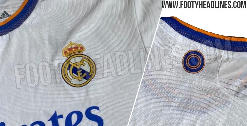
I wonder what the pattern on Madrid's shirt is. I wish there was a closer picture
I wonder what the pattern on Madrid's shirt is. I wish there was a closer picture
On SM-G991B using BigFooty.com mobile app
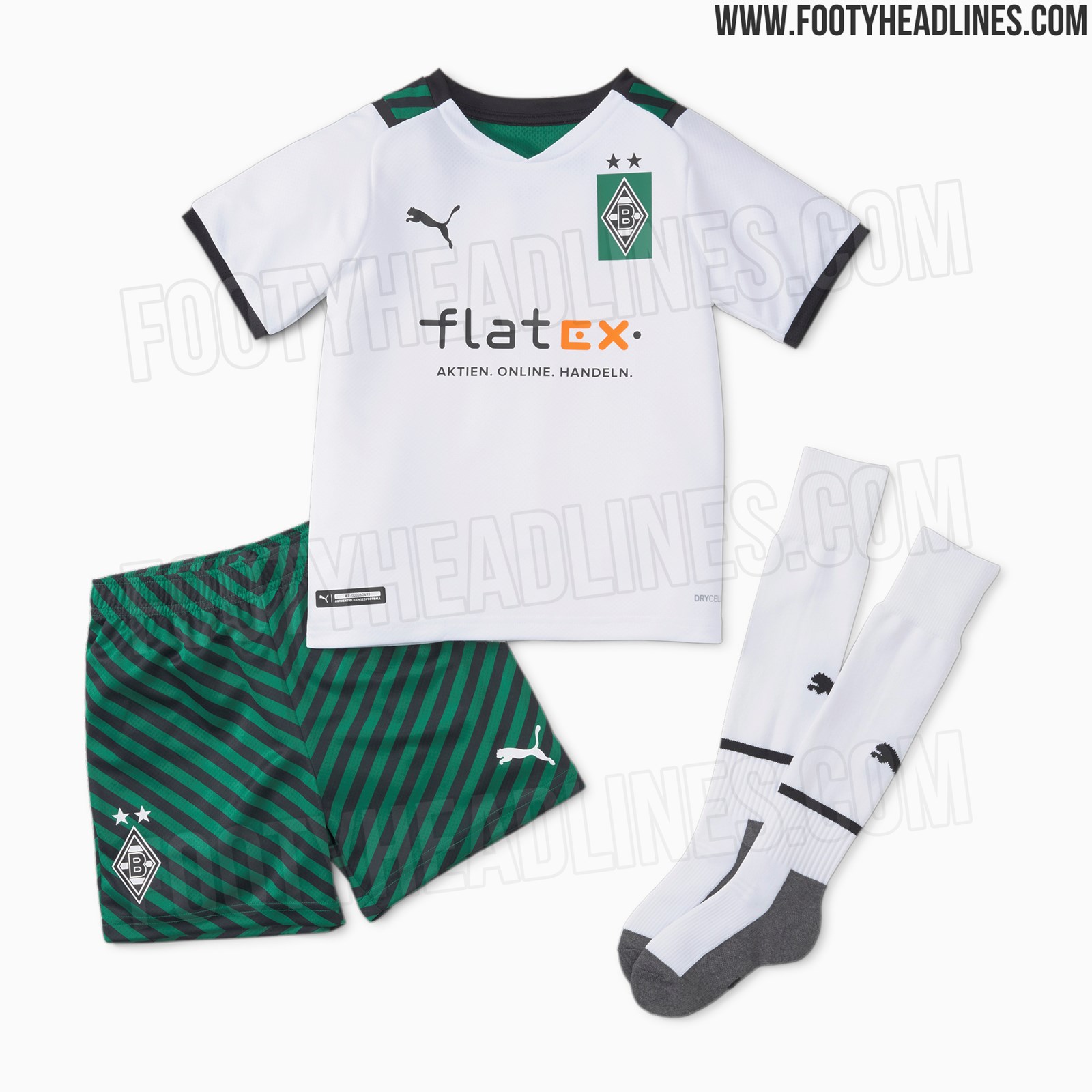
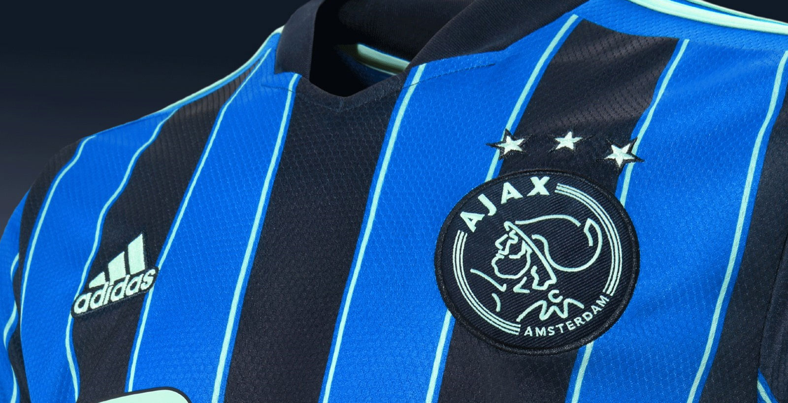
Ajax Amsterdam away:Grêmio FBPA's 2021-season jersey:
Home
Away
 www.footyheadlines.com
 www.footyheadlines.com
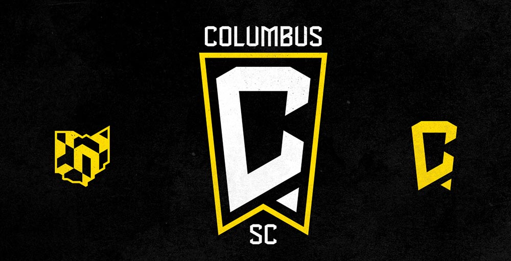
Cool video and I understand the Ohio flag shape.Columbus Crew Change Name to Columbus SC and Unveil New Logo
Columbus Crew have now confirmed their rebranding to Columbus SC (Soccer Club), as was rumored before.
This is a sad day for American soccer.Columbus Crew Change Name to Columbus SC and Unveil New Logo
Columbus Crew have now confirmed their rebranding to Columbus SC (Soccer Club), as was rumored before.
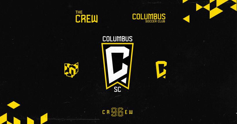
A lot of the teams seem to be moving to change there name or logo. Chicago (which went so bad they are changing again), Montreal went full rebrand, now Columbus (who almost moved out of columbus)This is a sad day for American soccer.
What on hell were they thinking?!
Reactions to the Crew’s rebrand announcement
The supporters made their feelings quite clear on the club’s new name and logo.www.massivereport.com