
And no outer white line around the AFL logo.
Navigation
Install the app
How to install the app on iOS
Follow along with the video below to see how to install our site as a web app on your home screen.
Note: This feature may not be available in some browsers.
More options
You are using an out of date browser. It may not display this or other websites correctly.
You should upgrade or use an alternative browser.
You should upgrade or use an alternative browser.
Discussion Bad Graphic Design
- Thread starter Jones2ByrneJones
- Start date
- Tagged users None

- Sep 19, 2007
- 19,053
- 17,608
- AFL Club
- St Kilda
- Other Teams
- Anaheim Ducks, PSV Eindhoven
lol 2 of the players have been flipped. Not to mention the club logos aren't quite right.

- Mar 30, 2014
- 2,593
- 4,253
- AFL Club
- Brisbane Lions
- Other Teams
- Dolphins, Seattle Kraken
Yeah this is accurate, although I think most of us prefer the BBFFCThey’ve used a hybrid Brisbane logo that has the maroon instead of Fitzroy’s red. Also says Brisbane Football Club which to my knowledge isn’t used by the Lions currently and wasn’t used by the Bears either. It’s been Brisbane Lions Australian Football Club since the merge.

fox footy graphic posted to fb. don't know if it's my early morning eyes, but the navy text on red background is really hard to read
also suss out the random 3 sets of numbers on tom's thigh (above the O & N in his name)
edit: can see it a bit easier on pc, my phone must have been on low brightness in the morning haha oop
Last edited:
- Sep 19, 2007
- 19,053
- 17,608
- AFL Club
- St Kilda
- Other Teams
- Anaheim Ducks, PSV Eindhoven
Needs a white shadow to make them pop.fox footy graphic posted to fb. don't know if it's my early morning eyes, but the navy text on red background is really hard to read

- Mar 30, 2014
- 2,593
- 4,253
- AFL Club
- Brisbane Lions
- Other Teams
- Dolphins, Seattle Kraken
I also spot some ochre

The whole CGI tarp thing with club logos is already bad as is.
Who the hell thought thats a good idea?
- Jul 13, 2017
- 4,723
- 8,579
- AFL Club
- West Coast
- Other Teams
- West Coast Wonders, West Perth
Honestly wouldn't have been surprised if they used the tripanel like some websites still do.
The whole CGI tarp thing with club logos is already bad as is.
Who the hell thought thats a good idea?
Especially when they put one over a section that actually had people in it!
Freight Train
Once hit the sign at the Mercantile Mutual Cup
- Moderator
- #1,164
is this bad graphic design tho?
Saw it. Hated it.
Very Fox though.
90% sure they still think Darren Glass is skipper too.
- Jan 16, 2019
- 795
- 957
- AFL Club
- West Coast
this isn't fox doing the graphics thoSaw it. Hated it.
Very Fox though.
90% sure they still think Darren Glass is skipper too.
this isn't fox doing the graphics tho
Really? - I thought it was a Fox game sorry. I kayo’d.
YES. It is bad on, like, a gazillion levels!is this bad graphic design tho?
Bwillow11
All Australian
- Sep 16, 2016
- 680
- 470
- AFL Club
- Collingwood

- Other Teams
- Melbourne Stars
I think the key is "graphic design"YES. It is bad on, like, a gazillion levels!
Its poor execution, not poor design.
Best bit was yesterday one was placed over actual supporters in the standsThe whole CGI tarp thing with club logos is already bad as is.
Who the hell thought thats a good idea?
The design incorporates ochre. Ergo, it is a travesty. It's a perfectly adequate implementation of a monstrosity. Or something like that. The point is: it sucks.I think the key is "graphic design"
Its poor execution, not poor design.

- Mar 30, 2014
- 2,593
- 4,253
- AFL Club
- Brisbane Lions
- Other Teams
- Dolphins, Seattle Kraken
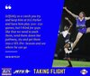
Tbh i feel sad for Teague in this photo, I think the logo can be ignore so we can focus on how sad he isAnother one from Fox Footy, this one from On the Couch last night:
View attachment 1149942
Using the old Carlton logo.


Similar threads
- Replies
- 8
- Views
- 528
