


what happened to the Footscray name???I always thought your team name was meant to stand for something, not what color the guernsey is mainly
Navigation
Install the app
How to install the app on iOS
Follow along with the video below to see how to install our site as a web app on your home screen.
Note: This feature may not be available in some browsers.
More options
You are using an out of date browser. It may not display this or other websites correctly.
You should upgrade or use an alternative browser.
You should upgrade or use an alternative browser.
Which club has the worst guernsey?
- Thread starter VineyToClark
- Start date
- Tagged users None
Fremantle give it a crack.
- Jul 16, 2003
- 1,654
- 2,079
- AFL Club
- Hawthorn
- Other Teams
- Keilor Bowls Club
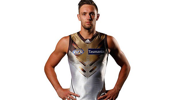
I think Hawthorns is terrible. P & P seems to adequately describes it. Really not much you can do with Brown & yellow. Stripes make it even worse.
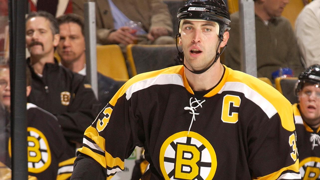
The Brown and Gold/Yellow combination isn't unique to Hawthorn in the sporting world.
The Boston Bruins rocked brown and gold before moving to more black and gold.
The San Diego Padres seem to also have reverted back to their original Brown and Gold colours.
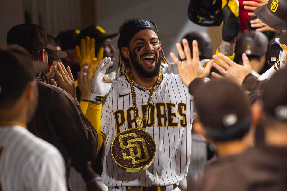
Our colours are what they are. As Don Scott said, "They're not the prettiest colours in the world, but they're our colours."
Strapping Young Lad
Moderator
- Apr 19, 2006
- 97,426
- 235,930
- AFL Club
- Hawthorn
- Other Teams
- Storm, Spurs, Socceroos
- Moderator
- #254
That’s premiership Gold, friend.I think Hawthorns is terrible. P & P seems to adequately describes it. Really not much you can do with Brown & yellow. Stripes make it even worse.
GWS. A big G that looks like a motorbike helmet pushed to one side.
once you see orange giving grey a blowie it’s can’t be unseen. I think it actually represents greater Sydney surrounding the Sydney harbour precinct - obviously the swans domain
for afl footy, the diagonal stripe is a great configuration. But personally I like the v configuration of the aus jumper v Ireland best
No doubt some young marketing guru telling the board “this is what the young kids want.” The same marketing gurus who had the final say on the suns and giants jumpers.
maybe it was conceived by someone on acid?
Yes we both know how to entertain the masses when we come together. Kept footy interesting for a long time now while most teams just fap about. I love our guernsey it blends beautifully with premiership cups which it what it is all about after all. That cannot be argued.
Not to brag but the combination brown/gold and silver of the cup is lust-have fashion.
View attachment 618854
View attachment 618855
View attachment 618856
‘The overlap with the colours of the hawk is marketing symmetry before marketing was thought of. But originally it was the foliage of the suburb of hawthorn ‘mayblooms’
I’d like to see us also adopt the hawthorn bush in autumn which is a darker green with bright red berries. Like the rabitoos but select an exact colour combo which resonates and causes an optical throb to our opponents
People: "Hawthorn have the worst colours and the ugliest guernsey"
Hawthorn: "O RLY?"

People:
This, but in green and red
They the big three of bad jumpers.
GC with a silly circle thing looks like pyjamas for toddlers.
GWS looks like an artist convention for artists who can’t paint or draw.
Hawthorn whilst classic stripes have bodily functions colours. Epic fail.
white and red are body fluids too
- Aug 12, 2017
- 3,953
- 7,089
- AFL Club
- GWS
Agree that GWS wasn’t great but the new clash jumper has taken them from the shithouse to the penthouse jumperwise
Yes, they call themselves the bloods.white and red are body fluids too
Would the Hawks be the Poos? or Pissers?
Strapping Young Lad
Moderator
- Apr 19, 2006
- 97,426
- 235,930
- AFL Club
- Hawthorn
- Other Teams
- Storm, Spurs, Socceroos
- Moderator
- #262
Genuinely unique jumper, and for that I liked it.People: "Hawthorn have the worst colours and the ugliest guernsey"
Hawthorn: "O RLY?"
People:
Also, as far as clubs that just swap out a color, our Turkish delight jumper was a doozy.

- Oct 8, 2014
- 146
- 245
- AFL Club
- Hawthorn
Sydney's home jumper is a shocker tbh
Santa suits.
I still rate our away strip as the best in the league. The predominant gold with the brown V is a thing of beauty.
Certainly much better than just about every other abomination of an away strip we've had.
Look at the socks!11 emphasise the gold if anythingGenuinely unique jumper, and for that I liked it.
Also, as far as clubs that just swap out a color, our Turkish delight jumper was a doozy.
View attachment 1279906
- Aug 17, 2014
- 6,335
- 4,281
- AFL Club
- Western Bulldogs
- Other Teams
- Not a fan of overseas teams.....
I don't know if that was a rhetorical question or not, but in case not, it was replaced to cover the western region of the the Western suburbs.what happened to the Footscray name???
- Mar 5, 2015
- 1,727
- 2,080
- AFL Club
- Western Bulldogs
- Other Teams
- Marconi, Arsenal, GreenEdge
Yep the new charcoal with the orange shadow G is freakin awesome.Agree that GWS wasn’t great but the new clash jumper has taken them from the shithouse to the penthouse jumperwise
Ocha905
Norm Smith Medallist
- Mar 19, 2014
- 5,228
- 14,031
- AFL Club
- North Melbourne
- Other Teams
- Coney Island Warriors, Dallas, Liverpool
Home guernsey rankings.
Great:
1. West Coast (vibrant colours, unique template)
2. Sydney (same as above but slightly clunky)
3. Western Bulldogs (unique template but boring colours)
4. Geelong (same as above)
5. Brisbane (unique colours, decent design).
Adequate:
Roughly equal 6th - Collingwood, Essendon, Fremantle, Hawthorn, Melbourne, North Melbourne, Port Adelaide, Richmond (Boring templates that do the job).
- If there was only one sash team they'd join the top 5.
- Hawthorn with the unique colours probably edge out the other teams.
- Port Adelaide least preferred with terrible number plate.
Needs improvement:
14. St Kilda (front looks good but too imbalanced overall)
15. GWS (same as above)
16. Adelaide (good colours, way too busy)
17. Gold Coast (good colours, terrible design)
18. Carlton (zzz)
Not a big fan of the traditional classics hey?Home guernsey rankings.
Great:
1. West Coast (vibrant colours, unique template)
2. Sydney (same as above but slightly clunky)
3. Western Bulldogs (unique template but boring colours)
4. Geelong (same as above)
5. Brisbane (unique colours, decent design).
Adequate:
Roughly equal 6th - Collingwood, Essendon, Fremantle, Hawthorn, Melbourne, North Melbourne, Port Adelaide, Richmond (Boring templates that do the job).
- If there was only one sash team they'd join the top 5.
- Hawthorn with the unique colours probably edge out the other teams.
- Port Adelaide least preferred with terrible number plate.
Needs improvement:
14. St Kilda (front looks good but too imbalanced overall)
15. GWS (same as above)
16. Adelaide (good colours, way too busy)
17. Gold Coast (good colours, terrible design)
18. Carlton (zzz)
Apart from the Tigers, my faves are Carlton and Melbourne.
Understated classics.
Tier list - Guernseys (S being the cream, D being awful)
S Tier - Melbourne
A Tier - Bulldogs, Essendon, Richmond, West Coast, Sydney, Collingwood
B Tier - Fremantle, Port, Geelong, Brisbane,
C Tier - Adelaide, GWS, St Kilda, Carlton, North Melbourne
D Tier - Hawthorn, Gold Coast
Basically Melbourne look the best.
S Tier - Melbourne
A Tier - Bulldogs, Essendon, Richmond, West Coast, Sydney, Collingwood
B Tier - Fremantle, Port, Geelong, Brisbane,
C Tier - Adelaide, GWS, St Kilda, Carlton, North Melbourne
D Tier - Hawthorn, Gold Coast
Basically Melbourne look the best.
- Dec 22, 2006
- 9,560
- 11,357
- AFL Club
- Carlton
- Other Teams
- Tottenham Hotspur
GWS charcoal is the best guernsey in the comp.
Ocha905
Norm Smith Medallist
- Mar 19, 2014
- 5,228
- 14,031
- AFL Club
- North Melbourne
- Other Teams
- Coney Island Warriors, Dallas, Liverpool
Excluding Carlton the others are perfectly fine but all a bit samey. If you love the Tigers uniform surely you love the Bombers uniform as well. Ditto for Collingwood and North Melbourne.Not a big fan of the traditional classics hey?
Apart from the Tigers, my faves are Carlton and Melbourne.
Understated classics.
Edit: Also when these teams face each other it mostly looks s**t. Collingwood v Carlton is easily the worst looking matchup.
So the Footscray name meant nothing to you?I don't know if that was a rhetorical question or not, but in case not, it was replaced to cover the western region of the the Western suburbs.
Hugh Greenwood
votes Gold Coast
PLAYERCARDSTART
1
Hugh Greenwood
- Age
- 32
- Ht
- 190cm
- Wt
- 92kg
- Pos.
- Mid
Career
Season
Last 5
- D
- 16.9
- 4star
- K
- 8.8
- 3star
- HB
- 8.1
- 5star
- M
- 2.3
- 2star
- T
- 6.8
- 5star
- CL
- 4.6
- 5star
- D
- 17.4
- 4star
- K
- 10.4
- 4star
- HB
- 7.0
- 4star
- M
- 1.5
- 2star
- T
- 8.9
- 5star
- CL
- 5.6
- 5star
- D
- 16.4
- 4star
- K
- 8.6
- 4star
- HB
- 7.8
- 5star
- M
- 2.2
- 3star
- T
- 7.6
- 5star
- CL
- 4.4
- 5star
PLAYERCARDEND
It seemed to be an attempt to try and pick up the Fitzroy supporters after their club ceased to exist. Not sure if many ex-Fitzroy supporters moved across, but marketing-wise it makes sense to try and cover the west.I don't know if that was a rhetorical question or not, but in case not, it was replaced to cover the western region of the the Western suburbs.
Yes, correct. The similar patterns don't bother me.Excluding Carlton the others are perfectly fine but all a bit samey. If you love the Tigers uniform surely you love the Bombers uniform as well. Ditto for Collingwood and North Melbourne.
Edit: Also when these teams face each other it mostly looks sh*t. Collingwood v Carlton is easily the worst looking matchup.
Similar threads
- Replies
- 27
- Views
- 2K
- Replies
- 15
- Views
- 1K
- Replies
- 12
- Views
- 876
- Poll
- Replies
- 42
- Views
- 1K
