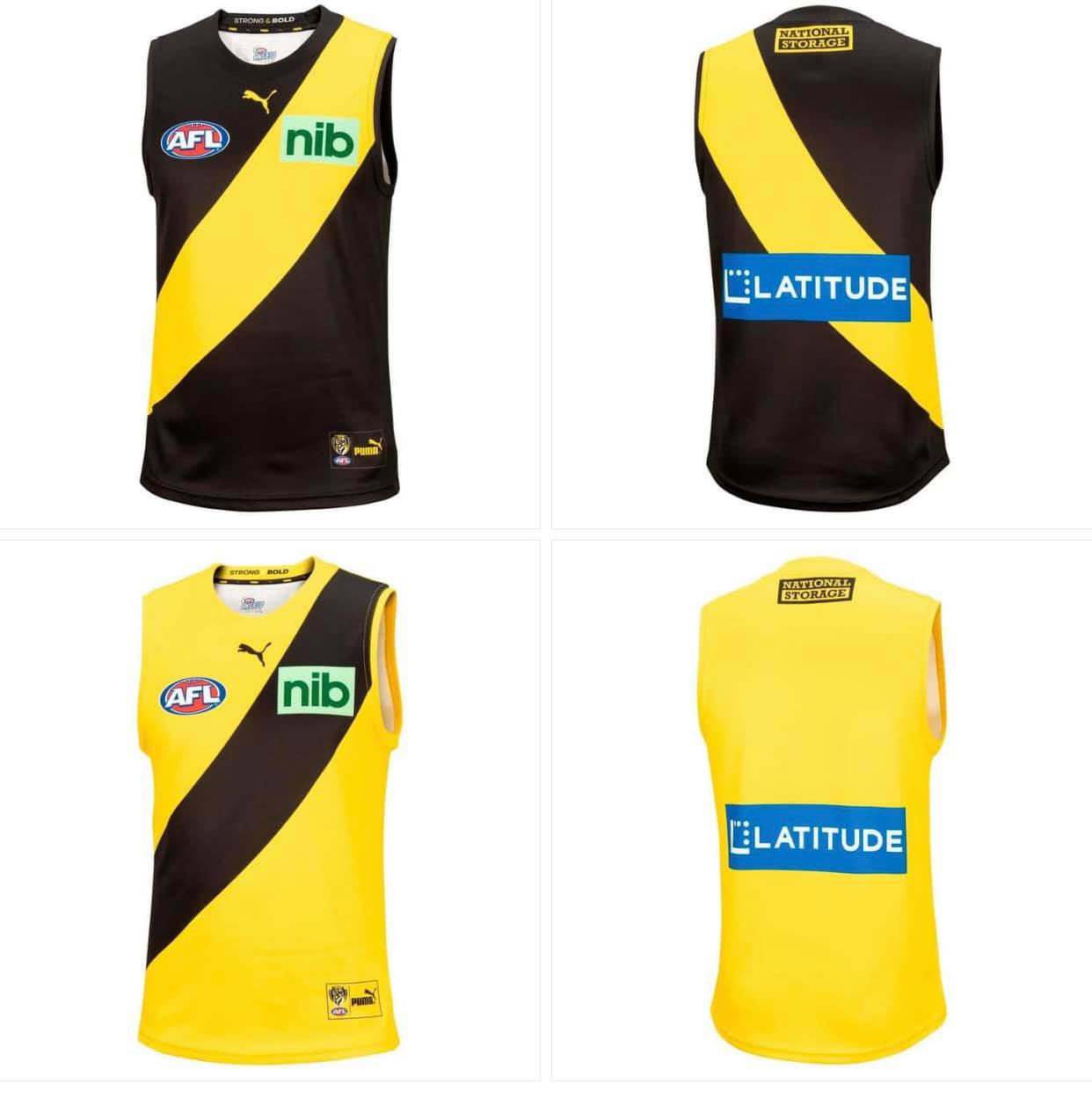
It looks absolutely horrendous, but I would rather have a high-paying major sponsor than miss out on a few grand due to dropped guernsey sales.
I hate it, so much.
But i'll buy one, because.....you're not, not going to buy a new Richmond Guernsey.
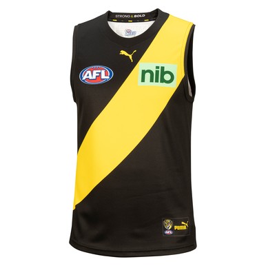
It even has a new red logo that I haven't seen for a few years