News Crows guernseys/apparel discussion and news

Remove this Banner Ad

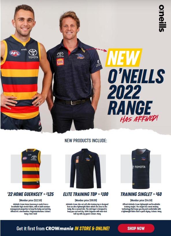
the 2022 crows yearbook features this crowmania ad with what seems to be a prototype for the 2022 home jumper with a different collar

1ec3fdcaf01bebb6cdd2c6f847d89981.jpg


Sent from my iPhone using BigFooty.com
 
What's bugged me over the years is that we've gradually added more hoops to the guernsey. For comparison's sake, here's a picture of our guernsey in 2017 vs a picture from 1997:

View attachment 1287049

Notice how in the 2017 one (sorry to bring back bad memories), there are three sets of hoops leading in to four, depending on torso length. Whereas the '97 one has two sets of hoops leading in to three. This looks cleaner. That said, here's a comparison of what we've just released for next season vs a quick, messy shoop of what I'd like to see us do:

View attachment 1287051

Pretty basic.

I suspect this'll be an unpopular opinion around here, but we have the messiest guernsey in the competition. Two sets of hoops looks more balanced, would get us closer to the original 90's design, would clean it up whilst still allowing the hoops to exist, and the navy block at the bottom would flow better into the home shorts. This creates a bolder, more monochrome look and would potentially have the added benefit of allowing us to wear our home guernsey away more often, against sides where a clash currently exists due to making the overall uniform darker (against Hawthorn for example).
Blue down the bottom of the guernsey doesn't work because it looks like you are wearing your shorts high with a midriff top
 

Log in to remove this ad.

What's bugged me over the years is that we've gradually added more hoops to the guernsey. For comparison's sake, here's a picture of our guernsey in 2017 vs a picture from 1997:

View attachment 1287049

Notice how in the 2017 one (sorry to bring back bad memories), there are three sets of hoops leading in to four, depending on torso length. Whereas the '97 one has two sets of hoops leading in to three. This looks cleaner. That said, here's a comparison of what we've just released for next season vs a quick, messy shoop of what I'd like to see us do:

View attachment 1287051

Pretty basic.

I suspect this'll be an unpopular opinion around here, but we have the messiest guernsey in the competition. Two sets of hoops looks more balanced, would get us closer to the original 90's design, would clean it up whilst still allowing the hoops to exist, and the navy block at the bottom would flow better into the home shorts. This creates a bolder, more monochrome look and would potentially have the added benefit of allowing us to wear our home guernsey away more often, against sides where a clash currently exists due to making the overall uniform darker (against Hawthorn for example).
No
 
What's bugged me over the years is that we've gradually added more hoops to the guernsey. For comparison's sake, here's a picture of our guernsey in 2017 vs a picture from 1997:

View attachment 1287049

Notice how in the 2017 one (sorry to bring back bad memories), there are three sets of hoops leading in to four, depending on torso length. Whereas the '97 one has two sets of hoops leading in to three. This looks cleaner. That said, here's a comparison of what we've just released for next season vs a quick, messy shoop of what I'd like to see us do:

View attachment 1287051

Pretty basic.

I suspect this'll be an unpopular opinion around here, but we have the messiest guernsey in the competition. Two sets of hoops looks more balanced, would get us closer to the original 90's design, would clean it up whilst still allowing the hoops to exist, and the navy block at the bottom would flow better into the home shorts. This creates a bolder, more monochrome look and would potentially have the added benefit of allowing us to wear our home guernsey away more often, against sides where a clash currently exists due to making the overall uniform darker (against Hawthorn for example).


I prefer the before. I know what you are saying but the hoop pattern is repeating and caters for taller and shorter players through the size differential of the guernseys. Its consistent in its design. The after design on taller players would look weird. I am no fashion design expert but those sort of discussions i imagine almost certainly would have been workshopped.
 
Our kit partner hasn't made the members gear most years, O'Neills doing it last year was an outlier. It's a volume issue I believe.
Adidas, Reebok, Puma, ISC as well as O'Neil all did the members polo. Not every year, but each one did at least one.

I did a clean out of a wardrobe this morning and put 12 polos in a vacuum bag. Won't wear, but want to keep em. I only buy the ones made by the apparel sponsor. So will give the 2022 one a miss.


Adidas ones the best.
Puma, ISC and O'Neil not bad either.

BLK and Reebok the worst.

Sent from my SM-G965F using Tapatalk
 

(Log in to remove this ad.)

Got the red away guernsey. I liked the yellow though. Now at least I have all three. Does anyone buy the new home jumper every year? I'd love too but not sure it's worth it for minimal changes and different sponsor logos. But at least we keep this jumper and are now headstrong in maintaining its look.
Collectors might. I bought an ISC one when we dropped them because a website had them for $20, before that I think the last new home one I had was a Reebok (and I think that was bought at discount too).
 
Interesting example given one of Fremantle’s colours is white.

Having said that I’m glad we’ve ditched the white.
I don't mind a number of alt Guernseys .....red, yellow, ect .....just not "umpire" white, it adds nothing to the match spectacle
 
Interestingly O’Neills range doesn’t currently include a warm up/runout top.
Perhaps a warm up top mirroring our 2022 indigenous guernsey? Hence the hold off on releasing it.
Just a theory I have.
 
They announce who designed this one? Ben Davis again?
 

Remove this Banner Ad

Back
Top