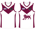
I like that Collingwood keep their guernseys basic and traditional, I think there's something special about a club wearing the same design or a variation on it for as much of their history as possible. For that reason I really wasn't a fan of some of the adidas takes on their guernsey, first changing to white on black and then doing all the weird tapering stripes and curved lines later on. The last few years' efforts under ISC and Nike have been excellent.
Navigation
Install the app
How to install the app on iOS
Follow along with the video below to see how to install our site as a web app on your home screen.
Note: This feature may not be available in some browsers.
More options
You are using an out of date browser. It may not display this or other websites correctly.
You should upgrade or use an alternative browser.
You should upgrade or use an alternative browser.
Workshop Jumper Ideas for 2022
- Thread starter aCunningPlan
- Start date
- Tagged users None
I like that Collingwood keep their guernseys basic and traditional, I think there's something special about a club wearing the same design or a variation on it for as much of their history as possible. For that reason I really wasn't a fan of some of the adidas takes on their guernsey, first changing to white on black and then doing all the weird tapering stripes and curved lines later on. The last few years' efforts under ISC and Nike have been excellent.
Would be nice if the wearing of traditional guernseys was afforded across the board.
i completely agreeWould be nice if the wearing of traditional guernseys was afforded across the board.
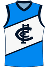
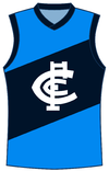
So Carlton has been in recent years using a lot of lighter blue combined with the standard navy blue and white for their indigenous art. I might be a little biased considering my allegiance to Sturt in the SANFL but I'd love for them to really lean into that colourway more, here's a couple of simple designs (yep, similar to my last design in here because I'm still sorting out my templates).


Watching Bris v Crows and thinking the Lion on the Brisbane jumper needs a maroon outline around it.
- Mar 30, 2014
- 2,593
- 4,253
- AFL Club
- Brisbane Lions
- Other Teams
- Dolphins, Seattle Kraken
Thats really ******* clean and they missed a trick not using that as their kit. If they needed to include the yellow for some reason, add it into the V or something. But your effort is a 10.I did these a little while ago earlier in this thread with the same idea, using the shape of the old yellow clash
View attachment 1334062
- Mar 30, 2014
- 2,593
- 4,253
- AFL Club
- Brisbane Lions
- Other Teams
- Dolphins, Seattle Kraken
It's funny because there are so many tiny changes they could make to just make their designs a winner, but they do weird thingsThats really ******* clean and they missed a trick not using that as their kit. If they needed to include the yellow for some reason, add it into the V or something. But your effort is a 10.
- May 3, 2004
- 643
- 1,208
- AFL Club
- Geelong
That is tidy!I did these a little while ago earlier in this thread with the same idea, using the shape of the old yellow clash
View attachment 1334062
Far better than what they wore recently
So many clubs do this and I ******* hate it.It's funny because there are so many tiny changes they could make to just make their designs a winner, but they do weird things
Especially when you see talented people in the mock up threads here pump out jumpers that would make bank for clubs and they instead give us things like the Hawks power ranger jumper or this Brisbane away jumper.
I could assume it could be the fact that we get to take a long time to focus on little details, whereas these designers have many teams to design for so they have time constraints and might just rush it a littleSo many clubs do this and I ******* hate it.
Especially when you see talented people in the mock up threads here pump out jumpers that would make bank for clubs and they instead give us things like the Hawks power ranger jumper or this Brisbane away jumper.

- Nov 3, 2020
- 3,022
- 11,197
- AFL Club
- Carlton
- Other Teams
- Sandringham Zebras, Melbourne Renegades
- May 3, 2004
- 643
- 1,208
- AFL Club
- Geelong
Carlton - navy blue with white monogram
Clash - white with blue monogram
Anything outside of that is unnecessary, IMO
Carlton's guernsey is that good, it doesn't need anything conceptual or creative.
Clash - white with blue monogram
Anything outside of that is unnecessary, IMO
Carlton's guernsey is that good, it doesn't need anything conceptual or creative.
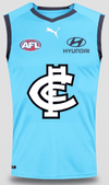
is that my template from a few years ago?A bit of an idea that I quickly whipped up. Uses the fluro blue from our '97 M&M jumper but the monogram of our 2022 clash jumper.
View attachment 1336019
- Nov 3, 2020
- 3,022
- 11,197
- AFL Club
- Carlton
- Other Teams
- Sandringham Zebras, Melbourne Renegades
It may have been, but I've had this screenshot bellow in my folder for several years now so I genuinely had no idea who posted the template here for the original M&M jumper.is that my template from a few years ago?
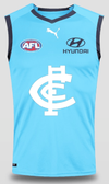
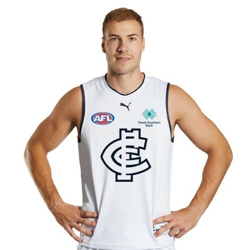
What I'm aiming to do next is edit this version of the jumper on McKay here and then adjust the blue to look more like the actual version which Ratts is wearing, while keeping the white monogram with the navy outline from our 2022 clash.
Similar threads
- Replies
- 726
- Views
- 78K


