- Moderator
- #3,826
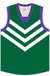
I have never looked at any freo jumper and thought it looked blue, I didn’t realise anyone thought this.
Follow along with the video below to see how to install our site as a web app on your home screen.
Note: This feature may not be available in some browsers.
Are you saying thats blue? Cause it actually sits next to a blue logo for the Guardian and looks pretty purple to me.
I'm amazed you find some of the clashes you do and yet you can't see how those two colours look very similar?Are you saying thats blue? Cause it actually sits next to a blue logo for the Guardian and looks pretty purple to me.
I didnt say they dont look very similar but so do red and purple in some hues, blue sits next to purple on the color wheel so of course it looks similar, i just think that every Freo jumper ive ever seen was very obviously purple and not blue. Similar sure, every purple thing ever has been similar to blue, same definitely not.I'm amazed you find some of the clashes you do and yet you can't see how those two colours look very similar?
I'm sure it's technically purple, but there's far more blue in it than red.Are you saying thats blue? Cause it actually sits next to a blue logo for the Guardian and looks pretty purple to me.
I've mentioned it before, I think going straight to a white clash strip is boring. I get teams with white in their colours can just invert them, but I think it's time some teams start to get bolder with using alternative colours for a clash strip. They do it in other sports around the world, Manchester United are known as the red devils but where a blue shirt as a clash. Personally I think Fremantle should revert to their original green strip or even a green alternative of their current strip doesn't really matter, but whatever purple clashes with we know green ain't, it's better than the boring white strip.Teams just need 2 sets of uniforms with contrasting colours. I always hated the white clash guernseys, glad they're phasing those out. I think the umpires and runners should only wear white.


Agree, I feel like the Fitzroy jumper doesn't help clashes a whole lots as there are large chunks of blue and red, with splashes of white and yellow thrown in as well. The game in round 23 will also be clashy with the Lions in home and Melbourne in royal blue.I'm going to be a bit controversial here, but I thought Melbourne v Brisbane Lions was a little clashy at times, particularly form the players fronts.
Both clubs practically used similar colours in their guernseys. Melbourne are navy and red in 70/30 split from the front. Lions are red and blue in 70/30 split too. The differences are in the hue of these colours.
I love seeing the old jumper but its not always the best. Using the bears design is often a better option for clashesAgree, I feel like the Fitzroy jumper doesn't help clashes a whole lots as there are large chunks of blue and red, with splashes of white and yellow thrown in as well. The game in round 23 will also be clashy with the Lions in home and Melbourne in royal blue.
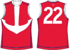
I want to see a red anchor guernsey. Here's my bad rendition, but you get the idea.I've mentioned it before, I think going straight to a white clash strip is boring. I get teams with white in their colours can just invert them, but I think it's time some teams start to get bolder with using alternative colours for a clash strip. They do it in other sports around the world, Manchester United are known as the red devils but where a blue shirt as a clash. Personally I think Fremantle should revert to their original green strip or even a green alternative of their current strip doesn't really matter, but whatever purple clashes with we know green ain't, it's better than the boring white strip.
View attachment 1430343
Or something like this
View attachment 1430345

Swear they had this as a training jumper at some poinyI want to see a red anchor guernsey. Here's my bad rendition, but you get the idea.
View attachment 1432171
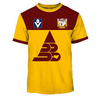
Just do a straight inverse of the 1995 - 1996 jumper and it'll be a winner, and wear it for non-Melbourne away games and games vs Gold Coast at Cararra.They should go for something like this for a clash.
View attachment 1432184
They should go for something like this for a clash.
View attachment 1432184

The anchor is s**t for symbolism.I want to see a red anchor guernsey. Here's my bad rendition, but you get the idea.
View attachment 1432171
Could also mean strength to be able to withstand something rough and hold a ship together. Also, their current uniform could be interpreted as going down with the brackets pointing down.The anchor is s**t for symbolism.
An anchor weighs down, prevents movement, exploration, and progress.
Basically the antithesis of dynamic organisations
It's North the shorts are more important than the jumper.North in Blue shorts, Crows in home and white shorts
What the f....
Do you really have a problem with it?North in Blue shorts, Crows in home and white shorts
What the f....
Also, their current uniform could be interpreted as going down with the brackets pointing down.
But North have been wearing white shorts in home games (bar when they wore the inverse) since what, last few years now?Do you really have a problem with it?
There’s no clash, if North want to wear blue shorts let them, it’s their home game.
Personally I love the away team in white shorts. If it doesn’t create a clash I’m all for itBut North have been wearing white shorts in home games (bar when they wore the inverse) since what, last few years now?
Point is Crows should've been in Navy shorts. Adding white was unnecessary.
Why change back to an old rule, mid season?
