Navigation
Install the app
How to install the app on iOS
Follow along with the video below to see how to install our site as a web app on your home screen.
Note: This feature may not be available in some browsers.
More options


You are using an out of date browser. It may not display this or other websites correctly.
You should upgrade or use an alternative browser.
You should upgrade or use an alternative browser.
Certified Legendary Thread #ReturnTheWings, Part 2: Job Done!
- Thread starter QS
- Start date
- Tagged users None
- Status
- Not open for further replies.

- Oct 1, 2012
- 3,245
- 3,035
- AFL Club
- West Coast
- Other Teams
- Los Angeles Lakers, Perth Wildcats
PI wings appear to be in much better proportion than the retails, hopefully subsequent runs of the retails address this. Seem far too deep currently.
Yep player issues looking much better. Plus numbers still the same font, thank god for that.
- Sep 8, 2011
- 11,013
- 11,015
- AFL Club
- West Coast
Yep player issues looking much better. Plus numbers still the same font, thank god for that.
Disagree, would have loved a change of font. Don’t changes every few years would be a nice subtle change
Disagree, would have loved a change of font. Don’t changes every few years would be a nice subtle change
Can't agree with there, those numbers on the promo video we're aweful!! I like the bigger, block numbers.
Jumpers in general with the new logo look better and better each time I see them, I guess I'm just getting used to them more
Wings-Burgers-Wings
Burger Wings
Burger Wings
JordanWCE
Norm Smith Medallist
Round 1 is going to look amazing, 05/06 GF vibes with us in full royal against the Swans.
- Oct 1, 2012
- 3,245
- 3,035
- AFL Club
- West Coast
- Other Teams
- Los Angeles Lakers, Perth Wildcats
Round 1 is going to look amazing, 06 GF vibes with us in full royal against the Swans.
EFA
- May 28, 2010
- 1,712
- 2,136
- AFL Club
- West Coast
Also a few HJ front/SGIO rears seen here:

was today photoshoot day?Also a few HJ front/SGIO rears seen here:
swear to god i had a tweet notification this morning saying something a long the lines of a team photoshoot. However, these ones look more like the broadcasters shots.
- Sep 8, 2011
- 11,013
- 11,015
- AFL Club
- West Coast
Rounded SGIO Logos is a first for us. I likeyAlso a few HJ front/SGIO rears seen here:

First look at Ah Chee in the wings.

The rest of the portraits are linked below.
http://www.aflphotos.com.au/galleries/results/?q=collection:AFL 2018 Portraits - West Coast Eagles&image_id=565096
Still not liking the ISC move
Last edited:


- Sep 8, 2011
- 11,013
- 11,015
- AFL Club
- West Coast
* me surely they did some normal photos too, they're a bit cringe.
Beno84
Debutant
- Oct 23, 2015
- 74
- 66
- AFL Club
- West Coast
Rounded SGIO Logos is a first for us. I likey
I've wondered why it wasn't done like that for years.. looks way better then the old sgio
View attachment 453157 View attachment 453158
Yeo could very well be modelling for an Underwear company or for a strip club. The black and white affects and his pose are not great for AFL player portraits IMO.
Agree with the black and white effects. Seems like they’re just trying to highlight the fact we’re Royal blue and gold again. Not that it ever really changed for many of us. I never embraced the navy, white and gold as the clubs identity.
So there's a picture of Hurn at the new stadium wearing the HJs branded royal. Do we assume that's a player issue, as the retail royals are only available with SGIO on the front?? Looks a tighter fit than the retails.
What you're seeing is Hurn's mad gains bro
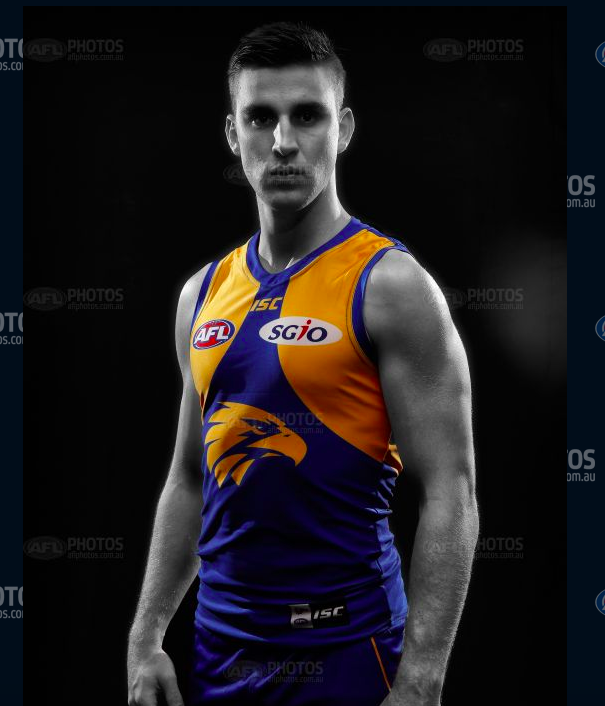
Judging by those portraits on the AFL photos page, it looks like the AFL & sgio logos are in proportion to the size of the jumper. If you look at the one of Jetta in the HJs wings, the logos look tiny, almost like he's wearing a kids size jumper. On the puma jumpers, the logos were all the same size, just more space between them as the sizes got bigger. So Jetta's logos used to almost touch.
Not sure if I like them looking so small. They also seem to be a fair amount higher up in the wings than the last few years. That I do like.
Not sure if I like them looking so small. They also seem to be a fair amount higher up in the wings than the last few years. That I do like.


- May 28, 2010
- 1,712
- 2,136
- AFL Club
- West Coast
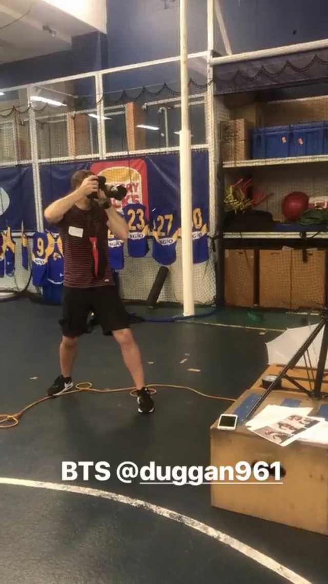
Get amongst it fellas.
How's the random camera guy passing through within the first thirty seconds, knowingly looking at the camera?
- Status
- Not open for further replies.
Similar threads
- Replies
- 338
- Views
- 13K
- Replies
- 225
- Views
- 10K
- Replies
- 1K
- Views
- 28K
- Locked
- Replies
- 1K
- Views
- 42K
