

I prefer the fluoro yellow, looks sick
Navigation
Install the app
How to install the app on iOS
Follow along with the video below to see how to install our site as a web app on your home screen.
Note: This feature may not be available in some browsers.
More options
-


LIVE: Richmond v Melbourne - 7:25PM Wed
Squiggle tips Demons at 77% chance -- What's your tip? -- Team line-ups »
You are using an out of date browser. It may not display this or other websites correctly.
You should upgrade or use an alternative browser.
You should upgrade or use an alternative browser.
Workshop Jumper Ideas for 2019
- Thread starter Silent Alarm
- Start date
- Tagged users None
- Status
- Not open for further replies.
- Feb 28, 2018
- 71
- 349
- AFL Club
- Geelong
- Other Teams
- Tottenham Hotspur
aha
lionbear
Geelong Member from 2016
- Feb 25, 2007
- 12,420
- 8,872
- AFL Club
- Geelong
- Other Teams
- 49ers, Indians, Storm
North wore their hoops 2 years earlier before Geelong.
http://footyjumpers.com/geelongpre.htm
http://footyjumpers.com/northpre.htm
I just meant it in the sense of it’s a Geelong jumper with North colors and logo’s with the hoops thickness and everything. My apologies if the post read like I was carrying on if they used this in a game, it’s up to them, but couldn’t see North using it as it is too similar to Geelong’s now.
- Sep 19, 2007
- 19,071
- 17,630
- AFL Club
- St Kilda
- Other Teams
- Anaheim Ducks, PSV Eindhoven
They have.im surprised they havent tried to find the absolute minimum amount of white they can without going away from their home kit.
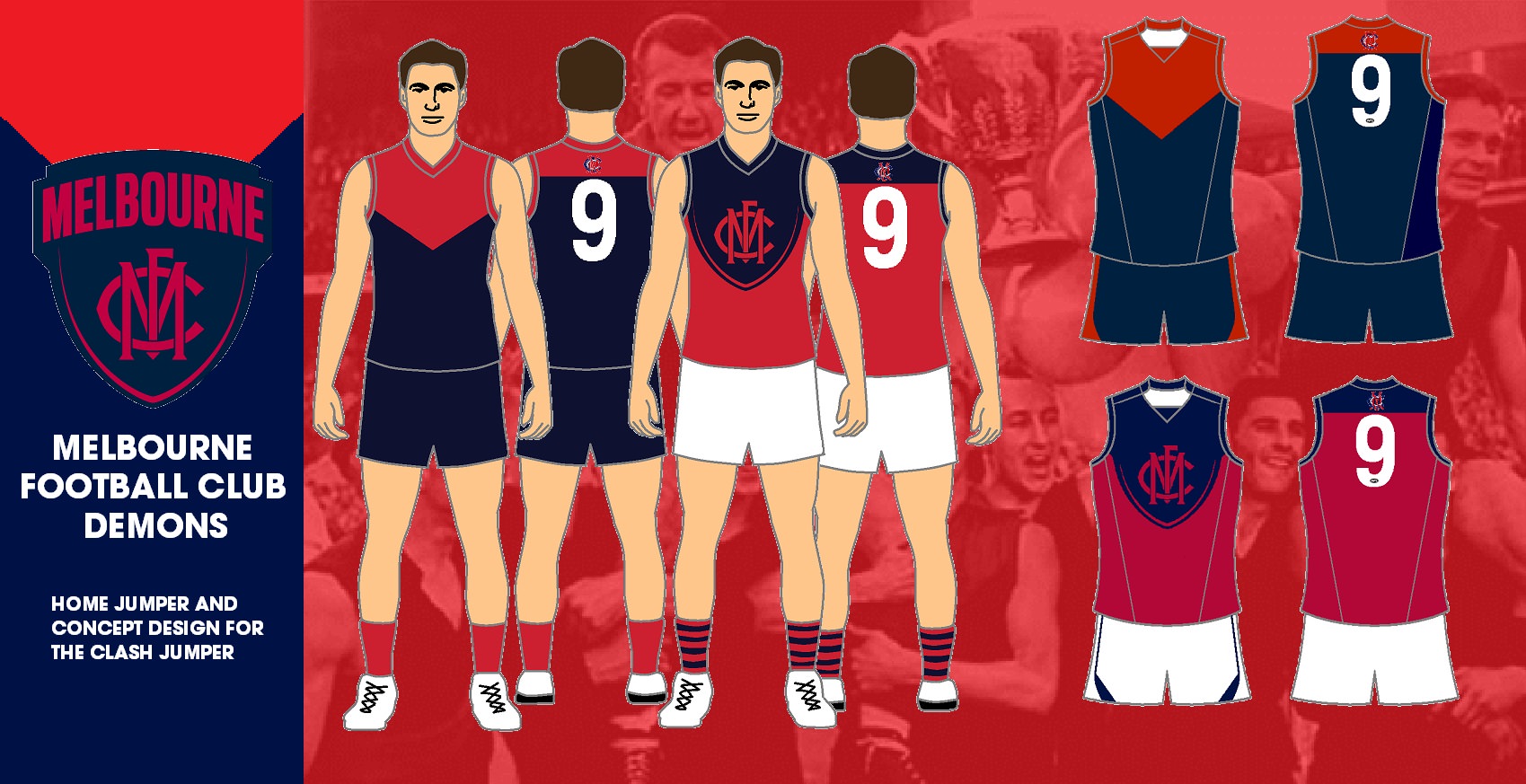
Here is my redesign of the Melbourne Clash stripe for next year. It uses the clubs new logo and replaces it the v neck on a red jumper with the logo in its normal navy blue colour.

The Blue Baggers
Premiership Player
- Apr 7, 2013
- 3,919
- 3,280
- AFL Club
- Carlton
Here is my redesign of the Melbourne Clash stripe for next year. It uses the clubs new logo and replaces it the v neck on a red jumper with the logo in its normal navy blue colour.
Pretty good , clash socks I’d have predominantly red with a blue top !!
The Blue Baggers
Premiership Player
- Apr 7, 2013
- 3,919
- 3,280
- AFL Club
- Carlton
Wish the Saints would use this as their clash with predominantly black socks !!
Zoops
Club Legend
- Apr 20, 2017
- 1,406
- 5,414
- AFL Club
- Melbourne
- Other Teams
- Vancouver Canucks, Southampton FC
That away jumper is really nice. I would take that as a preseason jumper, I think the socks would be better for the away if the socks had blue tops and the rest was red. Dandenong VFA style.Here is my redesign of the Melbourne Clash stripe for next year. It uses the clubs new logo and replaces it the v neck on a red jumper with the logo in its normal navy blue colour.
On [device_name] using BigFooty.com mobile app
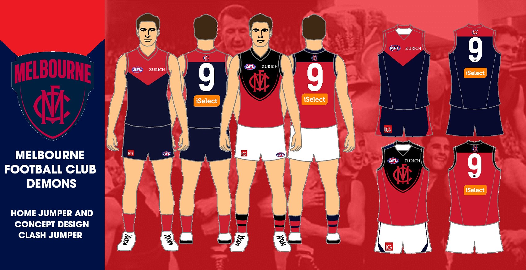
Made a slight alteration to the Melbourne jumpers by adding the sponsors, having the colours closer to the actual colours, and changing the socks.
Cory
Brownlow Medallist
Hope we go back to white and black
atlaser
Cancelled
- Jun 21, 2015
- 652
- 1,149
- AFL Club
- St Kilda
Here is my redesign of the Melbourne Clash stripe for next year. It uses the clubs new logo and replaces it the v neck on a red jumper with the logo in its normal navy blue colour.
This is a good example why the melbourne logo badge should have included the vee in it as part of the shape rather than a round bottom
Here is my redesign of the Collingwood jumpers, with inspiration from the 1919 Collingwood Premiership Jumper.
The home jumper is a black jumper with white stripes and number panel. This is how the 1919 Collingwood jumper looked. The clash jumper is a white jumper with black stripes and number panel. This is the reverse of the 1919 Collingwood jumper.
The home jumper is a black jumper with white stripes and number panel. This is how the 1919 Collingwood jumper looked. The clash jumper is a white jumper with black stripes and number panel. This is the reverse of the 1919 Collingwood jumper.

Last edited:
Fizzler
BBTB
- Dec 26, 2013
- 12,765
- 16,358
- AFL Club
- Port Adelaide
- Other Teams
- OKC, Coburg, Werribee, Storm, QPR
I think you’ve got a brown back collar and number on the home jumper on the player.Here is my redesign of the Collingwood jumpers, with inspiration from the 1919 Collingwood Premiership Jumper.
The home jumper is a black jumper with white stripes and number panel. This is how the 1919 Collingwood jumper looked. The clash jumper is a white jumper with black stripes and number panel. This is the reverse of the 1919 Collingwood jumper.
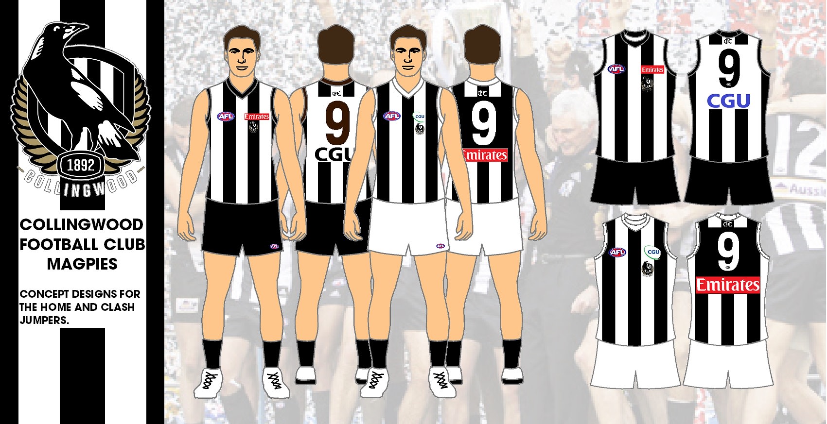
I think you’ve got a brown back collar and number on the home jumper on the player.
Is that better?
Fizzler
BBTB
- Dec 26, 2013
- 12,765
- 16,358
- AFL Club
- Port Adelaide
- Other Teams
- OKC, Coburg, Werribee, Storm, QPR
Perfect.Is that better?
I’d like to see something new from Gold Coast. Particularly if they get rid of May as well as Lynch, it’s time to start a new era.
Stick with the red and yellow, a bit of blue (maybe a touch darker so it’s not so cartoonish) and even a splash of black for the GC nightlife - it’s just symbolic, embrace it.
And I’d go with a traditional football design. Stripes (vertical or horizontal), sash... get rid of the logos, something to say “we’re a real football club, this is a real football jumper that can start a new identity”.
- Aug 4, 2013
- 1,004
- 2,066
- AFL Club
- West Coast
- Other Teams
- Perth Scorchers, Gladbach, Kyoto Sanga
Gold Coast should embrace a yellow & red checkerboard design. Ties into the lifesavers and is a design element used in European soccer but not really present here.
- Oct 27, 2016
- 5,948
- 10,672
- AFL Club
- Collingwood

- Other Teams
- Packers, Raptors, Renegades
Too many hoops, stripes and sashes. I know what you're trying to say there but I think it would be better if they try create something new, but still has the footy look to it. A v design like the old Bears would be an alright start, would appeal to Rugby lovers up North. But even I have to admit, the V is getting a bit over used but I think it would work well with the Suns.I’d like to see something new from Gold Coast. Particularly if they get rid of May as well as Lynch, it’s time to start a new era.
Stick with the red and yellow, a bit of blue (maybe a touch darker so it’s not so cartoonish) and even a splash of black for the GC nightlife - it’s just symbolic, embrace it.
And I’d go with a traditional football design. Stripes (vertical or horizontal), sash... get rid of the logos, something to say “we’re a real football club, this is a real football jumper that can start a new identity”.
Too many hoops, stripes and sashes. I know what you're trying to say there but I think it would be better if they try create something new, but still has the footy look to it. A v design like the old Bears would be an alright start, would appeal to Rugby lovers up North. But even I have to admit, the V is getting a bit over used but I think it would work well with the Suns.
Just think a good, classic, “real” football design would be a good move. Something to start to give them some identity. Even the GWS guernsey, though a touch gimmicky, looks pretty solid and has an identity.
Port stuffed around with bullshit jumpers before settling on a proper, classic design. Freo did the same before settling on a proper footy jumper in their signature purple.
It doesn’t have to be stripes or a sash, but I reckon they should go for something strong like that.
And maybe settle on two of the blue/red/yellow. And I don’t know if red is the one that needs to stay.
But red and yellow is the only jumper combination that isn't being used by any existing team.And maybe settle on two of the blue/red/yellow. And I don’t know if red is the one that needs to stay.
Blue and yellow - the premiers
Blue and red - Melbourne
Red and yellow, or considering they're the Gold Coast Suns, yellow and red. Or they can make it gold and crimson to feel special.
Yep, good call. A strong colour scheme would work for them.


And get some sort of proper mascot / symbol
Apollo, god of the sun
Apollo, god of the sun

- Jun 18, 2016
- 51,646
- 99,014
- AFL Club
- West Coast
- Other Teams
- Perth Scorchers
But red and yellow is the only jumper combination that isn't being used by any existing team.
Blue and yellow - the premiers
Blue and red - Melbourne
Red and yellow, or considering they're the Gold Coast Suns, yellow and red. Or they can make it gold and crimson to feel special.
As good an idea as that sounds on paper, it just brings them closer to the Lions IMO. They need to differentiate themselves. No club in the league uses yellow/gold as its primary colour so embrace it.
- Status
- Not open for further replies.
Similar threads
- Replies
- 726
- Views
- 78K
