SaadyArmy
Team Captain
- Jan 31, 2017
- 357
- 389
- AFL Club
- Gold Coast
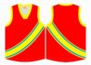
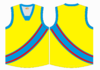
Here's another version of the same design but instead using the colour scheme FT used in his rebrand a while back. Looks very powerful even without red.
Shorts would probably stay Pewter Black in this case but just forgot to change it.
View attachment 608646
Really really good
On iPhone using BigFooty.com mobile app