Workshop Jumper Ideas for 2019

Remove this Banner Ad

Status
Not open for further replies.
46439637691_fff7fa5668_o.png


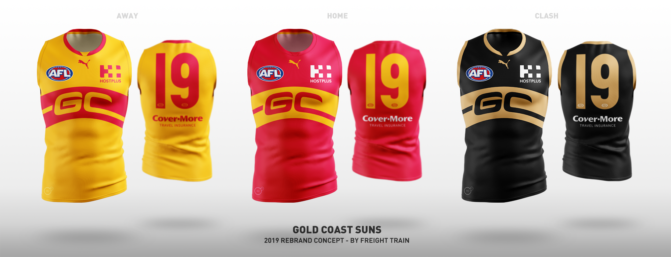
The fact Gold Coast haven't introduced some sort of rounded sun element on their guernseys is beyond me, and I felt this was the simplest "footy jumper" way to implement it, as well as keeping the monogram. Keep the mostly red home guernsey, which is a big part of their brand, and a simple inverse provides an adequate away guernsey. Then for a clash, a black and gold design is there for the taking and the Suns are the ideal team to use the colour set.

Really like this.

Gold jumper with red collar and cuffs, red shorts, red and gold socks would be a striking and identifiable uniform.
 
Gold Coast are just ****ed. Red and yellow are no good and it's too late to change it.

There's a reason so few teams, worldwide, utilise the colours. And when they do it's generally with maroons and deeper golds – not the brightest, primary colour versions.

Even Watford. Their strip is pretty cool, but only because it's stark and unique against the usual strips you see in soccer. Atlanta Hawks in the NBA have usually had majority white to balance it out, but these days they're more black and red with a bit of yellow. They have a red, white, and black uni and yellow just outlines the 'ATL' and numbers on all of them.

I don't really like black and gold but it could work for a club in the AFL... but I just don't think it's at all suitable for a team that's based on the Gold Coast. Tropical Townsville or Cairns, Newcastle, Wollongong... yeah. But not for a bright, garish region like the Gold Coast. It'd look crappy.

Most of the people on here are just really good with their presentation skills which arcs it up a bit. But you put it next to any other jumper or colour combo or club logo and ooooph.
 

Log in to remove this ad.

i think a majority yellow or gold jumper is required for gold coast. not red.
I think Richmond's yellow looks great and there is never any risk of not knowing which player is on what team.
likewise, the lakers in yellow are iconic.

if the red is only a minor part of the colour scheme/jumper design then they could make it deeper and less garish, plus add the blue.

So, like a yellow jumper, with red cuffs and collar, and a thin red stripe and a thin blue stripe (vertical but off centre)
 
Gold Coast are a bit fecked though. Can't just go with a simple design that another team already uses because of trademarking. But somehow ended up with the blandest training jumper inspired uniform ever.

Their own song starts with "We are the suns of the Gold Coast sky. We are one in the red, gold and blue" yet blue only gets a run on the hideous clash jumper. People mainly associate them with a red home jumper and a white away one. Gold and blue are afterthoughts.

The only other team in Qld uses maroon, blue and gold. Then for away games the revert to a red/blue/gold Fitzroy jumper or a gold/maroon Bears inspired one, and have previously worn white with blue. There's not enough distinction between the two, and Gold Coast can't soften the red too much towards maroon without looking more like the Lions. The AFL probably missed a trick using the orange/charcoal for GWS instead of Gold Coast. Charcoal/orange/white vs maroon/gold/blue in Qld and red/white vs some sort of blue or green in NSW.
 
Can't just go with a simple design that another team already uses because of trademarking.

is that the case though?
teams with vertical stripes (coll, north, hawks) - why not a 4th?
teams with sash (rich and ess) - why not a 3rd?
teams with hoops (geel and adel) - why not a 3rd?
teams with a V/Chevrons (Sydney, Port and Freo) - why not a 4th? even Melbourne is like this design in a way...
could go a tripanel like saints with our 3 colours...

each of these could be our 3 colours in either equal proportions or swayed to one in home and another in a clash.

if they want a traditional jumper design, surely these are options (plus others I haven't mentioned and those in lower leagues).
as it stands now, its basically like carlton but without a monogram but rather a logo - they could make the GCFC into a monogram and be like carlton....
 
Do GC have the balls to do a full rebrand? Hasn’t really ever been done in Australian Sport other than Melbourne United.

If so I think navy and pink would have a bit of a GC feel.


On iPhone using BigFooty.com mobile app
Colours and jumpers only? Or name also?
 

(Log in to remove this ad.)

Will a tassie team go full state colours?

I for one hope any inevitable Tassie team avoids the state jumper entirely. Keep the history but forge a new identity.*

Even the name Tasmania should be left to the proper state side. Suspect it won’t though.

*No teal or purple tho plz
 
I for one hope any inevitable Tassie team avoids the state jumper entirely. Keep the history but forge a new identity.*

Even the name Tasmania should be left to the proper state side. Suspect it won’t though.

*No teal or purple tho plz
Not adverse to the name Tasmania, think it's the right choice, but I'm with you they need to get rid of the state colours.
 
Am I the only one who thinks GWS should’ve been green & grey, colours starting with G in keeping with theme? That way Gold Coast could have had orange/ochre and light blue. Might just be my OCD...
 
1550802948138.png
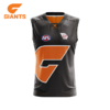
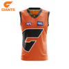
Really do think this grey jumper would work as a clash/away or even just as a derby jersey for GWS and personally just looks so much more appealing than the bland white one. Incorporating this and perhaps changing their current home jersey to something more akin to Ice-Wolf clash design below, I think GWS would have a handy set of jumpers.
1550803419329.png
 
Gold Coast are a bit fecked though. Can't just go with a simple design that another team already uses because of trademarking. But somehow ended up with the blandest training jumper inspired uniform ever.

Their own song starts with "We are the suns of the Gold Coast sky. We are one in the red, gold and blue" yet blue only gets a run on the hideous clash jumper. People mainly associate them with a red home jumper and a white away one. Gold and blue are afterthoughts.

The only other team in Qld uses maroon, blue and gold. Then for away games the revert to a red/blue/gold Fitzroy jumper or a gold/maroon Bears inspired one, and have previously worn white with blue. There's not enough distinction between the two, and Gold Coast can't soften the red too much towards maroon without looking more like the Lions. The AFL probably missed a trick using the orange/charcoal for GWS instead of Gold Coast. Charcoal/orange/white vs maroon/gold/blue in Qld and red/white vs some sort of blue or green in NSW.

gold-coast-kits-v3.png
 
View attachment 623678
Really do think this grey jumper would work as a clash/away or even just as a derby jersey for GWS and personally just looks so much more appealing than the bland white one. Incorporating this and perhaps changing their current home jersey to something more akin to Ice-Wolf clash design below, I think GWS would have a handy set of jumpers.
View attachment 623683
Just a grey back on the home would solve the derby problem and also most clashes for GWS
 
Just a grey back on the home would solve the derby problem and also most clashes for GWS

Indeed it would. Just a bit of preference in my end because I just see the use of predominantly white jerseys a bit lazy (excluding teams with white as one of their 2 colours) especially when you have a unique colour like orange as GWS do.


On iPhone using BigFooty.com mobile app
 
Status
Not open for further replies.

Remove this Banner Ad

Back
Top