- Mar 30, 2014
- 2,599
- 4,258
- AFL Club
- Brisbane Lions
- Other Teams
- Dolphins, Seattle Kraken
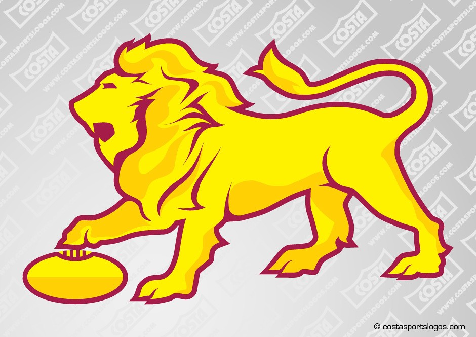
I honestly think we could do away with all text and just have a gold lion with maybe a maroon outline (simiar to the Lion by itself on the new Springfield HQ).View attachment 1415667
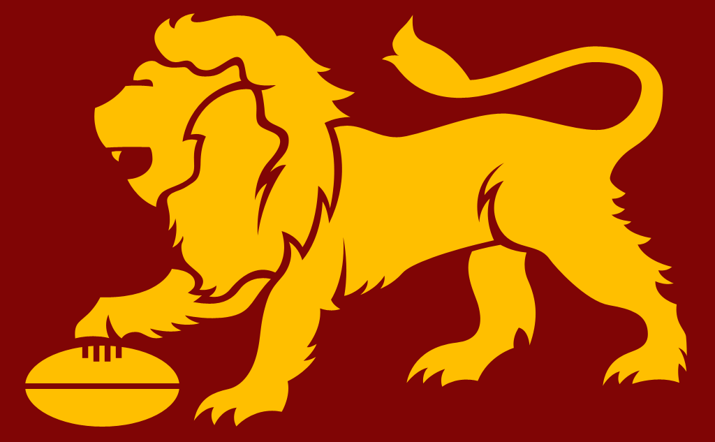
I haven't heard many complaints about Brisbane's current logo since they stopped using the Paddlepop jumper but I don't think there's much reason to keep using it when the Fitzroy logo is on all of their jumpers.