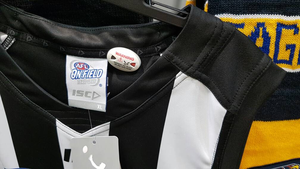
News 2017 Adelaide Crows ISC apparel

Remove this Banner Ad

Status
Not open for further replies.
look smaller but brighter than last years.

don't love them, and haven't loved them in the past but the shock factor has worn off for me. The width of the collar panels is bothering me a lot more, you can see it extends beyond the collar stitching which seems like an odd choice.
It's actually two overlapping pieces

Sent from my SM-G935F using Tapatalk
 
I'd be happy seeing the Crows wear anything on GF day if they were in it.

With that said, whoever thought gold epaulettes would suit a footy jumper needs to do some soul searching.
hmm, deep down if it came to it, yes - but if the AFL made us wear our clash top instead of the hoops in white shorts I'd be at risk of slipping into a rage induced coma.
 

Log in to remove this ad.

I'm no good with photo shop but can someone put up a side by side comparison of last years and this years jumper
 
hmm, deep down if it came to it, yes - but if the AFL made us wear our clash top instead of the hoops in white shorts I'd be at risk of slipping into a rage induced coma.

If we made it to the Grand Final, I wouldn't care if we were skins and the other team were shirts.
 
I'm no good with photo shop but can someone put up a side by side comparison of last years and this years jumper

sejmNev.jpg
 
arguably even worse :huh:

but the colours look great, I'll take it. Just seems like such an odd choice.
Its the most complicated collar i have seen on a guernsey really. Gone are the days where it was just a singular piece stitched on.

As much as people are iffy about the gold bits on ours, I reckon Collingwoods (and Port's last year) look odd because their stripes just stop and dont go over the shoulder.
d9a5a74568d29ecd6cffab464e64b881.jpg

Essendon's sash doesnt stop, that extra piece on theirs is red to make it look right.

Sent from my SM-G935F using Tapatalk
 
And that's in vastly different lighting conditions. Under lights in a night game the ISC will look darker again.

I was a bit worried about the ISC shorts with that first released shots but it may have just been the position of the sun making it look a lot lighter in colour

Apart from the navy, the yellow was just awful. Because it was yellow. Washed out yellow.

Sent from my SM-G935F using Tapatalk
 

(Log in to remove this ad.)

I'm no good with photo shop but can someone put up a side by side comparison of last years and this years jumper
On tablet so can't side by side it, but here are two pics that should be similar lighting.

416929.jpg
DNyIfur.jpg
 
And that's in vastly different lighting conditions. Under lights in a night game the ISC will look darker again.

I was a bit worried about the ISC shorts with that first released shots but it may have just been the position of the sun making it look a lot lighter in colour

Apart from the navy, the yellow was just awful. Because it was yellow. Washed out yellow.

Sent from my SM-G935F using Tapatalk


I dream of the day that our guernsey has blue thats almost black like that petrenko north melbourne game. I know that was black but I want a dark blue that looks black.

thumbnail_20170214_232808_zpslxiz745x.jpg
 
Status
Not open for further replies.

Remove this Banner Ad

Back
Top