Navigation
Install the app
How to install the app on iOS
Follow along with the video below to see how to install our site as a web app on your home screen.
Note: This feature may not be available in some browsers.
More options


You are using an out of date browser. It may not display this or other websites correctly.
You should upgrade or use an alternative browser.
You should upgrade or use an alternative browser.
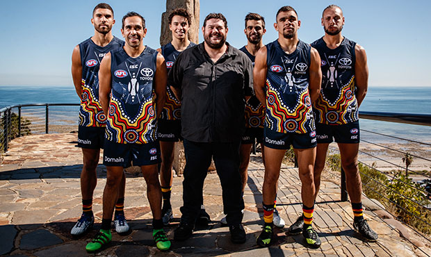
News 2017 Adelaide Crows ISC apparel
- Thread starter Hank93
- Start date
- Tagged users None
- Status
- Not open for further replies.

TrainRoo32
Premiership Player

I like the story behind the guernsey, but I don't think it's our best
Nailed it again
TrainRoo32
Premiership Player
Looks bloody excellent. Love the swooping crow on the back.
That crow on the back is fantastic
We go alright with the indigenous jumpers.
2015 still my favourite.
I think we need to go full navy cuffs and collar next year, it looks classy af.
2015 still my favourite.
I think we need to go full navy cuffs and collar next year, it looks classy af.
Not sure I like the target on their nads... still this is Something the AFC do very well! They always are up there with the best in the league every year with their designs.
Gorgeous Guernsey!
Blue collar and cuffs make it look so much stronger.
Blue collar and cuffs make it look so much stronger.
How good does the Navy look without the yellow trim on the collar and sleeves.Love the 2017 indigenous guernsey
And blue collar and cuffs come at me bro!
Sent from my iPhone using Tapatalk Pro
That's what our normal Guernsey should have
The Guernsey is getting better each year
Just pre-ordered mine they are sweet!
We haven't had a bad indigenous guernsey yet and this one is no exception.
This one is the best. Why do we need to change it every year. Why not create a tradition with it. Make one gurnsey part of our indigenous club heritage. Its designed to make a statement. I love this jumper. How awesome would it be to have a jumper that represents a culture and one that young Indigenous kids can aspire to wear the same guensey Betts and Milera wore.
Navy collar and cuffs. Reduce the hoops down to half like they were originally and no watermarks and it would be perfect imo.
Sent from my SM-G935F using Tapatalk
Ask and you shall receive

as the old saying goes, less is more

Last edited:
- Oct 28, 2014
- 9,835
- 23,863
- AFL Club
- Adelaide
Indigenous retro round?This one is the best. Why do we need to change it every year. Why not create a tradition with it. Make one gurnsey part of our indigenous club heritage. Its designed to make a statement. I love this jumper. How awesome would it be to have a jumper that represents a culture and one that young Indigenous kids can aspire to wear the same guensey Betts and Milera wore.
DD#23
Norm Smith Medallist
- Dec 31, 2013
- 9,127
- 12,400
- AFL Club
- Adelaide
looking at them all next to the black guernsey, am I the only one who thinks they'd all look fantastic on a black base rather than the pale navy?
From 2017 to 2013
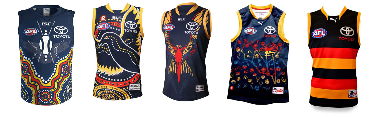
I like this years design, but I think it would have looked even better if they'd raised the red and yellow element and made an X shape, the balance is a bit off for mine.
This one is the best. Why do we need to change it every year. Why not create a tradition with it. Make one gurnsey part of our indigenous club heritage. Its designed to make a statement. I love this jumper. How awesome would it be to have a jumper that represents a culture and one that young Indigenous kids can aspire to wear the same guensey Betts and Milera wore.
$$$$$$ great idea but they would miss out on jumper sales!
TexForPM
Premiership Player


TexForPM
Premiership Player
they making these?Ask and you shall recieve
as the old saying goes, less is more

SugarShane
C12 H22 O11
15 still far and away the best for me. Light years ahead. 16 second, then probably 13 and 17 together. Never really rated 14.
From 2017 to 2013
Anyone know where that was filmed?
I wish, I'd be camping outside crowmania overnight to get onethey making these?
X shape is a good idea. Focusing solely on the blue area (top half), sort of looks like a crow head facing forward. Two boomerangs make the eyes. Wonder if that was intentional.looking at them all next to the black guernsey, am I the only one who thinks they'd all look fantastic on a black base rather than the pale navy?
I like this years design, but I think it would have looked even better if they'd raised the red and yellow element and made an X shape, the balance is a bit off for mine.
TexForPM
Premiership Player
Tweet to crows ask for a poll. The people can decideI wish, I'd be camping outside crowmania overnight to get one
Edit.
I didn't stress that this design is the bomb.
Let's do a poll here, then forward the results to AFC and ask for a poll too.
Last edited:
Would be a strong logo.That crow on the back is fantastic
- Status
- Not open for further replies.
Similar threads
- Poll
- Replies
- 581
- Views
- 20K
- Replies
- 2K
- Views
- 29K
- Replies
- 430
- Views
- 22K
