Navigation
Install the app
How to install the app on iOS
Follow along with the video below to see how to install our site as a web app on your home screen.
Note: This feature may not be available in some browsers.
More options


You are using an out of date browser. It may not display this or other websites correctly.
You should upgrade or use an alternative browser.
You should upgrade or use an alternative browser.
Club Mgmt. 2017 ISC gear available now
- Thread starter VelvetSledge
- Start date
- Tagged users None
The sash pinching in at the top on the neck side to fit around the shoulder seams.what is wrong with that jumper??
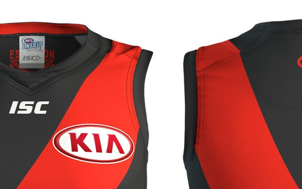
oh, it is actually curved. Bleghwhat is wrong with that jumper??
quotemokc
Brownlow Medallist
The ISC lettering should NOT. Be above the player numbers like that ffs
Whispering_Jack
Norm Smith Medallist
I don't think it is on the actual jumpers -The ISC lettering should NOT. Be above the player numbers like that ffs
https://www.bombershop.com.au/men/guernseys/essendon-home-guernsey
This ******* club
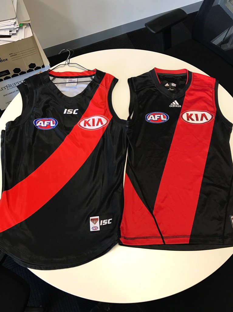
Not a fan. The Adidas one is so much better. I dislike the curvy sash. Don't really like the template either.
Oh well
Not a fan of the curvy sash either other wise I think it looks fine.
Mercurial89
Brownlow Medallist
Didn't we historically have a bit of a curve in the sash?
I think it's a massive improvement over the Adidas. I hated the straight sash that didn't even fit on the jumper, and I hated the black piping that interrupted the sash, and I hated that the adidas template had the 'corner' of the sash at the front of the jumper, making it look like a 'tick'.
The sash had been curved for over 100 years and every flag, I'm stoked it's back.
The sash had been curved for over 100 years and every flag, I'm stoked it's back.
- Nov 28, 2006
- 28,817
- 11,842
- AFL Club
- Essendon
the real crime is that they're $120
HurlsMeister18
Club Legend
I love the new jumper. Hated last years how the sash didn't join around the bottom right of the jumper but just sort of ran off the jumper. It was a stripe not a sash. A thinner sash that joins up like we have this year is perfect. Also a bit of curve adds some character.
quotemokc
Brownlow Medallist
Hopefully. I saw it on this image so I hope it doesn't.I don't think it is on the actual jumpers -
https://www.bombershop.com.au/men/guernseys/essendon-home-guernsey

That being said, they have done a bad job in making the guernsey look charcoal on the shop instead of black.
Zach Package
Prespakis2Tsatas
Hopefully. I saw it on this image so I hope it doesn't.

That being said, they have done a bad job in making the guernsey look charcoal on the shop instead of black.
That's clearly there for promotional purposes. If Zach was standing next to Justin Bieber it'd say Bieber and not ISC
- Mar 28, 2010
- 5,339
- 6,036
- AFL Club
- Essendon
- Other Teams
- Miami HEAT
Didn't we historically have a bit of a curve in the sash?
Yes, it's a sash not a thick line. I'm scratching my head at those who dislike this. It's a huge improvement from that horrible straight lined ADIDAS one where the front and back connect on the front. See here;
table tennis
Bigfooty class clown
At the end of the day. As long as the club is in a better financial position then who gives a rats toss back about the "curve".
VelvetSledge
Moderator
- May 24, 2007
- 17,464
- 35,198
- AFL Club
- Essendon
- Other Teams
- Liverpool FC, Melbourne Storm
- Thread starter
- Moderator
- #119
The dollars in play here are monstrous. This is huge.
- Mar 28, 2010
- 5,339
- 6,036
- AFL Club
- Essendon
- Other Teams
- Miami HEAT
The club also announced that New Era have joined so hopefully some good hats and beanies to come.
table tennis
Bigfooty class clown
Ive already got 3 new era essendon caps from past 3 yearsThe club also announced that New Era have joined so hopefully some good hats and beanies to come.
boncer34
Formerly "Dos23"
I seriously don't get the angst. They've paid huge bucks for the rights to make our jumper.The ISC lettering should NOT. Be above the player numbers like that ffs
Its black with a red sash, they haven't jammed their logo front and center so why can't they put it on the back? Does it really matter?
Not criticising mate just genuinely don't get the hate?
Eleven 38
Norm Smith Medallist
- Apr 22, 2010
- 6,213
- 5,435
- AFL Club
- Essendon
- Other Teams
- Canucks, Cowboys, Renegades
I seriously don't get the angst. They've paid huge bucks for the rights to make our jumper.
Its black with a red sash, they haven't jammed their logo front and center so why can't they put it on the back? Does it really matter?
Not criticising mate just genuinely don't get the hate?
It is front and centre, it's also front and bottom right.
boncer34
Formerly "Dos23"
You reckon thats the centre of the jumper?It is front and centre, it's also front and bottom right.
table tennis
Bigfooty class clown
Does anyone think ISC are too prominent on the Geelong or St.Kilda jumper?
Then why would we think it would be different for us.
The AFL have guidelines on jumper advertising and everyone has to fit in
Then why would we think it would be different for us.
The AFL have guidelines on jumper advertising and everyone has to fit in
Similar threads
- Replies
- 121
- Views
- 3K
- Replies
- 182
- Views
- 5K
- Replies
- 16
- Views
- 739
- Locked
- Poll
- Replies
- 928
- Views
- 37K
