
Kcrack
BigThrust Member
Chose option 2, prefer it without the Kangaroo pic though.
Follow along with the video below to see how to install our site as a web app on your home screen.
Note: This feature may not be available in some browsers.
What is going on?! Why are we voting for an inverted version of a guernsey with a V on it that represents the most miserable era in the history of our club that none of us were alive to see over the one that embodies the most successful era we've had? One that we've been begging to have as an alternate guernsey for years?
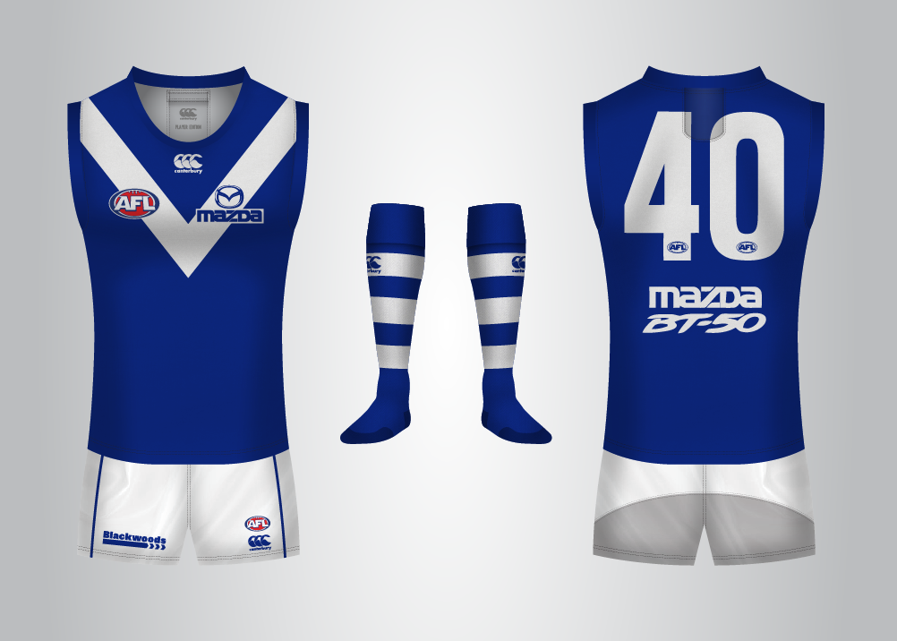
I like the V in number 2, but the stripes on the back look unbalanced against the front.
Take the blue number panel off the back of 3, whack it on 2 and lose the stripes.
What do you think of the shield on the back of #2? I assumed it was to appease NimChief.
Talking a lot of sense as usual Arden.I like the V in number 2, but the stripes on the back look unbalanced against the front.
Take the blue number panel off the back of 3, whack it on 2 and lose the stripes.
Talking a lot of sense as usual Arden.

Well done; soooooo much better if we went with #2.Looks good, especially without the ghost of Skippy.

No, no no.
This:
Can't believe the 90's jumper is going to get rolled.
Don't hate the Bay just because we love #1.Well considering that I've spotted two threads one which has now been locked and one in bay 13 where opposition supporters and disgustingly some of their mods are deliberately trolling the vote using different browsers to vote multiple times it's safe to say that the vote probably won't represent what Roo supporters want.
.*******!Don't hate the Bay just because we love #1.
