

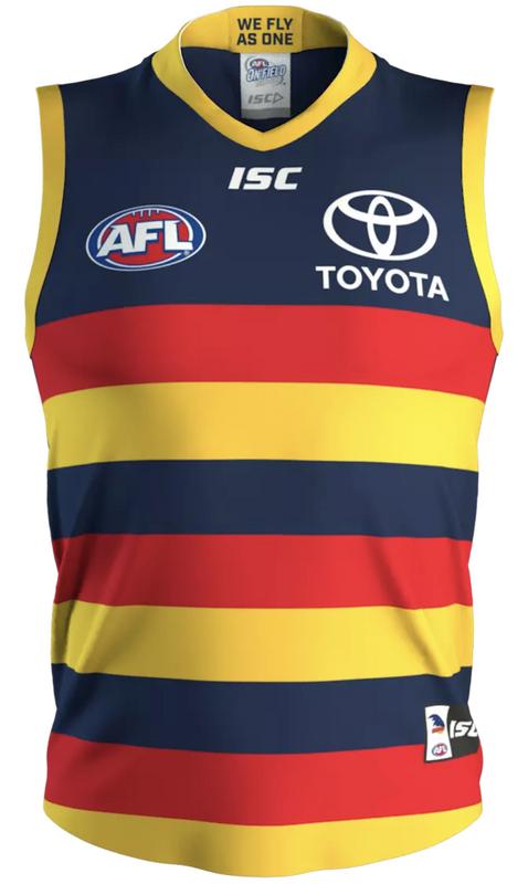
why is it getting 'bland' that we haven't messed with the home jumper for three years?
Keeping things 'fresh' and constantly tweaking is the reason we ended up with a striped square on the front of the jumper when the hoops disappeared completely
The jumper is fine, no need to change for change's sake
The only thing I'd do is put yellow cuffs on the end of the long sleeved jumpers
Keeping things 'fresh' and constantly tweaking is the reason we ended up with a striped square on the front of the jumper when the hoops disappeared completely
The jumper is fine, no need to change for change's sake
The only thing I'd do is put yellow cuffs on the end of the long sleeved jumpers

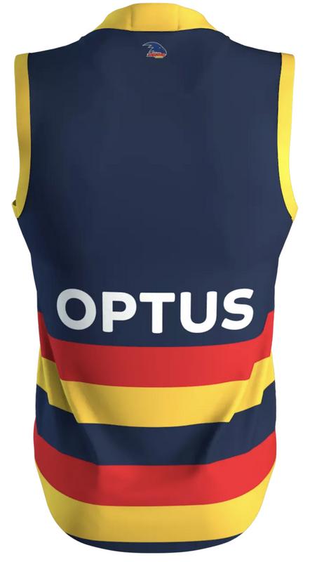


 especially the red and blue around the arms, who ticks this off seriously!