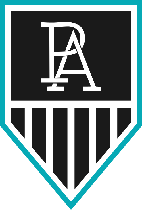
2020 celebrations

Remove this Banner Ad

It is Twitter, so take this with a pinch of salt. Personally, I am hoping it isn't real:


I heard this too. Personally i love the fact they stuck to the same brief of the original power logo

Prison bar stripes? Check.
New teal colour? Check.
Replace marketable heritage lightning fist with something a cap company put on the caps they made for us? Check.

Not surprised we signed off on this.
 
It is Twitter, so take this with a pinch of salt. Personally, I am hoping it isn't real:


It’s terrible. The club is making an awful mistake with this.
 

Log in to remove this ad.

Meh, it just looks like your average FigBooty effort tbh. Is the “A” in the monogram meant to be the lighthouse standing on the wharf?

At least it isn’t a humanoid magpie driving the fist float I guess.

Personally I'd have gone for a CCP propaganda poster with Kochie pointing to the future with rivers of gold and teal prisonbars because it's what port adelaide traditionally does.

Unfortunately a designer like that wouldn't have let us roll their payment into next fin year.
 
So it's a grab from a lawyer's notepad. Perhaps from the initial instructions on the trademark application or the submission to the AFL on the logo/prison bars? If it's real, someone's getting their arse kicked.

If that does end up being the logo, it'll be fairly underwhelming, but I'll wait for the final version before getting too triggered.

If the note is legit, it'll also be interesting to see whether the note about "Power" means we'll drop the nickname altogether and just be referred to as Port Adelaide or if it's just a note about the fact that Power is absent from the logo. "Power will not exist" makes it sound like the former.
 
Last edited:

(Log in to remove this ad.)

Any of our design gurus got the time and care-factor to mock it up properly?
kRTR7qg.png
 
Who drew that? It wasn't someone with design experience, surely. Surely we're going to outsource this to a professional, we're a major Professional sports club FFS.

I'm fine with the lean to the PBs and less "power" branding, but for the love of all that is holy, get a professional to design it.
 
I'm fine with the lean to the PBs and less "power" branding, but for the love of all that is holy, get a professional to design it.

The scary thing is, they did.
 
Who drew that? It wasn't someone with design experience, surely. Surely we're going to outsource this to a professional, we're a major Professional sports club FFS.

I'm fine with the lean to the PBs and less "power" branding, but for the love of all that is holy, get a professional to design it.

It's a legal notepad, so if it's legit, it's probably just a lawyer (who's assisting with a trademark application or submission to the AFL etc.) drawing it up from having it described to them.
 
I like it. If you try and incorporate more it gets cluttered. If you incorporate less then what do you run with? It's clearly Port Adelaide. It's clearly the logo of an older club. It's got the wharf. It's even got the chevron subtly.
 
I like it. If you try and incorporate more it gets cluttered. If you incorporate less then what do you run with? It's clearly Port Adelaide. It's clearly the logo of an older club. It's got the wharf. It's even got the chevron subtly.
I like the monogram, but if this is how they plan on integrating it into a logo, I think it would be best that they just didn’t, kept it as a secondary logo and replace it here with “Port Adelaide”.
 

Remove this Banner Ad

Back
Top