Analysis 2020 North apparel

Remove this Banner Ad

1573467120315.png

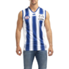
The pinstripes are too ******* thick, the canterbury logo should sit inside the stripe instead of it cutting off 3 metres below the collar, and there shouldn't be a ******* tramp stamp logo on the back. put it above the mazda logo. if collingwood does it on their jumper, we can do it. they'd better ******* wear black numbers with this version, at least
 

Log in to remove this ad.

View attachment 777811

The pinstripes are too ******* thick, the canterbury logo should sit inside the stripe instead of it cutting off 3 metres below the collar, and there shouldn't be a ******* tramp stamp logo on the back. put it above the mazda logo. if collingwood does it on their jumper, we can do it. they'd better ******* wear black numbers with this version, at least

Bang another blue stripe at the seams below the armpits, extend the middle stripe to the top and invert the Canturbury logo, and make the panel at the back blue with a white number. Then wear blue shorts and blue socks, and this is the home kit.
 
Bang another blue stripe at the seams below the armpits, extend the middle stripe to the top and invert the Canturbury logo, and make the panel at the back blue with a white number. Then wear blue shorts and blue socks, and this is the home kit.

1573468875689.png

I just spent 10 minutes mocking up exactly this, lmao
 
The shorts are that price every year. They are typically the first to go too. I watch those and the trackies like a hawk because they tend to not survive until the sales. The training shirts and singlets always do.
Yep, remember waiting for the shorts to be restocked at some point this year, but they never were.
 
Yep, remember waiting for the shorts to be restocked at some point this year, but they never were.
Never are. As soon as they go close to gone or on discount the 3rd parties buy them and resell them. It's why ozsale and supporter store always have AFL stuff but then charge more than the Canterbury sale stock. Sometimes they don't know what they're getting themselves into though because i still see new 2015/16 stock pop up and they try and sell training singlets for $70 because 1) they hope no one realises the year or 2) they try to sell it as "rare"
 
Can we get a new bloody template? The bib is horrendous and is very much due an update. Canterbury are great quality but really don’t seem to push the boundaries with their gear. Same old coming through every year for us.
 
Are they thick pinstripes or thin thumbstripes, you decide. Either way, an understandable attempt at adding more white to the blue jumper (and vice-versa) while maintaining enough of a difference between the home and the away. I'm sure there'll eventually be a more faithful throwback to the late-'70s, just don't think historical accuracy was the main focus here.

The logo doesn't need to be put anywhere (except maybe the bin?) when the jumper design itself, regardless of certain details, is far more recognisable and iconic.

One thing to keep an eye on is the foreshadowing powers of our one-offs, a la the extra lines on 2019's "Totem". Or look at how the recent "Bounding Roo" and "V" clash options materialised not long after those same elements were revived in Indigenous and/or Anniversary form. Even the back of the AFLW jumper took its cues from the Boomer 400 promo, despite different apparel suppliers.


Regarding historical accuracy, the pinstripes were discontinued at the end of 1973 so they weren't a late 70s thing.

Interesting points you make about foreshadowing. I'll be interested to see what direction this year's Indigenous jumper takes.

The other point is I think we are getting a very early look at this pinstripe design because similar design cues will be used in AFLW this coming season. If the club plans to tie the women's and men's designs together for each calendar year, then the AFLW will always spoil any surprise for the men's kit.
 
Never are. As soon as they go close to gone or on discount the 3rd parties buy them and resell them. It's why ozsale and supporter store always have AFL stuff but then charge more than the Canterbury sale stock. Sometimes they don't know what they're getting themselves into though because i still see new 2015/16 stock pop up and they try and sell training singlets for $70 because 1) they hope no one realises the year or 2) they try to sell it as "rare"
Any idea what the trackies sell for? Didn't see them this year.
 
Regarding historical accuracy, the pinstripes were discontinued at the end of 1973 so they weren't a late 70s thing.

Interesting points you make about foreshadowing. I'll be interested to see what direction this year's Indigenous jumper takes.

The other point is I think we are getting a very early look at this pinstripe design because similar design cues will be used in AFLW this coming season. If the club plans to tie the women's and men's designs together for each calendar year, then the AFLW will always spoil any surprise for the men's kit.
Was about to dispute that, but footyjumpers.com agrees with you. Last year of pinstripes was '73. I'm sure my first jumper had pinstripes and I couldn't have got it before '76. Maybe Merrett-Hassett sporting goods weren't as fastidious keeping up with the on-field versions in those days.

Edit: Hang on. They only dropped it for '74 and '75. Pinstripes were back from '76 to '80.
 

(Log in to remove this ad.)

Was about to dispute that, but footyjumpers.com agrees with you. Last year of pinstripes was '73. I'm sure my first jumper had pinstripes and I couldn't have got it before '76. Maybe Merrett-Hassett sporting goods weren't as fastidious keeping up with the on-field versions in those days.

Edit: Hang on. They only dropped it for '74 and '75. Pinstripes were back from '76 to '80.
Is it just me but does the pin striping from the 1976-80 jumper look a little thicker than the 1959-72 jumper.

1959-72
North-1959.gif

1976-80
North-1976.gif
 
Was about to dispute that, but footyjumpers.com agrees with you. Last year of pinstripes was '73. I'm sure my first jumper had pinstripes and I couldn't have got it before '76. Maybe Merrett-Hassett sporting goods weren't as fastidious keeping up with the on-field versions in those days.

Edit: Hang on. They only dropped it for '74 and '75. Pinstripes were back from '76 to '80.

I was going by the club website (which shows no pinstripes from 76 to 80) as well as my own shonky memory. My own first jumper was 77 (with no pinstripes) but there were multiple suppliers back then and I do remember that you could get them with or without pinstripes.

Checking contemporary photos, and yes, it's my shonky memory - definitely pinstripes galore in 1977 premiership pics.
 
100% agree.


The Kangaroo thing is probably targeted at kids.
Hell, why not just use the old crest as our official logo? It has a timeless look. The only thing that is a little hazy is the Latin phrase, as it has a different meaning to the club motto.
 
Hell, why not just use the old crest as our official logo? It has a timeless look. The only thing that is a little hazy is the Latin phrase, as it has a different meaning to the club motto.


Marketeers don't care for nostalgia.

They target their biggest growth market, kids.
 
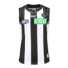
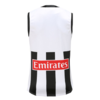
Collingwood just released their away jumper... and it's everything our home jumper should be, just in black.

1573545188172.png 1573545250084.png
Nice wide stripes so there isn't a big negative space on the sides - check
Club logo above the front sponsor instead of an awkward tramp stamp - check
Manufacturer logo sits inside the stripe, and doesn't awkwardly cut it off below the collar - check

Canterbury had better be taking notes.
 

Remove this Banner Ad

Back
Top