Workshop 2021 Jumper Ideas thread

Remove this Banner Ad

Status
Not open for further replies.
That away kit would look gorgeous with red shorts šŸ¤¤

You're right actually the yellow top with red shorts would match the lifeguard type look i thought they were originally going for. Plus it would give them more of a distinct identity to the rest of the competition which they've been lacking.
 

Log in to remove this ad.

Carlton

Home/main jumper:

Bought back the raised monogram but apart from that you can't really change a classic design (it still baffles me that Nike managed to * it up so badly in their last few years with them). With plain navy shorts and plain navy shorts and it is one of the best kits in the league. Full navy kit obviously gets worn in all home games and also away games against Cats, Suns and Swans.
graphic_kit_afl_2021_carl_111_home.png

When Carlton play in away games where the jumpers don't clash but the shorts do, the plain white shorts comes out. With the plain dark navy socks it should be worn in away games against Giants, Hawks and Saints.
graphic_kit_afl_2021_carl_121_change.png

North Melbourne have a mostly white jumper with royal blue shorts and socks, for away games against the Roos, the Blues should wear their traditional jumper with white shorts and navy and white hooped socks, which they wore in the early 20th century.
graphic_kit_afl_2021_carl_122_change.png

Clash jumper:
Decided to go a bit left field with this design, a mostly white jumper with a raised navy blue monogram, but added a reverse sash as worn as early on in their VFL existence when they had jumper clashes, decided to make it a pale sky blue, as the jumper is already mostly white. With white shorts and plain navy blue socks it should be worn in away games against Crows, Lions, Dons, Demons, Tigers, Bulldogs and Eagles.
graphic_kit_afl_2021_carl_221_clash.png

And the clash jumper with white shorts and hooped socks in away games against Freo and Port.
graphic_kit_afl_2021_carl_222_clash.png

Third/"heritage" jumper:
The dark navy home jumper with white shorts would cause a cluster with Collingwood in a mostly white jumper and black shorts. I wanted to go with a matchup that would honour Carlton's history as much as possible, improve the contrast and let the home team wear the regular home kit. I decided on a jumper with a lighter shade of navy blue, and Carlton's grand final wins over Collingwood on the jumper, worn in away games against the Magpies with white shorts and a lighter navy and white hooped socks. This jumper would likely sell like hotcakes with the Carlton fanbase.
graphic_kit_afl_2021_carl_323_third.png

Pre-season jumper:
Decided to go for the lighter navy blue monogram on a dark navy blue jumper look, taking the blueout concept to the next level.
graphic_kit_afl_2021_carl_pre.png
 
Carlton

Home/main jumper:

Bought back the raised monogram but apart from that you can't really change a classic design (it still baffles me that Nike managed to fu** it up so badly in their last few years with them). With plain navy shorts and plain navy shorts and it is one of the best kits in the league. Full navy kit obviously gets worn in all home games and also away games against Cats, Suns and Swans.
View attachment 873555

When Carlton play in away games where the jumpers don't clash but the shorts do, the plain white shorts comes out. With the plain dark navy socks it should be worn in away games against Giants, Hawks and Saints.
View attachment 873556

North Melbourne have a mostly white jumper with royal blue shorts and socks, for away games against the Roos, the Blues should wear their traditional jumper with white shorts and navy and white hooped socks, which they wore in the early 20th century.
View attachment 873557

Clash jumper:
Decided to go a bit left field with this design, a mostly white jumper with a raised navy blue monogram, but added a reverse sash as worn as early on in their VFL existence when they had jumper clashes, decided to make it a pale sky blue, as the jumper is already mostly white. With white shorts and plain navy blue socks it should be worn in away games against Crows, Lions, Dons, Demons, Tigers, Bulldogs and Eagles.
View attachment 873558

And the clash jumper with white shorts and hooped socks in away games against Freo and Port.
View attachment 873559

Third/"heritage" jumper:
The dark navy home jumper with white shorts would cause a cluster with Collingwood in a mostly white jumper and black shorts. I wanted to go with a matchup that would honour Carlton's history as much as possible, improve the contrast and let the home team wear the regular home kit. I decided on a jumper with a lighter shade of navy blue, and Carlton's grand final wins over Collingwood on the jumper, worn in away games against the Magpies with white shorts and a lighter navy and white hooped socks. This jumper would likely sell like hotcakes with the Carlton fanbase.
View attachment 873560

Pre-season jumper:
Decided to go for the lighter navy blue monogram on a dark navy blue jumper look, taking the blueout concept to the next level.
View attachment 873561
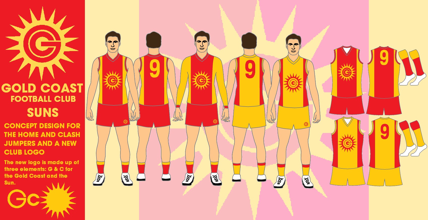
Love that clash idea. I created something a little like it previously, however, yet to post it.
 
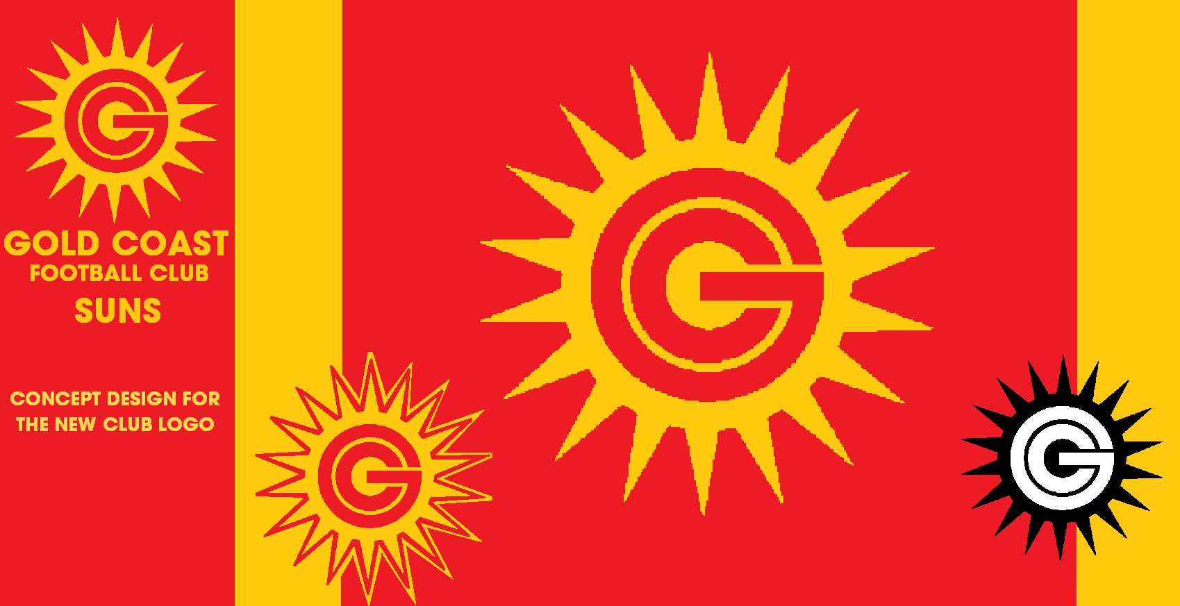
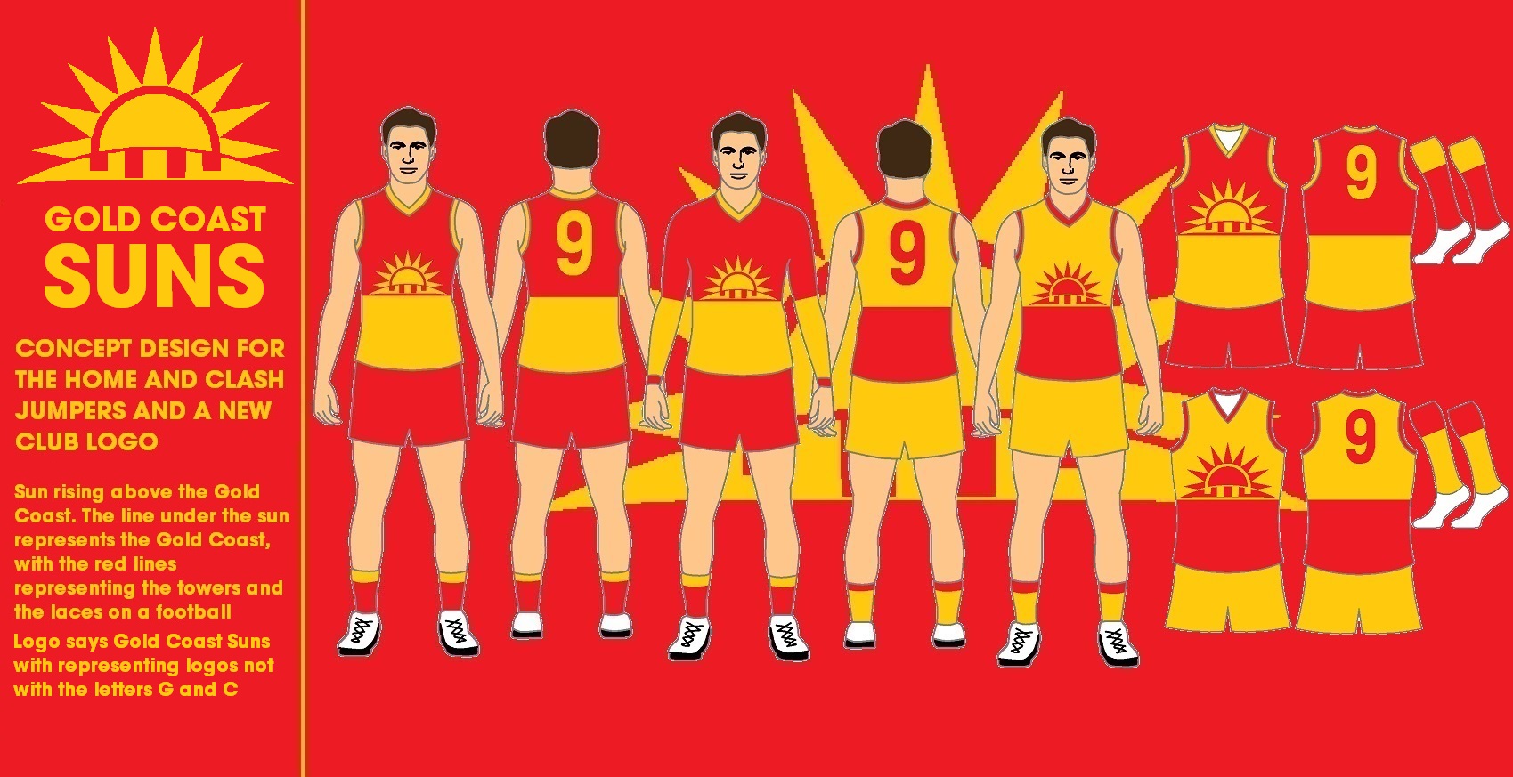
Here is my previous design of the Gold Coast Suns jumper and my new design for the jumper.

Previous
LgM6rTU.jpg

hVBXFvL.jpg


New Design
tqWmosj.jpg
 
View attachment 874939

My idea to #returntheanchor using the anchor found on the 1998 away jumper. It's a good balance between the original and the 00's anchor while being a lot sharper which makes it look stronger.

I've kept the current colours but added new away jumper based on the mid 00's design.
Can you show us how the back would look without the shield? Like the back of the west coast tri-panel? Ta xo
 
West Coast

Home/main jumper:

I'd go back to the wing size that they won their '06 flag in (without the white outline), just a personal preference. Otherwise just the status quo when it comes to the main kit. Blue jumper, gold wings, blue shorts and mostly blue socks is the classic Eagles look. Worn at all home games and away games against Magpies, Cats, Suns, Saints, Swans and if they want to away games against Giants and Hawks as well.
graphic_kit_afl_2021_wce_111_home.png

And of course white shorts improves contrast against mostly dark opponents, this combo should be worn in away games against Dons, Port and if they want to Giants and Hawks as well.
graphic_kit_afl_2021_wce_121_change.png

Clash jumper:
Just like the main jumper, my personal preference is higher wings, and I also believe whenever possible their clash jumper should be worn with blue shorts and blue socks, just like their inaugural season kit, in away games against Lions, Freo and Tigers.
graphic_kit_afl_2021_wce_211_clash.png

And of course white shorts when the opposition have blue shorts, such as away games against Crows, Blues and Demons.
graphic_kit_afl_2021_wce_221_clash.png

And white shorts with mostly gold socks in away games against Roos and Dogs.
graphic_kit_afl_2021_wce_222_clash.png

Pre-season jumper:
Made an attempt at a wings version of that jumper.
graphic_kit_afl_2021_wce_pre.png
 
Last edited:
Richmond

Richmond's jumper set between 2017-2019 was almost perfect besides the weird line on the collar, which is now gone with the 2020 versions, so the main change to this kit besides the team coloured AFL logos are the shorts, as I find the Puma two line template weird.

Home/main jumper:
Main kit should be with mostly black shorts and hooped socks as per the status quo. Worn at all home games and away games against Cats, Suns, Roos and Swans.
graphic_kit_afl_2021_rich_111_home.png

Black shorts swapped for white shorts for away games against Giants.
graphic_kit_afl_2021_rich_121_change.png

Main jumper with white shorts and mostly black socks for away games against Saints (in a redback jumper) and Hawks who both have similar coloured hooped socks.
graphic_kit_afl_2021_rich_122_change.png

Yellow shorts instead of black or white in away games against Magpies and Dogs.
graphic_kit_afl_2021_rich_131_change.png

Clash jumper:
Richmond are currently the only team in AFL history to win a grand final in a clash jumper. Only change to that jumper I would make is no weird line on the collar, which the current 2020 design achieves. The clash jumper should always be worn with white shorts and with hooped socks if possible. This should be worn in away games against Lions, Blues, Dons, Freo, Demons, Port and Eagles.
graphic_kit_afl_2021_rich_221_clash.png

And with mostly black socks against the Crows as the Crows have similar coloured hooped socks.
graphic_kit_afl_2021_rich_222_clash.png

Pre-season jumper:
Decided to go for the black sash on a black jumper look.
graphic_kit_afl_2021_rich_pre.png
 
Sorry for using an old design again but I decided to try using it with a new colour scheme.
The idea for these new colours is very simple, they're just based off the water on the beach.

View attachment 872776
Not feeling the design but blue and green is pretty solid. The beach always gets the focus but the Hinterland is a strong element in the area as well.
 
Fremantle

Probably the least amount of change I've made to the status quo, they currently have the best overall set in the league.

Home/main jumper:
Only changes I made to the overall kit is the Fremantle coloured AFL logos and plain purple shorts (as it matches better with plain purple socks in my opinion).
Full home kit worn in all home games and away games against Cats, Suns, Roos and Swans.
graphic_kit_afl_2021_fre_111_home.png

I know Fremantle have a preference to either be all purple or all white, so white shorts and hooped socks should only be used in away games against Magpies. I made the alternate shorts plain white as the main shorts are now all purple.
graphic_kit_afl_2021_fre_122_change.png

Clash jumper:
Only changes I made to the current clash jumper is the coloured AFL logos and swapping the sponsors around. White shorts and plain purple socks with the white jumper should be used in away games against the Saints.
graphic_kit_afl_2021_fre_221_clash.png

While white jumper with the white shorts and hooped socks should be worn in away games against Crows, Lions, Blues, Dons, Giants, Hawks, Demons, Port, Tigers, Eagles and Bulldogs.
graphic_kit_afl_2021_fre_222_clash.png

Pre-season jumper:
Decided to incorporate the waters docking on Fremantle's harbour along with their original colours as well.
graphic_kit_afl_2021_fre_pre.png
 

(Log in to remove this ad.)

Port Adelaide
While I do believe Port should be allowed to wear the prison bar jumpers, I also believe the design they currently have is the best in the league. This is just my personal preference.

Home/main jumper:

Kept the status quo on the entire home kit, besides the display of the MG sponsor and the Port coloured AFL logos. Worn at all home games and away games against Cats, Suns, Roos and Swans.
graphic_kit_afl_2021_port_111_home.png

Swap the black shorts for white shorts for away games against Giants, Hawks, Saints (redback jumper), Dogs and Eagles.
graphic_kit_afl_2021_port_121_change.png

Clash jumper:
I decided to revert the clash jumper to predominantly white, as it is one of their two traditional colours, and incorporate their traditional white number panel in the back. With white shorts and plain black socks it should be worn in away games against Crows, Lions, Dons, Demons and Tigers.
graphic_kit_afl_2021_port_221_clash.png

And with white shorts and hooped socks it should be used in away games against Blues and Freo.
graphic_kit_afl_2021_port_222_clash.png

Third jumper:
Made the third jumper mostly grey, similar to their current clash jumper, but with their traditional white number panel. The idea for me is to have a jumper that is as black and white as possible without clashing with Collingwood's traditional setup of white jumper, black stripes, black shorts and black socks. This would only be worn in away games against the Magpies of Collingwood anyway.
graphic_kit_afl_2021_port_322_third.png

Pre-season jumper:
The traditional Port Adelaide wharf nylons on the Port coastline, taking the SA coastline shape.
graphic_kit_afl_2021_port_pre.png
 
Port Adelaide
While I do believe Port should be allowed to wear the prison bar jumpers, I also believe the design they currently have is the best in the league. This is just my personal preference.

Home/main jumper:

Kept the status quo on the entire home kit, besides the display of the MG sponsor and the Port coloured AFL logos. Worn at all home games and away games against Cats, Suns, Roos and Swans.
View attachment 877279

Swap the black shorts for white shorts for away games against Giants, Hawks, Saints (redback jumper), Dogs and Eagles.
View attachment 877280

Clash jumper:
I decided to revert the clash jumper to predominantly white, as it is one of their two traditional colours, and incorporate their traditional white number panel in the back. With white shorts and plain black socks it should be worn in away games against Crows, Lions, Dons, Demons and Tigers.
View attachment 877281

And with white shorts and hooped socks it should be used in away games against Blues and Freo.
View attachment 877282

Third jumper:
Made the third jumper mostly grey, similar to their current clash jumper, but with their traditional white number panel. The idea for me is to have a jumper that is as black and white as possible without clashing with Collingwood's traditional setup of white jumper, black stripes, black shorts and black socks. This would only be worn in away games against the Magpies of Collingwood anyway.
View attachment 877283

Pre-season jumper:
The traditional Port Adelaide wharf nylons on the Port coastline, taking the SA coastline shape.
View attachment 877284
4ue.gif
 
Sydney Swans

There's a reason why I kept the Swans and my Lions to be the last two posted, all will be revealed.

Home/main jumper:
While I personally think the Swans jumper looks better with the white back, they won two flags in a red back, so I decided to keep the status quo besides the AFL logo now being red and white. This whole kit would be worn in all home games and all away games except against Lions, Suns, Giants and Saints (in a redback jumper).
graphic_kit_afl_2021_syd_111_home.png

Clash jumper:
Decided to base the clash jumper on what the Swans wore in the 1980's. With white shorts and hooped socks it should be worn in away games against Lions, Suns (even though there would be no clash of jumpers with my proposal to give the Suns a yellow jumper, the red shorts of both teams would still clash and the Swans 1980's jumper looks better with white shorts than their current jumper) and Giants. They could also wear this setup in away games against the Hawks if they want to give this jumper more exposure.
graphic_kit_afl_2021_syd_221_clash.png

And plain red socks in away games against the Saints as they have red and white on their hooped socks.
graphic_kit_afl_2021_syd_222_clash.png

Pre-season jumper (outside Victoria):
Decided on hybrid of the opera house vee yoke and the South Melbourne vee.
graphic_kit_afl_2021_syd_pre.png

Pre-season jumper (in Victoria):
This idea has been repeatedly suggested by many old Fitzroy fans and I'm surprised it's never come into reality. Personally I think the Swans and Lions should play one pre-season match in Melbourne every year, with Swans in the old Souths jumper and Lions in the old Fitzroy jumper and become an annual tradition, just like the NRL's charity shield between South Sydney and St George "Illawarra". For the first match-up, I based the Swans design on the 1981 design with a modernised collar and the SMFC monogram above the number.
graphic_kit_afl_2021_syd_previc.png
 
Brisbane Lions

Saved my own team for last.

Home/main jumper:
We need to go back to as close as possible to the proper threepeat era jumper, with the proper yoke, white "BBFFC" text, thick white outline on the numbers and yoke even between front and back and not going lower than the cuffs. It is also my personal preference to wear our jumper in every home game and away game where there no jumper clashes, but I also respect that the old Fitzroy fans want to see the Roys-style jumper worn when playing down in Victoria. For me wearing the threepeat jumper should always be worn against Collingwood, home or away, considering that we beat them in two Grand Finals in that jumper, there is no jumper clash and they are our biggest rival. The shorts should also be similar to the threepeat era design with the two thinnish stripes with the thick stripe. Threepeat jumper with maroon shorts obviously worn at all home games and away games against the Magpies and Roos (if playing in Hobart).
graphic_kit_afl_2021_bl_111_home.png

Threepeat jumper with white shorts should be worn in away games against Suns (in a yellow jumper), Giants and Hawks (if playing in Launceston).
graphic_kit_afl_2021_bl_131_change.png

Victorian away jumper:
Our club has a unique history. With the exception of games against the old enemy, or if we make the Grand Final as a higher ranked team or versing a team we have no jumper clash with, I'm happy to see the Roys inspired design worn at Victorian games where there are no jumper clashes. I also would like to see us wear the Fitzroy blue shorts with that jumper when we are versing teams that don't wear blue shorts as part of their main kit. I'm also happy to see us wear the Roys styled jumper against the Dockers considering our main jumper clashes with their main jumper and the Roys had their last ever AFL win and played their last ever AFL game against them. This setup therefore should be worn in away games against Dons, Freo, Cats, Hawks (if playing in Melbourne) Port and Tigers.
graphic_kit_afl_2021_bl_222_away.png

And the Roys inspired design with white shorts in away games against Blues, Dees, Roos (if playing in Melbourne) and Bulldogs.
graphic_kit_afl_2021_bl_232_away.png

Clash jumper:
Obviously if we have a Fitzroy inspired design, it makes sense to have a design inspired by the Bears. It also makes sense to try and emulate the 1980's design, rather than the weird mish-mash Majestic tried in 2017-2019, as it actually functions as its' purpose as a clash jumper and allows us to maintain the yoke uniformity across all three jumpers. Just like the FFC monogram being replaced with the Lion, in this clash design it obviously makes sense to remove the BB monogram with the lion. Plain maroon socks should also be worn with this jumper, just like what the Bears wore in the 80's. Worn in away games against Crows, Saints (as my portfolio has them in a mostly red jumper), Swans and Eagles.
graphic_kit_afl_2021_bl_333_away.png

Pre-season jumper (outside Victoria):
Went for a maroon, blue and gold version of our 2015 clash jumper.
graphic_kit_afl_2021_bl_pre.png

Pre-season jumper (in Victoria):
As mentioned on my Swans post, we should play them in a pre-season match in Melbourne every year with us wearing a Fitzroy jumper and them in a South Melbourne jumper. This design is based on the 1996 jumper.
graphic_kit_afl_2021_bl_previc.png
 
View attachment 874939

My idea to #returntheanchor using the anchor found on the 1998 away jumper. It's a good balance between the original and the 00's anchor while being a lot sharper which makes it look stronger.

I've kept the current colours but added new away jumper based on the mid 00's design.
damn i love that first purple one!!!!
 
Or this different version, adapted from a GC version posted by freight train a while back which was one of my favourites on the jumper design forum.


gws black.jpg
 
Last edited:
Status
Not open for further replies.

Remove this Banner Ad

Back
Top