Workshop 2021 Jumper Ideas thread

Remove this Banner Ad

Status
Not open for further replies.
My first AFL jumper on illustrator is a blatant North Melbourne shitpost. I hope the Norf fans like it.
Credit to fancyscum for the template and assistance. Also a thank you to Freight Train for your assistance as well. Thanks so much guys.

View attachment 886688

Honestly it looks better than the one we actually wore. Also, as an aside, I know it's on all of our stuff now but that Mazda logo is for the tip.
 
Worse guernsey in league. Great colours tho. Red guernsey with Yellow V on breast. Rotate to yellow guernsey with red V for away. How hard is it!!!! Get rid of the blue aswell. Gold Coast Guards would have been better aswell

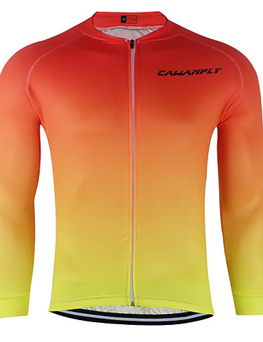
I feel like a gradient would work really well on a Gold Coast jumper with the colours they’ve got
 
I feel like a gradient would work really well on a Gold Coast jumper with the colours they’ve got

Nah, a red-to-yellow gradient would never work.
 

Log in to remove this ad.

(It is pretty s**t though...)

aoivfz1574047904807.jpg


Must be time to whip out fancy's GC design again.

526574b4-678c-4303-ba4b-b625fba3dd45-png.588967
 
(for clarification I’m kidding, red-to-yellow gradients are the best, and a proven way to win NAFL)
 
View attachment 888252
I posted this in the 2020 Jumper Ideas Thread but with the whole Carona thing and the talk of Privatisation of Football, I think that this might be a possibility.
Gah privatised football would make me sad :( you also have an interesting use of Capitalisation!
 

(Log in to remove this ad.)

For the Suns, I'd just say "screw tradition". They're not a traditional club so they should be rather abstract with their jumper. Their wave guernsey wasn't traditional, but it worked IMO. It was unique to the Gold Coast and it was different. The wave should've been their home jumper. And a plus, they won their first game with it. The white wave was also rather ok as well.

1591532164497.png 1591532186154.png
 
For the Suns, I'd just say "screw tradition". They're not a traditional club so they should be rather abstract with their jumper. Their wave guernsey wasn't traditional, but it worked IMO. It was unique to the Gold Coast and it was different. The wave should've been their home jumper. And a plus, they won their first game with it. The white wave was also rather ok as well.

View attachment 888283View attachment 888284
Yep, zero reason for gold coast to have a traditional jumper. This was great opportunity to have a truely unique jumper element like West Coast with the wings or Freo with the Anchor. A plus for this design too is the fact that the gradient made it possible for the Red and Yellow to work together without reminding anyone of Ronald McDonald.
 
Yep, zero reason for gold coast to have a traditional jumper. This was great opportunity to have a truely unique jumper element like West Coast with the wings or Freo with the Anchor. A plus for this design too is the fact that the gradient made it possible for the Red and Yellow to work together without reminding anyone of Ronald McDonald.
I feel like neither of the expansion teams really did anything exceptional with their kits or branding. In saying that, the Giants one is definitely more fleshed out and feels like they have established a brand (and things like the #bigsound have really gone a long way to giving them identity). The poor Suns :(
 
This Jazz get up would be perfect for GC. Maybe invert the hoop order for the home so that the guernsey is mainly red, shorts mainly yellow and then the socks could go back the other way (yellow to red).

View attachment 888060
This Jazz get up would be perfect for GC. Maybe invert the hoop order for the home so that the guernsey is mainly red, shorts mainly yellow and then the socks could go back the other way (yellow to red).

View attachment 888060

 
Yep, zero reason for gold coast to have a traditional jumper. This was great opportunity to have a truely unique jumper element like West Coast with the wings or Freo with the Anchor. A plus for this design too is the fact that the gradient made it possible for the Red and Yellow to work together without reminding anyone of Ronald McDonald.

I think the suns need 3 things:
- the red needs to be darker and stronger
- drop the blue, it's too similar to the only other qld team, especially now that brisbane wear the old fitzroy jumper a fair bit.
- the logo actually looks alright in its full form with the SUNS word under the gc disc, if using the logo it needs to have the words and the disc smaller because the disc on its own looks ordinary. This would also balance more yellow on the front to match the back of the jumper better. Not traditional to have words on an afl jumper but as others have stated it's something different and original for a new team.
 
Last edited:
Status
Not open for further replies.

Remove this Banner Ad

Back
Top