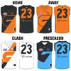
Workshop 2021 Jumper Ideas thread

Remove this Banner Ad

Status
Not open for further replies.
I was under the impression in 2010 that they’d be called the Stingrays, in hindsight most people would say Sharks was a better name but I’m not sure they’d just be able to take Southport’s nickname. Both infinitely better than Suns. Big agree on Port being the Pirates, I’d still love for us to do that.
 

Log in to remove this ad.

I was under the impression in 2010 that they’d be called the Stingrays, in hindsight most people would say Sharks was a better name but I’m not sure they’d just be able to take Southport’s nickname. Both infinitely better than Suns.
Yeah doesn't look like Sharks made it to the final cook-off. Is "Suns" better than "Guards", "Marlins" or "Ironmen" though?
 
Sorry for double-post ya'll.

If they changed to the Rays it could be a happy medium between Stingrays and Suns :D
Rays was actually one of the candidates too, separate from Stingrays.
 
Wonder how it would look if the white trim was blue to incorporate all their colours.

Agree. Change white trim to blue. Then do an inverse of red and gold but keep blue trim for away strip.
Then email it to the club

Really love the inclusion of Charcoal on that alternate kit. This would be the perfect kit for embracing a 'lifesaver' brand.

The gold is my favourite one. I maintain gold should be the main colour for a Gold Coast team, and it's a good identity to look even more like surf lifesavers.

Couple of different combinations that have been mentioned but keeping the red with gold or inverse design. Not a huge fan of the blue trims but the charcoal definitely has a factor.

GC Jumper ideas.PNG
 
Couple of different combinations that have been mentioned but keeping the red with gold or inverse design. Not a huge fan of the blue trims but the charcoal definitely has a factor.

View attachment 1019275
They look good regardless, but I actually preferred the white trim to both charcoal and blue.
 

(Log in to remove this ad.)

So reports are GWS have a new jumper coming out soon and I have been always annoyed by the fact the balance is off from the front to the back. The numbers should be white so the three colours match the front, or the no brainer is that it needs a charcoal back with an orange number. Anyhow for those reason I actually think the colours go best in a Tri colours format. The simple tri colours work well and if you use the more blueish charcoal and more vibrant orange is really strikes a cord imo.

I personally like the first one with the orange at the bottom option better as it creates a contrast between that and the shorts and would allow for orange numbers on the charcoal and white background. Interested to hear peoples thoughts on which they prefer. I will post ones with a G logo inserted soon too.

gws tri colour front & back opposite.jpg gws tri colour front & back.jpg
 
So reports are GWS have a new jumper coming out soon and I have been always annoyed by the fact the balance is off from the front to the back. The numbers should be white so the three colours match the front, or the no brainer is that it needs a charcoal back with an orange number. Anyhow for those reason I actually think the colours go best in a Tri colours format. The simple tri colours work well and if you use the more blueish charcoal and more vibrant orange is really strikes a cord imo.

I personally like the first one with the orange at the bottom option better as it creates a contrast between that and the shorts and would allow for orange numbers on the charcoal and white background. Interested to hear peoples thoughts on which they prefer. I will post ones with a G logo inserted soon too.

View attachment 1035846View attachment 1035847
1. That looks clean as * and should absolutely be the GWS jumper going forward. Drop Canberra off the back and put GIANTS on there instead.

2. GWS going tri-colours would * off the Bulldogs and just add to their rivalry.
 
Status
Not open for further replies.

Remove this Banner Ad

Back
Top