Navigation
Install the app
How to install the app on iOS
Follow along with the video below to see how to install our site as a web app on your home screen.
Note: This feature may not be available in some browsers.
More options


You are using an out of date browser. It may not display this or other websites correctly.
You should upgrade or use an alternative browser.
You should upgrade or use an alternative browser.
Adelaide Crows New Logo Poll
- Thread starter kaij10
- Start date
- Tagged users None
Punchy Bassett
Brownlow Medallist
im afraid that it's growing on me!!!
I'm going to come down there and smack some sense into you!
- Thread starter
- #28
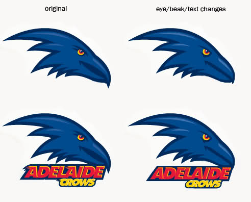
so much better without the crap text. The logo itself reminds me of Atlanta Hawks logo (below) for some reason! Well it is a very American logo which tend to not use Shield logos.
Now this thing looks fierce. It makes the Crows 'fiercer' logo look like a stuffed kids toy
Now this thing looks fierce. It makes the Crows 'fiercer' logo look like a stuffed kids toy
- Oct 7, 2008
- 9,702
- 42
- AFL Club
- Adelaide
- Other Teams
- GWS, NA Roosters, ATL Falcons
- Banned
- #29
sameim afraid that it's growing on me!!!
im not revolted at it anymore, it's just getting the meh response out of me. Nothing bad or good about it.
by round 1 next year I may actually like it
Things I don't like about it (including some I agree with from above):
1. It's a flat out ripoff of the Baltimore Ravens(?) logo. Not unique or original.
2. The text is "Nintendo DS" (thank kaij10 for a good choice of words).
3. The eye is feminine - looks like it's wearing mascara FFS.
4. In general, it says "American sports franchise" and not "Australian football club".
Things I like about it:
1. It is not, apparently, replacing the official club logo - just a merchandise thing and for the away jumper, as I understand it. So OK, whatever, as long as we can still buy polos and suchlike with the official club logo as an alternative. Sorry but I'm 52 and I'm NOT wearing a shirt with that thing on it
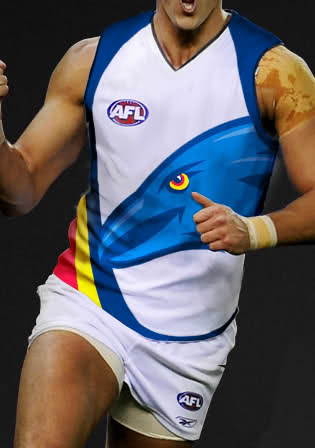
Which brings me to my biggest worry: That we're going to end up with an abomination of an away jumper like Hawthorn's or Port's. I can deal with white (I think Freo's and Carlton's are good) but only with a strong, simple, logo-based design - not some cartoon.
It's the possibility of the awful away jumper that bothers me the most.
1. It's a flat out ripoff of the Baltimore Ravens(?) logo. Not unique or original.
2. The text is "Nintendo DS" (thank kaij10 for a good choice of words).
3. The eye is feminine - looks like it's wearing mascara FFS.
4. In general, it says "American sports franchise" and not "Australian football club".
Things I like about it:
1. It is not, apparently, replacing the official club logo - just a merchandise thing and for the away jumper, as I understand it. So OK, whatever, as long as we can still buy polos and suchlike with the official club logo as an alternative. Sorry but I'm 52 and I'm NOT wearing a shirt with that thing on it
Which brings me to my biggest worry: That we're going to end up with an abomination of an away jumper like Hawthorn's or Port's. I can deal with white (I think Freo's and Carlton's are good) but only with a strong, simple, logo-based design - not some cartoon.
It's the possibility of the awful away jumper that bothers me the most.
DangerRoo
Draftee
Things I don't like about it (including some I agree with from above):
It's the possibility of the awful away jumper that bothers me the most.
If they get the away jumper right - I can live with the logo.
Smoooothy
SACK THE LOT OF THEM!
- Jan 12, 2005
- 24,312
- 22,283
- AFL Club
- Adelaide
- Other Teams
- North Adelaide; ConeyIslandWarriors
i may think differently if it's splattered all over a white away guernsey next year - hawks style.....same
im not revolted at it anymore, it's just getting the meh response out of me. Nothing bad or good about it.
by round 1 next year I may actually like it
i may think differently if it's splattered all over a white away guernsey next year - hawks style.....
does someone want to whip this up just so we can get a general idea?
- May 10, 2004
- 24,853
- 5,687
- AFL Club
- Geelong
- Other Teams
- Pistons/Hammers/Sri Lanka/The Exers
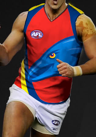
It's about as good as the current one.
In other words not very.
In other words not very.
Oh god, I hope it's not that.
Don't think that's a bad effort actually however there is no white in our club colours and i see no reason why there should be white in our jumper.
Don't think that's a bad effort actually however there is no white in our club colours and i see no reason why there should be white in our jumper.
there is no white in Hawthorn's colours either. white is an obvious choice as you can easily add your own colours to it. It just needs to be done right
I like it (noting it would be slighty dif at that's straight from the Haws), but I'm a massive merch whore.Hawks style...
Hawks style...
and this is not right, if the Crow was the right navy blue colour I would have less of an issue with it, but you can expect something cringeworthy I fear.
DangerRoo
Draftee
The white jumper looks good. Nice colours.
Personally I would prefer not to have a massive birds head on a footy jumper.
Personally I would prefer not to have a massive birds head on a footy jumper.
Hawks style...
I miss our colours in this pic
Just as long as they get it right, so it looks professional and not something like Brisbane's debacle or Ports then I'll be ok with it.
I like it (noting it would be slighty dif at that's straight from the Haws), but I'm a massive merch whore.
I dont mind it either.
The best white jumpers are Carltons and Freo's IMO.
This one is not as good as theirs but is not too bad.
I HATE the white jumpers - all of them
FFS it's not soccer or athletics
there is a reason teams have colours
white is not a colour
neither is teal
FFS
I feel better now
FFS it's not soccer or athletics
there is a reason teams have colours
white is not a colour
neither is teal
FFS
I feel better now
Drugs Are Bad Mackay?
Moderator
- May 24, 2006
- 77,345
- 152,001
- AFL Club
- Adelaide
- Other Teams
- Redbacks, Sturt, Liverpool, Arizona
- Moderator
- #48
I think it depends on whether we win games.I voted undecided. I think it depends how it is used.
If we go well next year then no one will care about the logo or the away guernsey.
If we lose matches then suddenly these things become 'curses' that we must get rid of.
- Nov 14, 2007
- 48,271
- 26,739
- AFL Club
- Adelaide
Nup - it's revolting. Looks like somethin Port would try to pull off. Get rid of it before it's on anything permanant.
The logo needs the whole of the actual Crow on it - looks like an eagle or hawk - and it's totally the wrong blue - we are navy blue not some faggy royally blue.
The logo needs the whole of the actual Crow on it - looks like an eagle or hawk - and it's totally the wrong blue - we are navy blue not some faggy royally blue.
Modernization or Americanization? Next thing the Crows (doesn't even look like a Crow) will be wearing BLING on the field.
Will their slogan change too? "The Team for All Bogans"..
Makes me want to tuck my pants into my ugg boots.
Worst Logo in the NBL.. (It's an AFL Logo? You're kidding?)
GET RID OF IT!!!!
Will their slogan change too? "The Team for All Bogans"..
Makes me want to tuck my pants into my ugg boots.
Worst Logo in the NBL.. (It's an AFL Logo? You're kidding?)
GET RID OF IT!!!!
Similar threads
- Poll
- Replies
- 581
- Views
- 20K
- Replies
- 157
- Views
- 8K
- Replies
- 2K
- Views
- 29K
- Replies
- 72
- Views
- 2K
