

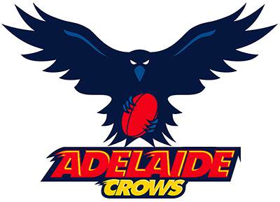
I love that crow but I’m not keen on the striping.
Navigation
Install the app
How to install the app on iOS
Follow along with the video below to see how to install our site as a web app on your home screen.
Note: This feature may not be available in some browsers.
More options
You are using an out of date browser. It may not display this or other websites correctly.
You should upgrade or use an alternative browser.
You should upgrade or use an alternative browser.
Adelaide Logo Redesign: 2018
- Thread starter Dank Academy
- Start date
- Tagged users None
.This is what we need but in crows colours View attachment 773829
On SM-N960F using BigFooty.com mobile app

On SM-N960F using BigFooty.com mobile app
That or a variation of that is the best by far, just bloody do it


Like this but with less noise. Needs to be easy to replicate imo
Where’s the noise?Like this but with less noise. Needs to be easy to replicate imo
Feathers. Too many points imo.Where’s the noise?
- Sep 21, 2004
- 36,993
- 25,769
- AFL Club
- West Coast
- Other Teams
- Norwood & Liverpool.
Crows dont really swoop though. They stand and peck.
So something standing on/over a football would make more sense
On SM-G925I using BigFooty.com mobile app
So something standing on/over a football would make more sense
On SM-G925I using BigFooty.com mobile app
Turn your sound up.Where’s the noise?
It's a photoshopped version of the Austin Crows logo over in the US. I assume they have an ammo league over there. I'm just using it as a concept to show that I'd like a front-on swooping Crow. If we wanted to do something like this, it would have to be re-designed anyway and would probably need smoother edges because this one would look weird on clothing.Like this but with less noise. Needs to be easy to replicate imo
It's a logo. We aren't trying to make an Attenborough doco here.Crows dont really swoop though. They stand and peck.
So something standing on/over a football would make more sense
On SM-G925I using BigFooty.com mobile app
https://www.abc.net.au/news/2016-11-16/crows-copy-magpies-to-swoop-unsuspecting-public/8031100Crows dont really swoop though. They stand and peck.
So something standing on/over a football would make more sense
On SM-G925I using BigFooty.com mobile app
- Sep 21, 2004
- 36,993
- 25,769
- AFL Club
- West Coast
- Other Teams
- Norwood & Liverpool.
I don't think the swooping crow works as is (and anything with the wings spread out), we've pretty much only looked at it at a large size that it won't be used at often.
Needs more weight in the centre, maybe the shield above does it, too much detail in the corners, nothing in the centre, I don't think it works alongside the other logos for things like print, ladders, tv graphics etc.

Needs more weight in the centre, maybe the shield above does it, too much detail in the corners, nothing in the centre, I don't think it works alongside the other logos for things like print, ladders, tv graphics etc.
Last edited:

I like this logo not sure about what to do with the title
logo found here https://dribbble.com/shots/3711787-Crow-Logo-Icon I just changed the colours so credit to this guy for designing it
Is this still too american bastardize crowish?View attachment 774256
I like this logo not sure about what to do with the title
logo found here https://dribbble.com/shots/3711787-Crow-Logo-Icon I just changed the colours so credit to this guy for designing it
We need to use this guy more. He is somewhat timeless and if done right should appeal.to everyone.

Sent from my SM-G930F using Tapatalk
Sent from my SM-G930F using Tapatalk
Would work really in a Boston Celtics style Oval logo.We need to use this guy more. He is somewhat timeless and if done right should appeal.to everyone.
Sent from my SM-G930F using Tapatalk
- Sep 8, 2011
- 10,990
- 10,956
- AFL Club
- West Coast
We need to use this guy more. He is somewhat timeless and if done right should appeal.to everyone.
Sent from my SM-G930F using Tapatalk
I like that idea. Would hope that they remove the logos from the jumper.
Remove the movement lines, logos and modernise his features. Also like the idea of incorporating him into a Boston Celtics style badge.We need to use this guy more. He is somewhat timeless and if done right should appeal.to everyone.
Sent from my SM-G930F using Tapatalk
.Remove the movement lines, logos and modernise his features. Also like the idea of incorporating him into a Boston Celtics style badge.

On SM-N960F using BigFooty.com mobile app

We need to use this guy more. He is somewhat timeless and if done right should appeal.to everyone.
Sent from my SM-G930F using Tapatalk
I think one part that made this logo work was the crow being black. I HATE the raptor logo but I feel like the colouring doesn't help. If the raptor logo had a black crow it would look a lot better.
Look at the Dank Academy logo with the black crow, looks good.
.png")
This robboaustralia effort looks good with the black too.
.jpeg")
Similar threads
- Replies
- 79
- Views
- 3K
- Poll
- Replies
- 581
- Views
- 20K
- Replies
- 2K
- Views
- 28K
