News AFL Logo to be redesigned

Remove this Banner Ad

Is there a possibility that the Toyota logo could become a part of the official logo in a similar way the NRL logo features Telstra quite prominently?

View attachment 687624

If we did end up with something similar it would cause some sticky issues for multiple teams who have different car manufacturers on their jumper

Thats not the league logo though, its the equivalent of the current AFL Toyota Premiership logo we see painted on the ground. The NRL have used the sponsored version on their jerseys for probably close to 20 years now for some reason.

The actual league logo for the NRL is just a simplified version of what they already had.

E590572B-C77C-4B81-8A3D-51317E656E02.jpeg
 
On a few comments above, people forget that creative agencies don't just come in and redesign a logo. They redesign an entire brand, a logo is really only a small part of this, and a large rebrand should transcend all the way through from applications to 'tone of voice'. I'm curious as to whether this rebrand will flow down to all local leagues as well, or if it's just at the top-flight.

I will be very disappointed if we moved into the arena of the NRL and allow for corporate sponsorship on the League logo though.
 
Minimalism has been popular for a fair few years now. If you chase current trends you end up becoming outdated pretty quickly.

The current logo is actually doing a fine job.

People forget that it had initially had a silver gradient style oval rather than white, and darker red depth lines on the inner oval, but this was only used online and in some print formats but not on the guernseys or playing fields.

After a couple of years the more complicated version of the logo was turfed.


I have an ochre prototype that has the an old version of the current logo, pretty interesting as the previous AFL logo is watermarked all over the guernsey.
 

Log in to remove this ad.

I forgot about that brand book from NASA that was released. One of the designers at my old work bought the NYTA Handbook though, it was glorious!
 
What about an A with where the horizontal stick goes in the letter joining the sides is
Replaced by a football.

So it’s A with a football joining the sides.

Simple and obvious.

T21408949.MEDIUM.jpg

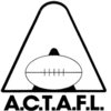
Might look better with proper execution, but this is from the ACTAFL (what a mouthful) all the way back in 1987.
 
Australia must be emphasised. Maybe just “Australian Football”. I hate it when those in the rugby states call our sport AFL! That’s the league sure. But our sport is AUSTRALIAN FOOTBALL! Maybe no letters in the logo but just a footy on a map? Now that minimalist.
Cue Mark Jaxson- 12 minute mark
 
Change for the sake of change, as per everything when it comes to the AFL execs. Why they feel the need to constantly mess with s**t is beyond. Just leave it alone, it's fine as it is. 20 years isn't even a long time. 100% guarantee they put f**king names on the back of jumpers in the next decade too, and I bloody hate that idea.

I do not like change :mad:
 
Weird that they think the current one can’t be recoloured, especially since they did it for a commemorative c’wood jumper

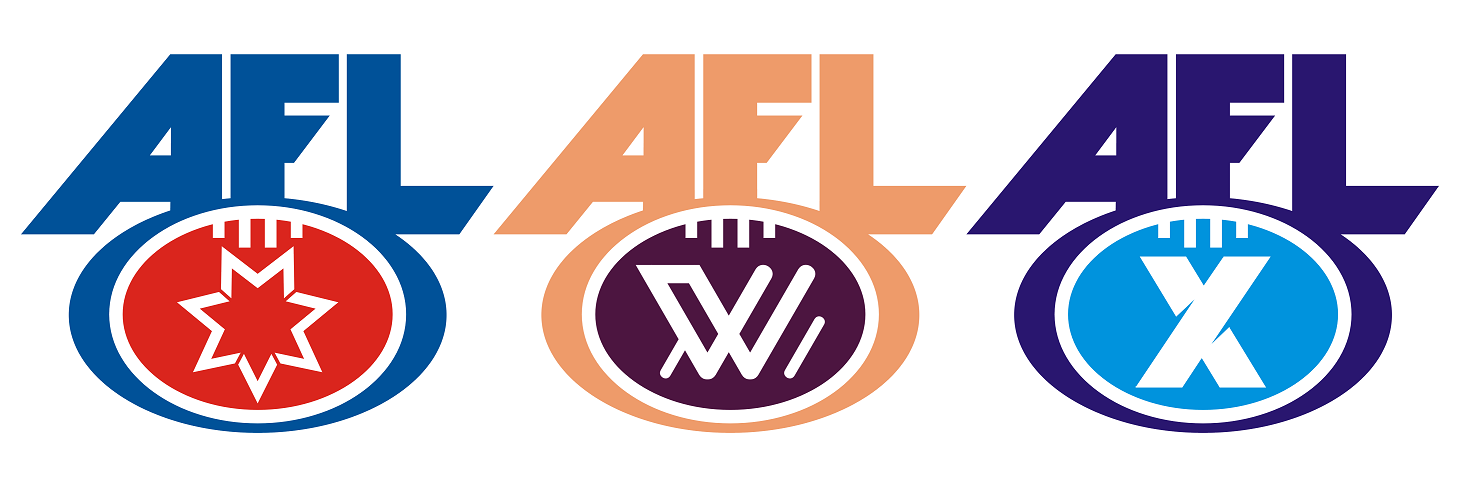
I guess they probably want an identifiable symbol like the AFLW logo - it does look slightly dated next to the W logo - if they’re using the same design firm as they did for that one then I’m hopeful.
 
They've said overtly why they think they need a change. They want something that is better able to be transferred across different uses, like AFLW and the state leagues that operate under the AFL logo. This is something that already occurs for cricket and rugby league to pretty good effect. It's about bringing everything under the AFL banner together in a more modern way.

The current logo is a little dated, certainly. It's held up okay but it's definitely a product of it's time. It's certainly nothing timeless and irreplaceable like the NFL/MLB/NBA logos. I actually think the classic VFL and SANFL logos are far more timeless but both leagues have adopted strange modfied versions for no good reason.

I'm personally against the logo being recoloured for individual teams, I think it should be the same colours for everyone, but I fully expect it to be recoloured for every team as the A-League logo is.

I expect that it won't go too abstract, and that we'll still see the AFL text featuring prominently. How they decide to work that in with the subsidiary versions will be interesting.
 

(Log in to remove this ad.)

What about an A with where the horizontal stick goes in the letter joining the sides is
Replaced by a football.

So it’s A with a football joining the sides.

Simple and obvious.
View attachment 687668

Might look better with proper execution, but this is from the ACTAFL (what a mouthful) all the way back in 1987.
w5wnt.jpg


The logo immediately prior to the current one was just an 'A' and was updated to the current logo specifically to address the confusion surrounding what the logo meant in non-AFL states. You can bet your house on the letters 'A', 'F' and 'L' featuring in the updated logo.
 
Intially very surprised the majority believe in the new logo, Ive grown up with it and now have come round to agree with a new look.
I rekon red, white and blue are essential for the league brand I.D., anyone think otherwise?
 
Intially very surprised the majority believe in the new logo, Ive grown up with it and now have come round to agree with a new look.
I rekon red, white and blue are essential for the league brand I.D., anyone think otherwise?
Maybe blue+white, and the other colour can change based on the team?
 
Intially very surprised the majority believe in the new logo, Ive grown up with it and now have come round to agree with a new look.
I rekon red, white and blue are essential for the league brand I.D., anyone think otherwise?
One colour, which can be any colour. You heard it here first
 
bring back a badge with a football on it, keep it red, blue, white ...the australian flag colours. Dont try and be fancy with goalposts/sherrin
 

Remove this Banner Ad

Back
Top