Mero
Norm Smith Medallist
They're virtually exactly the same as last year, except for Collingwood.i love these new womens kits.... they are looking very nice!!
Follow along with the video below to see how to install our site as a web app on your home screen.
Note: This feature may not be available in some browsers.
They're virtually exactly the same as last year, except for Collingwood.i love these new womens kits.... they are looking very nice!!

I like these ideas for even AFL jumpers because they’re generally plain at face value but have enough scope for flair and a selling point. I’ve long said the Demons need to use a grey or beige jumper with an old map of Melbourne city imprinted into it lightly.The Blues have unveiled a new clash jumper. Thanks to Cody_ for the tip.
http://www.carltonfc.com.au/news/2017-12-12/new-aflw-clash-guernsey-unveiled

"CARLTON'S AFL Women's team will don a new clash guernsey in 2018, after the Club created a unique design to capture the story of the historic first AFLW season.
From horseshoe charms and iconic Carlton streets, to images from the first game at Ikon Park and the coach’s whistle, more than 20 individual moments, pictures and symbols have been incorporated on both the front and back of the light blue jumper."
--------------
It's certainly unique imo, and given there's zero history in this competition there's some really cool scope to create some interesting designs. It'll be totally invisible from a distance, but I don't think that's the point.
The monogram also gets some 3D shading on the home and clash jumpers, which could be a look to the future if Nike can no longer stitch the CFC into the material. It looks pretty good.
Where and how recently? Never seen anything like it on there.I think the pattern is painted on a white structure at Princes Park. I took a photo of it when I last visited but I don't have a memory card reader so I can't check for sure.
Brisbane, Adelaide... take the hint!It'll be totally invisible from a distance
The crows watermarks are pretty much invisible when you are watching the game, no problem with them (besides the logo being watermarked) haven’t seen enough of Brisbane’s to comment.Brisbane, Adelaide... take the hint!
Nice looking jumper and love the shading idea on the monogram.
The navy looks darkerThe Blues have unveiled a new clash jumper. Thanks to Cody_ for the tip.
http://www.carltonfc.com.au/news/2017-12-12/new-aflw-clash-guernsey-unveiled
"CARLTON'S AFL Women's team will don a new clash guernsey in 2018, after the Club created a unique design to capture the story of the historic first AFLW season.
From horseshoe charms and iconic Carlton streets, to images from the first game at Ikon Park and the coach’s whistle, more than 20 individual moments, pictures and symbols have been incorporated on both the front and back of the light blue jumper."
--------------
It's certainly unique imo, and given there's zero history in this competition there's some really cool scope to create some interesting designs. It'll be totally invisible from a distance, but I don't think that's the point.
The monogram also gets some 3D shading on the home and clash jumpers, which could be a look to the future if Nike can no longer stitch the CFC into the material. It looks pretty good.
Old as well?The navy looks darker
It was painted this year, during or before July.Where and how recently? Never seen anything like it on there.


 (shop.afl.com.au/afl-guernseys)
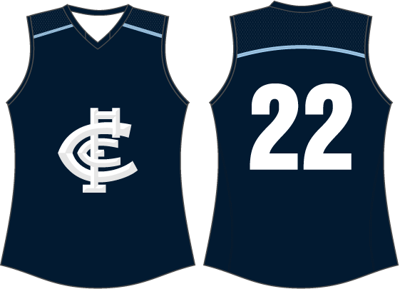
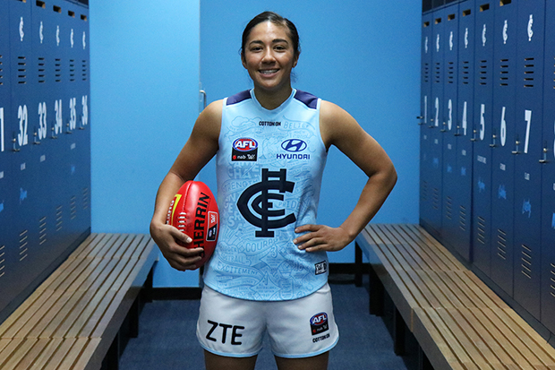
Not sure if already discussed, but it looks like Collingwood have a women's retail (ISC) and player (Cotton On) available;
View attachment 445282(shop.afl.com.au/afl-guernseys)
Not to be nitpicky, but at the end of the Cs and F, there are triangles that flare out. You can see them if you look really closely. Also the weaving is a bit off. The F shouldn't be "above" all of both Cs' arms.
My version of the Carlton monogram with embossing
This is an AFL women's guernsey, not an AFLW guernsey.And Crows with a more conventional design (for fan use at men's and women's games I suppose)
View attachment 445279View attachment 445280(shop.afl.com.au/afl-guernseys)
ISC make women jumpers for every AFL club, whether that team has an AFLW team or not.
Separate things.
Yes, thanks folks; I figured this out a bit later - lesson learnt is not to write posts when I'm not yet fully awake!This is an AFL women's guernsey, not an AFLW guernsey.
pink, really?
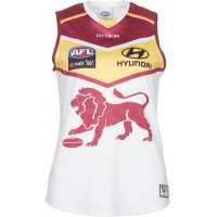
Brisbane Lions AFLW clash strip
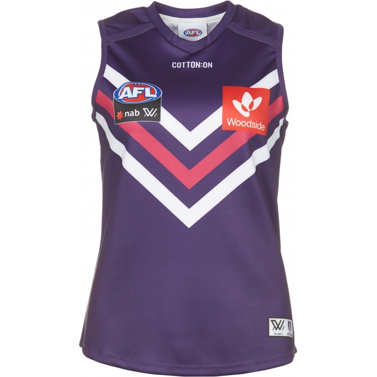
well it is AFLW. Fremantle have a pink chevron on their home and clash guernseypink, really?
Oh, Freo did it already? No issue then.well it is AFLW. Fremantle have a pink chevron on their home and clash guernsey
Of course I know that Freo did it last year, the point I was trying to make was that just because just because freo decided to use pink, doesn't make it right. There is no need for any team to add pink to their colour palette only for their womens team, it doesn't happen in the W-League (anymore) and it doesn't happen in the WBBL, the AFL really should ban it's use unless it is being used for a charitable purpose.