- Moderator
- #1
With the AFLW Draft today we've seen the reveal of a number of new designs for 2019. Share stories and information in this thread. Any anti-AFLW posts will be swiftly dealt with. We had a similar thread last year and it went smoothly so I don't anticipate any trouble but this is just a forewarning.
Let's get started with Collingwood who, as of now, have no front sponsor. It appears like they've planned for this by putting the club logo where a sponsor would usually go instead, but it's interesting to see that Holden have dropped off. I guess a lot of the initial sponsorships would have been 2-year deals which is why we should be seeing plenty of change this season.

A closer look at the new collar design that looks like it will be adopted league-wide; the Cotton On contract remaining in place.
Geelong joins and has got Ford on board for the women's side of things too, but the centering of the logo is a disappointment (note the light blue oval remains as well).
Doesn't look like too much has changed here for Carlton except for a lowering off the monogram, which is in line with their VFLW jumper (to fit the front numbers on) but looks stupid here.
Melbourne looks pretty similar.
A lowering of the hoops for Adelaide.
New sponsor for Brisbane.
The Bulldogs get the gold logo but also a significant lowering of the hoops... it does make me wonder if they're going to introduce front numbers in the AFLW?
A brand new design here for the GWS Giants. It sucks, but it utilises orange much more than white. Which can only be a good thing.
Freo looks pretty similar from what I can tell.
View from the back - Demons no longer using the redback but following suit in the men's team, the Cats have weird positioning on their sponsor, Giants' guernsey will be extremely unbalanced with a charcoal back but an orange front.
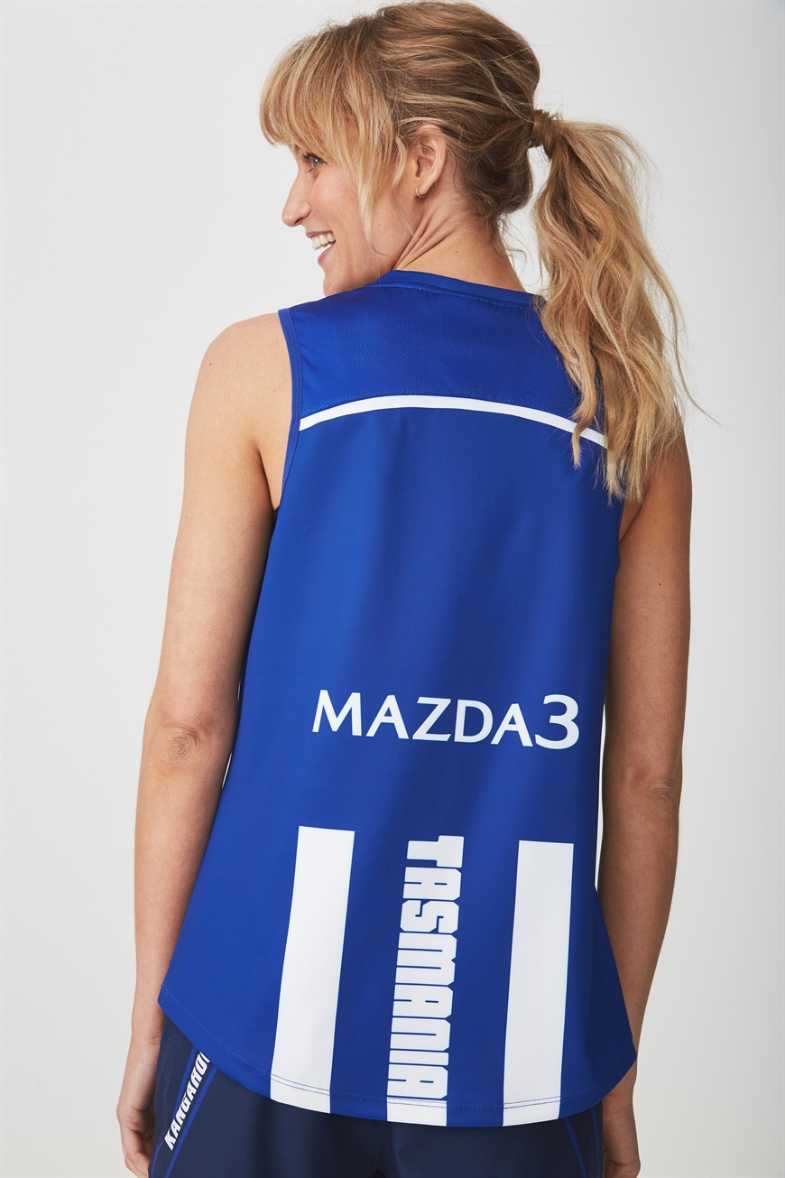
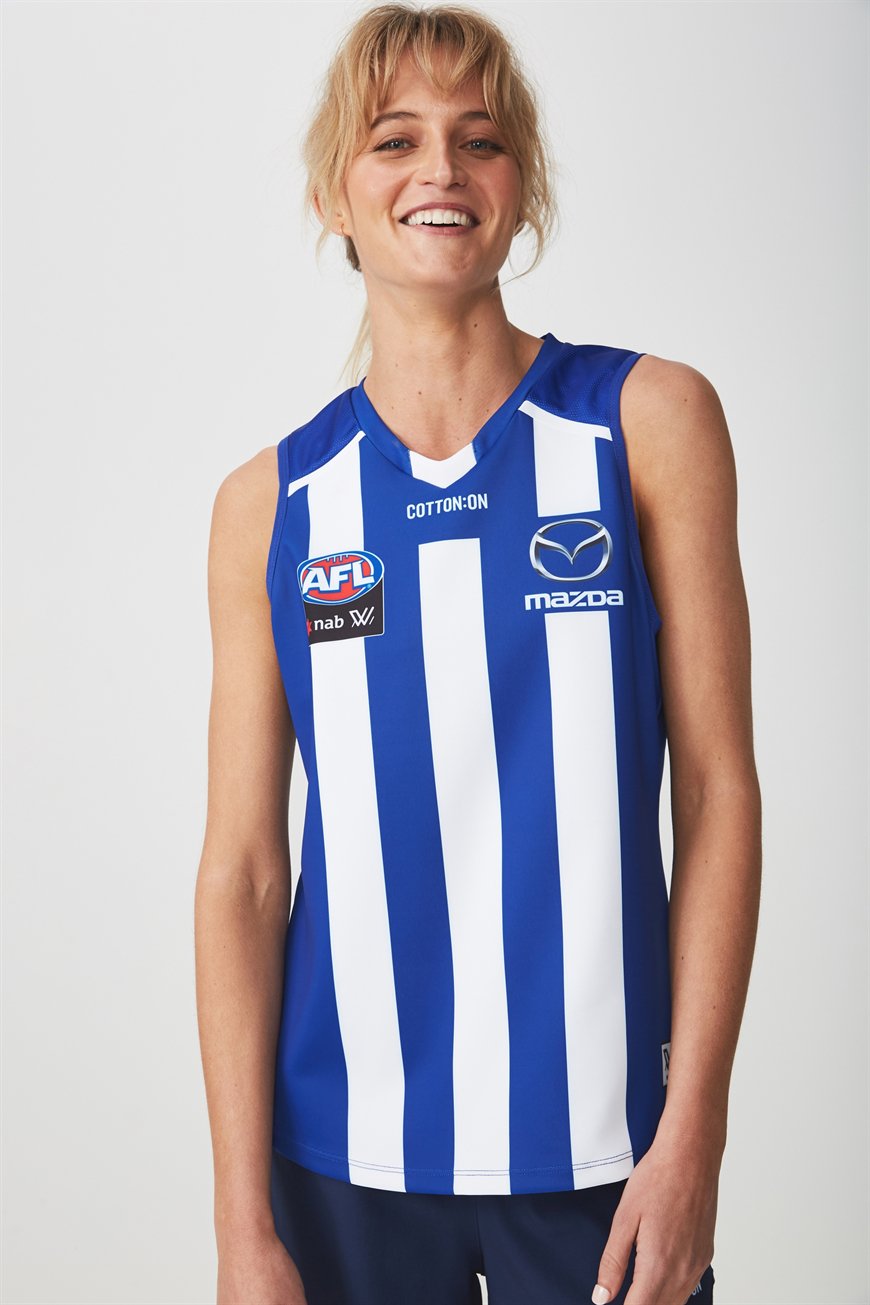
The only club missing from these draft pics is North Melbourne but going off early promo pics, they'll be using something similar to this (but obviously minus the COAR branding).
What do we think, FJGD?
Let's get started with Collingwood who, as of now, have no front sponsor. It appears like they've planned for this by putting the club logo where a sponsor would usually go instead, but it's interesting to see that Holden have dropped off. I guess a lot of the initial sponsorships would have been 2-year deals which is why we should be seeing plenty of change this season.

A closer look at the new collar design that looks like it will be adopted league-wide; the Cotton On contract remaining in place.

Geelong joins and has got Ford on board for the women's side of things too, but the centering of the logo is a disappointment (note the light blue oval remains as well).

Doesn't look like too much has changed here for Carlton except for a lowering off the monogram, which is in line with their VFLW jumper (to fit the front numbers on) but looks stupid here.

Melbourne looks pretty similar.

A lowering of the hoops for Adelaide.

New sponsor for Brisbane.

The Bulldogs get the gold logo but also a significant lowering of the hoops... it does make me wonder if they're going to introduce front numbers in the AFLW?

A brand new design here for the GWS Giants. It sucks, but it utilises orange much more than white. Which can only be a good thing.

Freo looks pretty similar from what I can tell.

View from the back - Demons no longer using the redback but following suit in the men's team, the Cats have weird positioning on their sponsor, Giants' guernsey will be extremely unbalanced with a charcoal back but an orange front.

The only club missing from these draft pics is North Melbourne but going off early promo pics, they'll be using something similar to this (but obviously minus the COAR branding).
What do we think, FJGD?