Competition Agotw12

Remove this Banner Ad

HH1.jpg


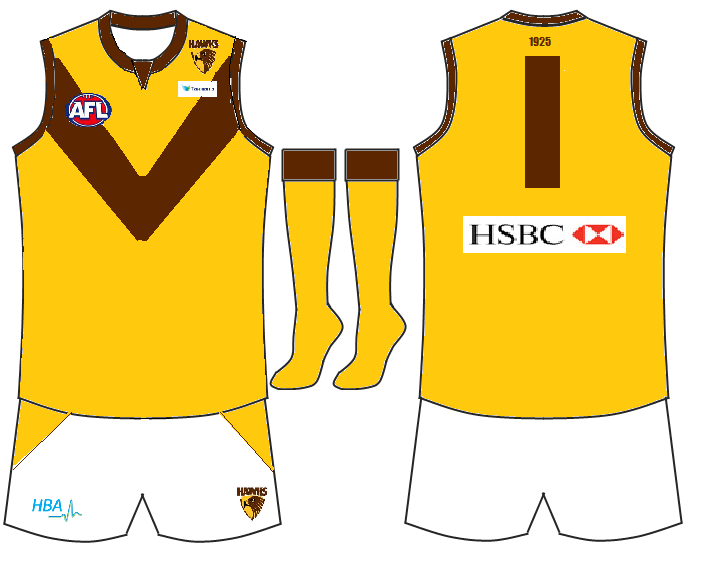
Seeing as the Hawks are trying to take over my country, New Zealand has provided the inspiration for this (my one and only, bloody exams) entry. Hawthorn's traditional gold has been incorporated with New Zealand's Silver and Black to create this snazzy number.
 

Log in to remove this ad.

some very similar ideas here
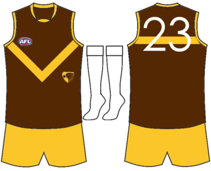
They may be a little similar but there are limited ideas for past Hawthorn guernseys, and they are actually very different, mine is mainly gold (yellow), LEEARMS has a logo on the guernsey, the V is outlined in white and it has white shorts and lastly Marraj1996's guernseys V is lower, there is a line on the back and yellow shorts.
 
They may be a little similar but there are limited ideas for past Hawthorn guernseys, and they are actually very different, mine is mainly gold (yellow), LEEARMS has a logo on the guernsey, the V is outlined in white and it has white shorts and lastly Marraj1996's guernseys V is lower, there is a line on the back and yellow shorts.

How about my design? I used aspects of past Hawthorn jumpers guernsey for something I would call unique and different

http://i426.photobucket.com/albums/pp342/gppato/hawks-away-1.png

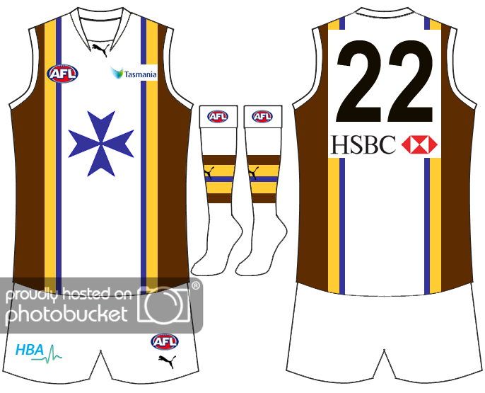
I incorporated the blue Maltese cross from 1873, the blue and gold from 1913 and the brown from the current logo and got the above, I really like how it came out :)

Not that I'm saying it's a bad thing with the similar designs, just pointing it out... I meaning LeeARM has a white outline with the vee which would be called unique to that design.

Murraj1966 uses a yellow vee on brown, and you use a brown vee on yellow. The switching in colours is a settle change, but the brown vee on yellow, might look better to one people, while a yellow vee on brown could work better for another person...

It's nothing, I mean you made a good point with the position on the vee being different, which greatly changes the design... however I feel now I'm just starting to ramble on about nothing, wishing I never brought it up...
 
Yeah I agree mate, I wasn't having a go at you, yeah your guernsey is great, looks a little like a Brisbane Lions guernsey though
 
i was worried about that I was trying of changing to a more chocolate brown, than the current maroon-ish brown...

and I realised you weren't having a good at me, I was kinda stumbling over myself anyway...
 
your guernsey is great, looks a little like a Brisbane Lions guernsey though

i was worried about that I was trying of changing to a more chocolate brown, than the current maroon-ish brown...

http://i426.photobucket.com/albums/...raphics/Footy Jumper designs/hawks-away-1.png

http://i426.photobucket.com/albums/... Graphics/Footy Jumper designs/hawks-away.png

changed the brown slightly in the bottom jumper, changed the yellow to a slightly more faded yellow, kinda darker blue too... which do you think looks better?
 

(Log in to remove this ad.)

Lol don't know how many more times I can handle seeing that design on this page xD
 
decided on this!

hawks-away-0.png

I incorporated the blue Maltese cross from 1873, the blue and gold from 1913 and the brown from the current logo and got the above, I really like how it came out :)


(all the other previous design edits well be made links, so cory knows not to use them)
 

Remove this Banner Ad

Back
Top