News ANZAC day jumpers 2020

Remove this Banner Ad

Collingwood and Essendon to wear ANZAC day jumpers in R5.

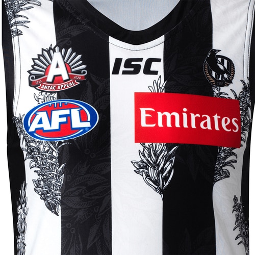
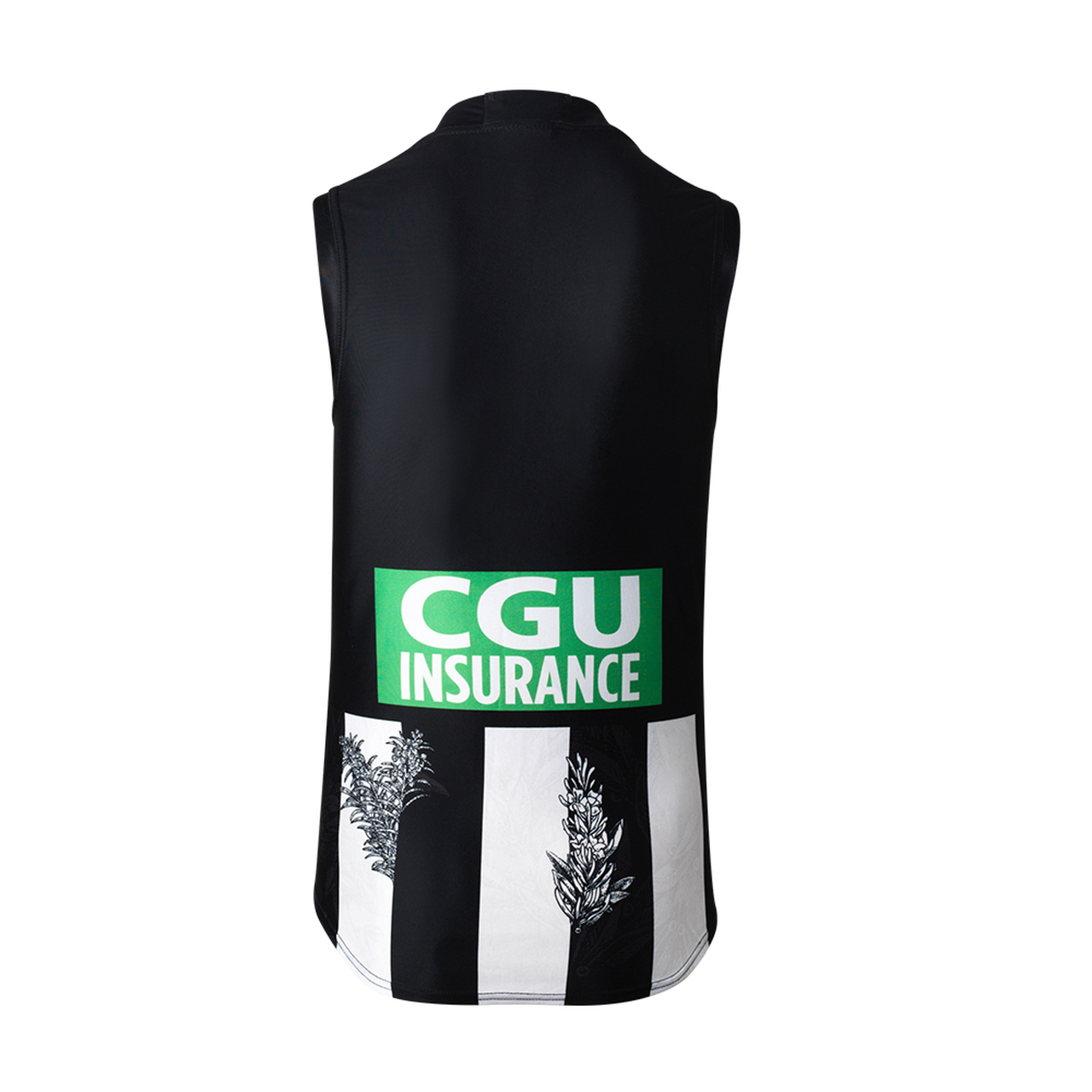
Collingwood's jumper features two different designs of rosemary
  • A black and white design overlaid on white stripe that at times overlaps the black stripe
  • A dark grey larger design on the black stripe.

The 2020 Collingwood ANZAC Appeal guernsey, to be worn next Friday night, was unveiled this morning, featuring rosemary sprigs woven throughout the traditional black and white stripes.

Rosemary holds significance for Australians as it is found growing wild on the Gallipoli peninsula, with small sprigs of rosemary worn on ANZAC Day as a symbol of remembrance and commemoration.

ANZACPI-1__17891.1592869412.jpg
ANZACPI-3__57584.1592869412.jpg
ANZACPI-2__92892.1592869412.jpg


1593131208337.png

1593131272596.png
 
Last edited by a moderator:
Essendon's with their now traditional poppy sash, which is wider this year.


ANZACArtPI1__22927.1592453274.jpg


ANZACArtPI2__50961.1592453268.jpg
ANZACArtPI4__46228.1592453268.jpg
 
Last edited by a moderator:

Log in to remove this ad.

Sad that the Lest we forget poppy will be covered by the sponsor
I would say they won't have the additional sponsor for this kit, as has been seen with the Brisbane and Sydney kits (in the case of the giants Canberra is actually a sponsor)
 
The Essendon jumper is a shocker. The eye is quite obviously drawn straight to the Fujitsu logo – the huge black box is egregious – and the positioning of the AFL/Anzac logos doesn't actually elevate the latter, it just makes it look like a design accident. The last time the AFL logo has been that low on a club jumper would've been the St Kilda crusader of the late 90s.

A misstep.
It would look better with some of the poppys overlapping into the black sponsor boxes instead of being a clean cut.


Also, get ready for another ******* horrible clash. Seriously, telling Essendon and Richmond apart in the old Dreamtime games when they both wore their home guernseys was easier than telling Collingwood and Essendon apart when the Bombers have to wear white shorts.
Even though our away jumper is based on the 1990 jumper I'm surprised we didn't have a white based jumper as a further reference this year.
 
They're both taking the pi55.
These do nothing to honour anyone.
Shutterstock Clip Art designers are probably the only winner.
Grubby attempts to do something different to extra $120 from the punter who has to buy every jumper they release.
 
Last edited:
Same issue with the essendon Anzac kit, as well as the dons/swans heritage kits a couple of years ago. It just looks worse being a wider sash. I prefer these sort of kits over the ones with the digger imagery.but imo wod rather the kit with a simple poppy design element or something that with proper sponsorship integration
 
Essendon's with their now traditional poppy sash, which is wider this year.


ANZACArtPI1__22927.1592453274.jpg


ANZACArtPI2__50961.1592453268.jpg
ANZACArtPI4__46228.1592453268.jpg
This has to be the worst sponsor/logo placement of all time. A giant Fujitsu logo that they have cut a massive box out of the sash to make room for. The black box goes well over the halfway point of the jumper.

Meanwhile, the AFL logo is the lowest I've ever seen because they've awkwardly tried to centre both the ANZAC and AFL logos to the Fujitsu logo.

The black and white A-Mart logo is a big improvement over the blue one but once again, they've cut a strip right through the whole sash to fit it in.

This never used to be an issue, this industry gets more and more amateur at getting the most simple things right.

It's a shame too because the poppy design actually looks really nice. I would have bought one for sure if they didn't ruin it with the logos.
 
Essendon's with their now traditional poppy sash, which is wider this year.


ANZACArtPI1__22927.1592453274.jpg


ANZACArtPI2__50961.1592453268.jpg
ANZACArtPI4__46228.1592453268.jpg
They lowered the AFL logo, instead of having the ANZAC logo higher. Bizarre too.

Just once I'd like to see Essendon, Richmond or Carlton wear an actual clash guernsey against us. Enough of white shorts are enough to differentiate
 
They're both taking the pi55.
These do nothing to honour anyone.
Shutterstock Clip Art designers are probably the only winner.
Grubby attempts to do something different to extra $120 from the punter who has to buy every jumper they release.

Usually I would agree but I noticed this year that ALL profits from Collingwood’s Anzac merch sales are going to the Anzac Appeal, as opposed to previous years where it was only a portion of profits. That, I’m happy with.
 
Collingwood have knocked that out of the park. Cracking jumper.
Essendon's look cheap due to the massive sponsor boxes and the misplaced AFL logo, could just be the photo but it also looks like it is heading towards BLacK territory too.
 

(Log in to remove this ad.)

1593152613439.png
Is anyone able to mock up one where the non-sash red (i.e the main body) in this is replaced with poppies, and the sash is a solid red and a black border of it, so that the sash is distinguised clearly (and it also passes the clubs own rules about it)

Just thinking of coming up with a way that allows them to keep their poppy design going, but is also an effective clash guernsey?
 
Usually I would agree but I noticed this year that ALL profits from Collingwood’s Anzac merch sales are going to the Anzac Appeal, as opposed to previous years where it was only a portion of profits. That, I’m happy with.

I read the same about Essendon’s. If they’re finally doing that I’m ok with it.

In prior years it was a $10 donation per jumper - they didn’t disclose how much it was though, I had to ask them. They just said “proceeds from every sale to the appeal”. I wrote a fair old serve and asked to have it passed on to the appropriate person in the club, hopefully it was.

As for the Essendon sponsor box, this really rings a bell... I’m sure promo shots in prior years have looked just as ridiculous but come gameday, it was smaller and more appropriate.
 
Usually I would agree but I noticed this year that ALL profits from Collingwood’s Anzac merch sales are going to the Anzac Appeal, as opposed to previous years where it was only a portion of profits. That, I’m happy with.
Well, I stand corrected on the distribution.
The designs, however, can get in the bin.
Rosemary twigs look ridiculous on a footy jumper.
I believe more people would purchase a Collingwood jumper with an Anzac logo and perhaps a Poppy than a jumper with twigs all over it.
Similarly with Essendon, a discreet logo and Poppy instead of a sash of poppies.
 
Essendon's with their now traditional poppy sash, which is wider this year.


ANZACArtPI1__22927.1592453274.jpg


ANZACArtPI2__50961.1592453268.jpg
ANZACArtPI4__46228.1592453268.jpg


The Fujitsu logo really dominates the front hey.

Like as if they thought their logo/brand/view precedes any kind of ANZAC sentimentality.

Essendon, just invert FFS.
 
The Fujitsu logo really dominates the front hey.

Like as if they thought their logo/brand/view precedes any kind of ANZAC sentimentality.

Essendon, just invert FFS.
Would be interesting to see what it would look like with the inversion of the logo as part of the sash (whether with the poppy or just plain red).

Even though it is not done as well as it could be done, imo it is a better design then some of the other kits that have been around over the last several years.
 

Remove this Banner Ad

Back
Top