

Honestly thought that looked a little KKK at a glanceayyyy lmao
View attachment 235869
Navigation
Install the app
How to install the app on iOS
Follow along with the video below to see how to install our site as a web app on your home screen.
Note: This feature may not be available in some browsers.
More options
You are using an out of date browser. It may not display this or other websites correctly.
You should upgrade or use an alternative browser.
You should upgrade or use an alternative browser.
Discussion Bad Graphic Design
- Thread starter Jones2ByrneJones
- Start date
- Tagged users None
Was this posted in the competitions thread? Go ahead anyway. You'll never best the masters at afl.com.au.Well given the mods haven't replied (after asking several times over several mediums) and comps need mod approval, then I'm waiting for that.
I
I reckon he does a good job with them. Watched Lingy do it last night and he wasn't too flash....but he's a pain in the arse anywayLike how Ch7 continually send rompingwins out to interview the Auskick kids depite his clear ineptitude with children.
Jones2ByrneJones
Hour of Pessimism
- Jul 27, 2012
- 15,819
- 27,986
- AFL Club
- Port Adelaide
- Thread starter
- #304
I'll make the comp tonight ")
I don't think he'll be going back to that manicuristIs Joel Selwood a leper??
DiamondGuy
Le goûter qui »BANG«
- Sep 25, 2013
- 972
- 2,265
- AFL Club
- Geelong
- Other Teams
- Norwich, St Kilda

Jones2ByrneJones
Hour of Pessimism
- Jul 27, 2012
- 15,819
- 27,986
- AFL Club
- Port Adelaide
- Thread starter
- #308
Nice find!
This is perfect to use as inspiration for the St Kilda/GWS (i.e. Giants) match in this week's Lame Headline/Graphic Competition.
MKMatty
Busy Vibin’
Did someone throw up in the goal square?
DiamondGuy
Le goûter qui »BANG«
- Sep 25, 2013
- 972
- 2,265
- AFL Club
- Geelong
- Other Teams
- Norwich, St Kilda
Did someone throw up in the goal square?
No, that was the day that Tony Shaw shat himself.
Early 90s footy records are a goldmine for bad design jobs like this... I assume it was still the pre-software era and they were prepared by being cut out by hand. It's even more hilarious to me as they are each holding a footy.
So it's not so much bad as it is over-ambitiousNo, that was the day that Tony Shaw shat himself.
Early 90s footy records are a goldmine for bad design jobs like this... I assume it was still the pre-software era and they were prepared by being cut out by hand. It's even more hilarious to me as they are each holding a footy.
- Moderator
- #312
It's even more hilarious to me as they are each holding a footy.
~MULTIBALL~
Not a bad price of graphic design at all, but I thought id share if anyway. This is the shopfront of my local TAB. Does the design on the AFL Guernsey look familiar?

It's literally the Swans uniform, photoshopped blue. There's a touch of red still present on the back where the white meets the back

It's literally the Swans uniform, photoshopped blue. There's a touch of red still present on the back where the white meets the back
- Jan 29, 2007
- 912
- 1,175
- AFL Club
- Melbourne
Not a bad price of graphic design at all, but I thought id share if anyway. This is the shopfront of my local TAB. Does the design on the AFL Guernsey look familiar?
View attachment 237766
It's literally the Swans uniform, photoshopped blue. There's a touch of red still present on the back where the white meets the back
The interesting part is that bloke looks nothing like Adam Goodes which is clearly who the original photo is of.
Jones2ByrneJones
Hour of Pessimism
- Jul 27, 2012
- 15,819
- 27,986
- AFL Club
- Port Adelaide
- Thread starter
- #315
It's also mirrored. The jock tag on the left-hand-side being the give away. The obscured ISC logo on the jock tag is also clearly backwards.
MKMatty
Busy Vibin’
For * sake.


There's really not much objectively 'bad' about that - it's just unbelievably tacky.
DiamondGuy
Le goûter qui »BANG«
- Sep 25, 2013
- 972
- 2,265
- AFL Club
- Geelong
- Other Teams
- Norwich, St Kilda

Had a giggle on that one.
- Moderator
- #320
I don't know why it only seems to be betting agencies that blur out logos
- Moderator
- #322
How good is his arm, though?
Jack Stevens
#2 Ticket Holder
Could be to stop club sponsors kicking up a fuss about being used in gambling advertising. The AFL are also pretty funny about letting anyone who isn't paying them through the nose for exclusive rights using their copyright.
Javelin
All Australian
- Jun 6, 2013
- 849
- 1,116
- AFL Club
- West Coast
Does that make it racist?The interesting part is that bloke looks nothing like Adam Goodes which is clearly who the original photo is of.
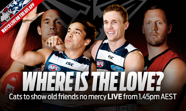
 Umming and ahhing about whether this belongs in the lame headline/graphic thread but I reckon here is more suitable. What is going on with his hand?
Similar threads
- Replies
- 8
- Views
- 541
