Navigation
Install the app
How to install the app on iOS
Follow along with the video below to see how to install our site as a web app on your home screen.
Note: This feature may not be available in some browsers.
More options


You are using an out of date browser. It may not display this or other websites correctly.
You should upgrade or use an alternative browser.
You should upgrade or use an alternative browser.
Discussion Bad Graphic Design
- Thread starter Jones2ByrneJones
- Start date
- Tagged users None

fancyscum
Radical Crommunist
So bad, what year are we living in again? 1998?
Who wants to make a list of everything wrong with this?
Dav
Hotel? Trivago.
So bad, what year are we living in again? 1998?
I have literally no idea how it's meant to be aesthetically pleasing.
I think we'd exceed the post limit tbhWho wants to make a list of everything wrong with this?
fancyscum
Radical Crommunist
It isn't the best on its own, but when combined with all the other arcade style elements, it works quite well imo.I have literally no idea how it's meant to be aesthetically pleasing.
Dav
Hotel? Trivago.
It isn't the best on its own, but when combined with all the other arcade style elements, it works quite well imo.
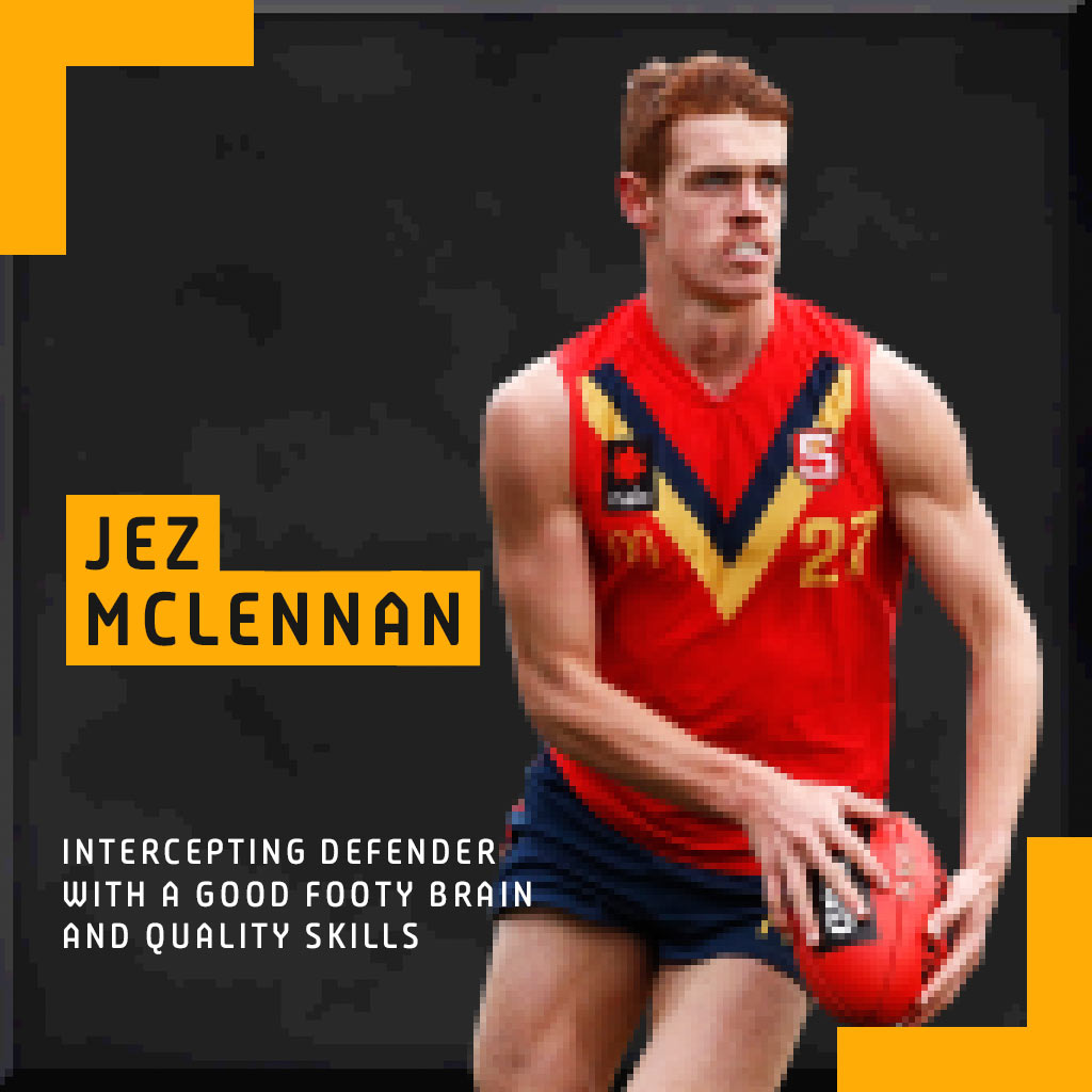
Yeah but the pixellated player makes zero sense to me.
- Mar 23, 2007
- 34,930
- 23,534
- AFL Club
- Hawthorn
- Other Teams
- Man U, Canucks and 49ers
Who wants to make a list of everything wrong with this?
Sorry, it’s not a long weekend. Not enough time...
The Half Back
BC Approved
Does anyone remember the AFL game on iphone, where you had to run to intercept the ball and kick goals etc?
Reminds me of that.

Not a major one, having two different Ms is a bit irritating. I actually like the look of the font they’ve gone with, but it’s old that the different Ms even made the cut.
cosimo
Debutant
Di
Different ‘a’ used too, very odd...
View attachment 582407
Not a major one, having two different Ms is a bit irritating. I actually like the look of the font they’ve gone with, but it’s old that the different Ms even made the cut.
Different ‘a’ used too, very odd...
- Aug 27, 2007
- 13,129
- 11,287
- AFL Club
- Fremantle
- Other Teams
- Everton_East Freo_Atalanta_Tranmere
And different 'R's
And I don't mind it tbh
The red 2020 gets lost in the busy lights of the background image
And I don't mind it tbh
The red 2020 gets lost in the busy lights of the background image
DiamondGuy
Le goûter qui »BANG«
- Sep 25, 2013
- 972
- 2,265
- AFL Club
- Geelong
- Other Teams
- Norwich, St Kilda

Javelin
All Australian
- Jun 6, 2013
- 849
- 1,116
- AFL Club
- West Coast
That's an awfully reflective table!
- Aug 27, 2007
- 13,129
- 11,287
- AFL Club
- Fremantle
- Other Teams
- Everton_East Freo_Atalanta_Tranmere
His left arm looks a bit oddly etched
Am I missing something?
Am I missing something?
- Moderator
- #793
I've seen much worse
- Nov 15, 2010
- 2,409
- 2,157
- AFL Club
- Fremantle
- Other Teams
- WACA, Western Force, Arsenal, Glory
It says "final" you perverts


Javelin
All Australian
- Jun 6, 2013
- 849
- 1,116
- AFL Club
- West Coast
The gradient in the "L" annoys me
cannavo
LFG #16

- Aug 27, 2007
- 13,129
- 11,287
- AFL Club
- Fremantle
- Other Teams
- Everton_East Freo_Atalanta_Tranmere
Dat transparency in the Sydney logo tho
Plus they probably should have used the Mariners logo with the black outline + black text
There's more, but the Sydney logo is the main one
Plus they probably should have used the Mariners logo with the black outline + black text
There's more, but the Sydney logo is the main one
Sparkle
Simpson for Strawberry
Dat transparency in the Sydney logo tho
Plus they probably should have used the Mariners logo with the black outline + black text
There's more, but the Sydney logo is the main one
I think the Mariners logo is the right choice, the black would be too dark. Just the lousy transparency effort on the Sydney FC logo that I noticed
Javelin
All Australian
- Jun 6, 2013
- 849
- 1,116
- AFL Club
- West Coast
The horse hooves at the top seems out of place, given there's not really any other reference to racing.
The horse hooves at the top seems out of place, given there's not really any other reference to racing.
Except that TEG is a race track.
Similar threads
- Replies
- 8
- Views
- 538
