
Secular St Kilda
Navigation
Install the app
How to install the app on iOS
Follow along with the video below to see how to install our site as a web app on your home screen.
Note: This feature may not be available in some browsers.
More options
You are using an out of date browser. It may not display this or other websites correctly.
You should upgrade or use an alternative browser.
You should upgrade or use an alternative browser.
Discussion Bad Graphic Design
- Thread starter Jones2ByrneJones
- Start date
- Tagged users None

Transparent port logo number 164729
fancyscum
Radical Crommunist
I don't mind the port logo being transparent, the real issue for me is that the port logo pretty much touches the V and the Richmond one is miles away.View attachment 653611
Transparent port logo number 164729
Javelin
All Australian
- Jun 6, 2013
- 849
- 1,116
- AFL Club
- West Coast
Agreed, the transparency in this image isn't so bad due to the dark background and the fact the transparency is consistent throughout the whole logo. To the casual observer they might not even register it's transparent.I don't mind the port logo being transparent, the real issue for me is that the port logo pretty much touches the V and the Richmond one is miles away.
caloschwaby
Whisper
- Jan 3, 2017
- 4,842
- 6,455
- AFL Club
- Collingwood

- Other Teams
- Celtics, Renegades, Packers
Not overall horrible, but a few anomalies...
- Aug 27, 2007
- 13,125
- 11,284
- AFL Club
- Fremantle
- Other Teams
- Everton_East Freo_Atalanta_Tranmere
YES. NO. YES. MAYBE. YES. NO. YES. NO. YES.
NO. NO. YES. NO. YES. YES. YES. NO. NO. NO.
Also they didn't even bother properly alphabetising it. People read left to right, top to bottom.
They ordered ABCCEFPRSGGGHMNSWW
They stopped at Freo, then dropped down to the second line to continue at Geelong, then went from North back up to Port.YES. NO. YES. MAYBE. YES. NO. YES. NO. YES.
NO. NO. YES. NO. YES. YES. YES. NO. NO. NO.
Also they didn't even bother properly alphabetising it. People read left to right, top to bottom.
They ordered ABCCEFPRSGGGHMNSWW
Waddafak
- May 25, 2009
- 4,014
- 2,765
- AFL Club
- Port Adelaide
I remember last season there was and ad on Channel 7 for the West Coast vs someone and 7 used the old Eagle head logo.Having worked in this environment it's pretty common to see misuse of logos (dark outlined text/objects on logos on dark backgrounds is a rookie mistake)
I usually just put all the 'old' versions of logos in a folder simply called 'old' and just keep the current ones in there
I've noticed even foxtel use old version of AFL/A-League clubs a lot. All it takes is for the club to be like 'look here guys. you have been using our old logo. please delete all versions on file and use the attached' and send them the various versions of the current logo in print/digital format
PLUS i know for a fact anytime a club (or any organisation) re-brands it logo, they send a new suite to all media outlets/clubs/associations etc that would use their logo and even in some cases a style guide
Sent from my SM-G930F using Tapatalk
YES. NO. YES. MAYBE. YES. NO. YES. NO. YES.
NO. NO. YES. NO. YES. YES. YES. NO. NO. NO.
Also they didn't even bother properly alphabetising it. People read left to right, top to bottom.
They ordered ABCCEFPRSGGGHMNSWW
They stopped at Freo, then dropped down to the second line to continue at Geelong, then went from North back up to Port.
Waddafak
Looks to me like they've taken an existing image of all 18 logos together and altered it to fit their banner. All logos are the "dark background" version, and I reckon the original had three lines of six clubs, but they've cut up the bottom line and added it to the sides.
")

Michael Scarn
Club Legend

- Oct 27, 2016
- 5,938
- 10,623
- AFL Club
- Collingwood
- Other Teams
- Packers, Raptors, Renegades
PREM1ER D1V1S1ON
Michael Scarn
Club Legend
Nelson defeated Alexander
- Jan 16, 2019
- 794
- 957
- AFL Club
- West Coast
is that kyle remiers
Michael Scarn
Club Legend
is that kyle remiers
Yep. Kicked 7 for Aberfeldie the other day
Michael Scarn
Club Legend
Warren Tredrea must be trying to get a job for Willy Wonka
SaadyArmy
Team Captain
- Jan 31, 2017
- 357
- 389
- AFL Club
- Gold Coast
DiamondGuy
Le goûter qui »BANG«
- Sep 25, 2013
- 972
- 2,265
- AFL Club
- Geelong
- Other Teams
- Norwich, St Kilda
They've botched about half of the surfboards for the charity auction on the 360 show. The Power one is navy!


DiamondGuy
Le goûter qui »BANG«
- Sep 25, 2013
- 972
- 2,265
- AFL Club
- Geelong
- Other Teams
- Norwich, St Kilda
- Moderator
- #873
Funnily enough, the club is guilty of it themselves. I noticed this the other day. If you zoom in on the favicon.ico on the westernbulldogs.com.au website, you get this:

- Aug 27, 2007
- 13,125
- 11,284
- AFL Club
- Fremantle
- Other Teams
- Everton_East Freo_Atalanta_Tranmere
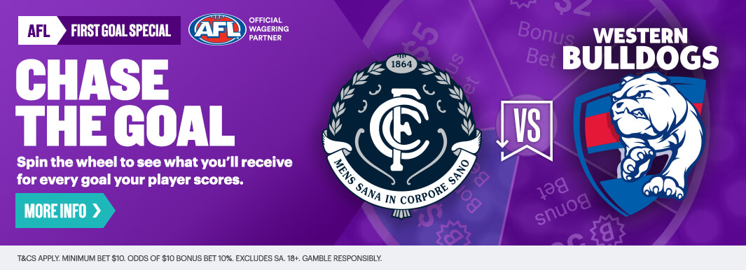
Looks like they used the CMYK transparent background version for the chase the goal ad. No way is that RGB
Pump's attempt to incorporate every teams design onto their water bottles has given a QLD woman the literal shits
https://www.dailymail.co.uk/news/ar...ng-nasty-rash-drank-mouldy-bottled-water.html
https://www.dailymail.co.uk/news/ar...ng-nasty-rash-drank-mouldy-bottled-water.html
Similar threads
- Replies
- 8
- Views
- 527
