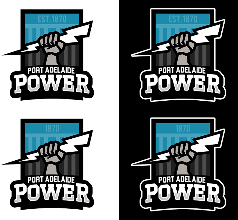
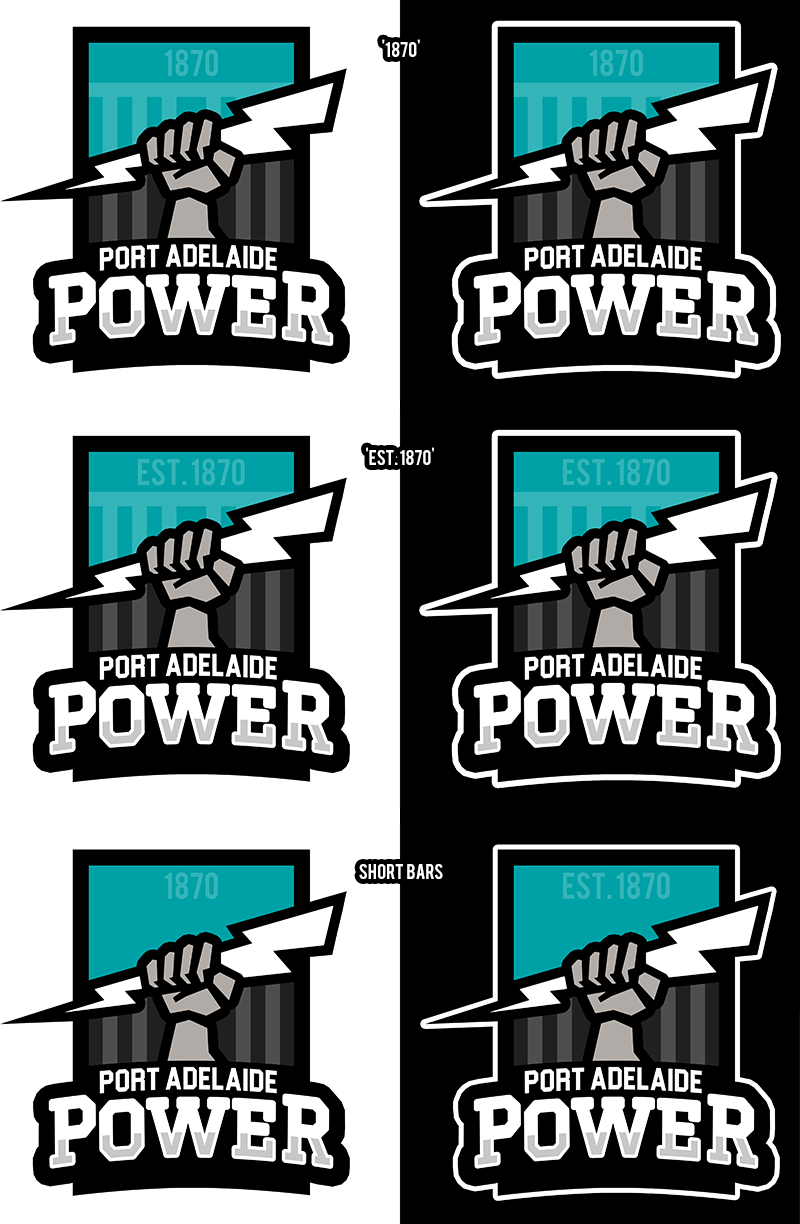
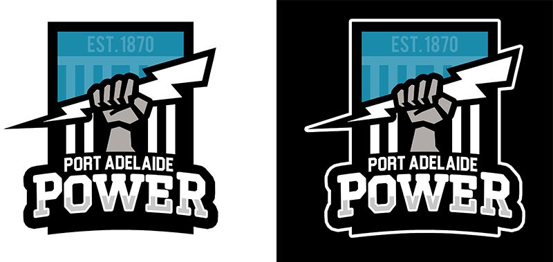
I think it's okay but gee it's unconventional. A straight up rectangle shape is rarely if ever seen in a sports logo, it's asymmetrical, it doesn't even have reference to Port or Port Adelaide on it which is a core part of our brand and the fist holding a lightning bolt is novel but demonstrates a misunderstanding/confusion of what exactly our nickname is about.
Melbourne have improved theirs, but when you look at them as a Whole, ours is pretty decent....apart from POWER.
If we ever move on I hope we rectify those bits. I tried with a familiar rectangle based shield and a big PORT wordmark, and I did away with the imagery related to the word "power". IMO, if we were to include imagery about power, it would have to be lightning. It looks cooler and we've actually used it on guernseys, etc, where the fist hasn't been used at all as a standalone symbol.
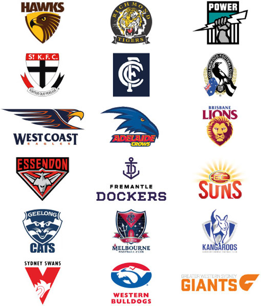
PS a few of those are wrong. Richmond, Carlton, Fremantle, Melbourne and the Bulldogs have different logos.