Navigation
Install the app
How to install the app on iOS
Follow along with the video below to see how to install our site as a web app on your home screen.
Note: This feature may not be available in some browsers.
More options


You are using an out of date browser. It may not display this or other websites correctly.
You should upgrade or use an alternative browser.
You should upgrade or use an alternative browser.
BLK Clash Guernsey
- Thread starter woundedcrow
- Start date
- Tagged users None
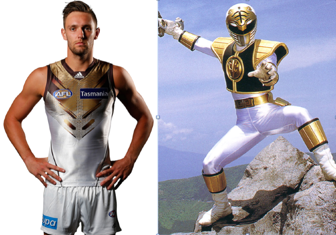
You blokes reckon ours is bad.

- May 7, 2007
- 5,109
- 6,047
- AFL Club
- Adelaide
Surely we wont use it against the pies????
It will be a lot more of a clash than our normal jumper.
It will be a lot more of a clash than our normal jumper.
Justinpa1
Club Legend
- Oct 21, 2013
- 1,245
- 1,643
- AFL Club
- Adelaide
- Other Teams
- Norwood Redlegs, Liverpool FC,49ers
Me Too, but why we are wearing a white jumper against black and white just doesn't make any sense.
Both jumpers will clash more tomorrow rather than less like our home jumper with white shorts would!
But of course the clowns at AFL HQ know best!
Both jumpers will clash more tomorrow rather than less like our home jumper with white shorts would!
But of course the clowns at AFL HQ know best!
Dean1
All Australian
- Jan 4, 2015
- 614
- 457
- AFL Club
- Adelaide
Probably because Collingwood now wear a mostly black.Me Too, but why we are wearing a white jumper against black and white just doesn't make any sense.
Both jumpers will clash more tomorrow rather than less like our home jumper with white shorts would!
But of course the clowns at AFL HQ know best!
If Carlton v Richmond can get away with black v blue so should we!
As the Crows, a South Australian side, we must wear an away jumper whether it's needed or not. VFL policy
We wore white against them late last year at the G, the club has already announced they will wear white, or directed to, to be frank.
This is one of those games tho' where it makes sense for Adelaide to wear home jumper AND shorts and Collingwood to wear their white shorts like Geelong often do in home games.
I did tweet to the club that they need to grow a set and just say no and push back. Look at the Port v Rich AO final.
This is one of those games tho' where it makes sense for Adelaide to wear home jumper AND shorts and Collingwood to wear their white shorts like Geelong often do in home games.
I did tweet to the club that they need to grow a set and just say no and push back. Look at the Port v Rich AO final.
As the Crows, a South Australian side, we must wear an away jumper whether it's needed or not. VFL policy
We should just start ignoring that. That's what clubs with 60,000 members are allowed to do, right?
Justinpa1
Club Legend
- Oct 21, 2013
- 1,245
- 1,643
- AFL Club
- Adelaide
- Other Teams
- Norwood Redlegs, Liverpool FC,49ers
Last year when we played them at the G it was quite hard to tell the difference between the two guernseys and we had more colour on our strip last year than this years one.
Smoooothy
SACK THE LOT OF THEM!
- Jan 12, 2005
- 24,312
- 22,283
- AFL Club
- Adelaide
- Other Teams
- North Adelaide; ConeyIslandWarriors
almost guarantee we will beSurely we wont use it against the pies????
It will be a lot more of a clash than our normal jumper.
- Jul 25, 2010
- 32,674
- 18,767
- AFL Club
- Adelaide
- Other Teams
- Golden State Warriors NBA Champions
You blokes reckon ours is bad.
That is a dead set Barry Crocker.
You blokes reckon ours is bad.
You can do what you want when you are winning.
ClearlyYou can do what you want when you are winning.
How many times do we wear the clash jumper this year?
I saw that the abomination that is the Hawks clash jumper will be on show 3 times (yes only 3) ... how often do we pull on the claw marks?
I saw that the abomination that is the Hawks clash jumper will be on show 3 times (yes only 3) ... how often do we pull on the claw marks?
How many times do we wear the clash jumper this year?
I saw that the abomination that is the Hawks clash jumper will be on show 3 times (yes only 3) ... how often do we pull on the claw marks?
Going from recent history, 8 times.
Actually, if Port wear their showdown jumper with white shorts and Geelong wear white shorts against us, we won't wear our home jumper with white shorts this year.
Justinpa1
Club Legend
- Oct 21, 2013
- 1,245
- 1,643
- AFL Club
- Adelaide
- Other Teams
- Norwood Redlegs, Liverpool FC,49ers
The away Guernsey looks quite good on TV, I know the colours on the slashes are a bit brighter than our colours but the jumper looks good on the boys
The away Guernsey looks quite good on TV, I know the colours on the slashes are a bit brighter than our colours but the jumper looks good on the boys
Yeah I was going to say I haven't even noticed the guernsey since we are winning but I actually don't mind it at all. Not something I will complain about but hopefully the next one pleases more people I guess.
- Mar 20, 2013
- 4,948
- 4,982
- AFL Club
- Adelaide
N
The really dark blue socks not matching the blue elsewhere though looks a bit odd (and the design on the socks is horrid)
Strange we wore those socks against their black socks
ot as bad as expected.Yeah I was going to say I haven't even noticed the guernsey since we are winning but I actually don't mind it at all. Not something I will complain about but hopefully the next one pleases more people I guess.
The really dark blue socks not matching the blue elsewhere though looks a bit odd (and the design on the socks is horrid)
Strange we wore those socks against their black socks
Dean1
All Australian
- Jan 4, 2015
- 614
- 457
- AFL Club
- Adelaide
You can barely see the yellow on the front as it gets bunched up towards the bottomN
ot as bad as expected.
The really dark blue socks not matching the blue elsewhere though looks a bit odd (and the design on the socks is horrid)
Strange we wore those socks against their black socks
mort0089
Team Captain
Sorry. I hated it, thought it looked awful. It needs to go.The away Guernsey looks quite good on TV, I know the colours on the slashes are a bit brighter than our colours but the jumper looks good on the boys
I kind of liked it.
Is far better than our last two away jumpers.
The socks are a bit odd though.
Is far better than our last two away jumpers.
The socks are a bit odd though.
The socks are crap. And looking side on at the guernsey it has a weird bluish tinge towards the bottom of it, like the wierd royal blue ran in the wash.
I don't like it, mostly because the socks and the guernsey both have navy on them which makes the royal blue looks so much worse.
I don't like it, mostly because the socks and the guernsey both have navy on them which makes the royal blue looks so much worse.
Long Shanks
Senior List
- Aug 19, 2013
- 274
- 286
- AFL Club
- Adelaide
Anything would look better than that art class accident that was our last away jumper.
When I first saw pics of our new jumper I didn't mind it but it doesn't look as good on the players.
Oh and what the hell is with those socks!
When I first saw pics of our new jumper I didn't mind it but it doesn't look as good on the players.
Oh and what the hell is with those socks!
Similar threads
- Replies
- 17
- Views
- 1K
