


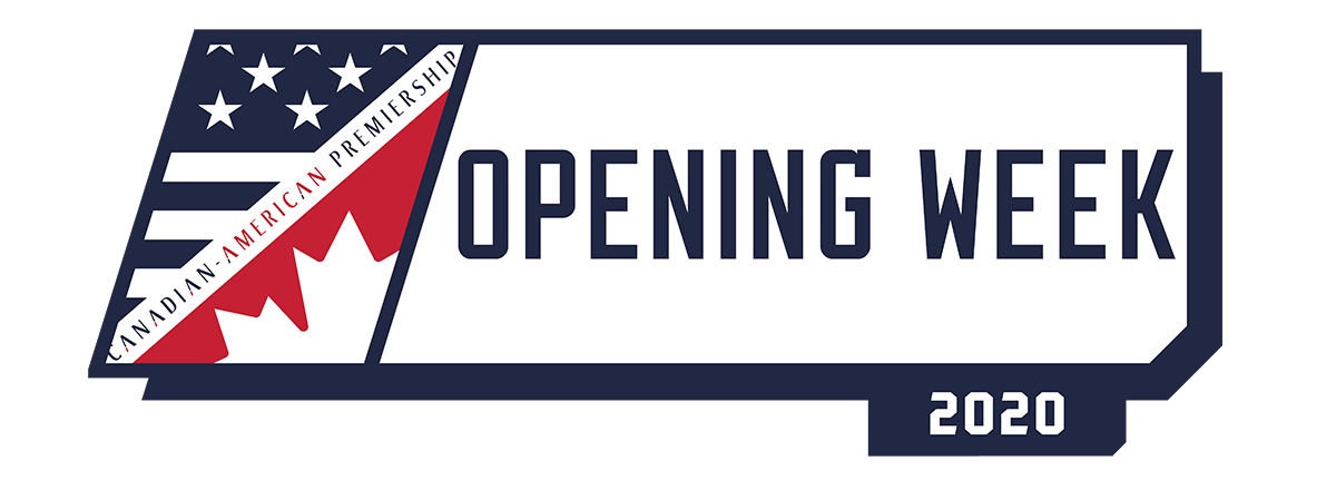
Welcome to Week 1 of the 2020 Canadian-American Premiership. This weeks Big Ticket game features the rebranded Houston visiting Pittsburgh.
Please vote once in each match (unless you are playing in it) and make sure you do not vote for yourself.
Eastern Conference
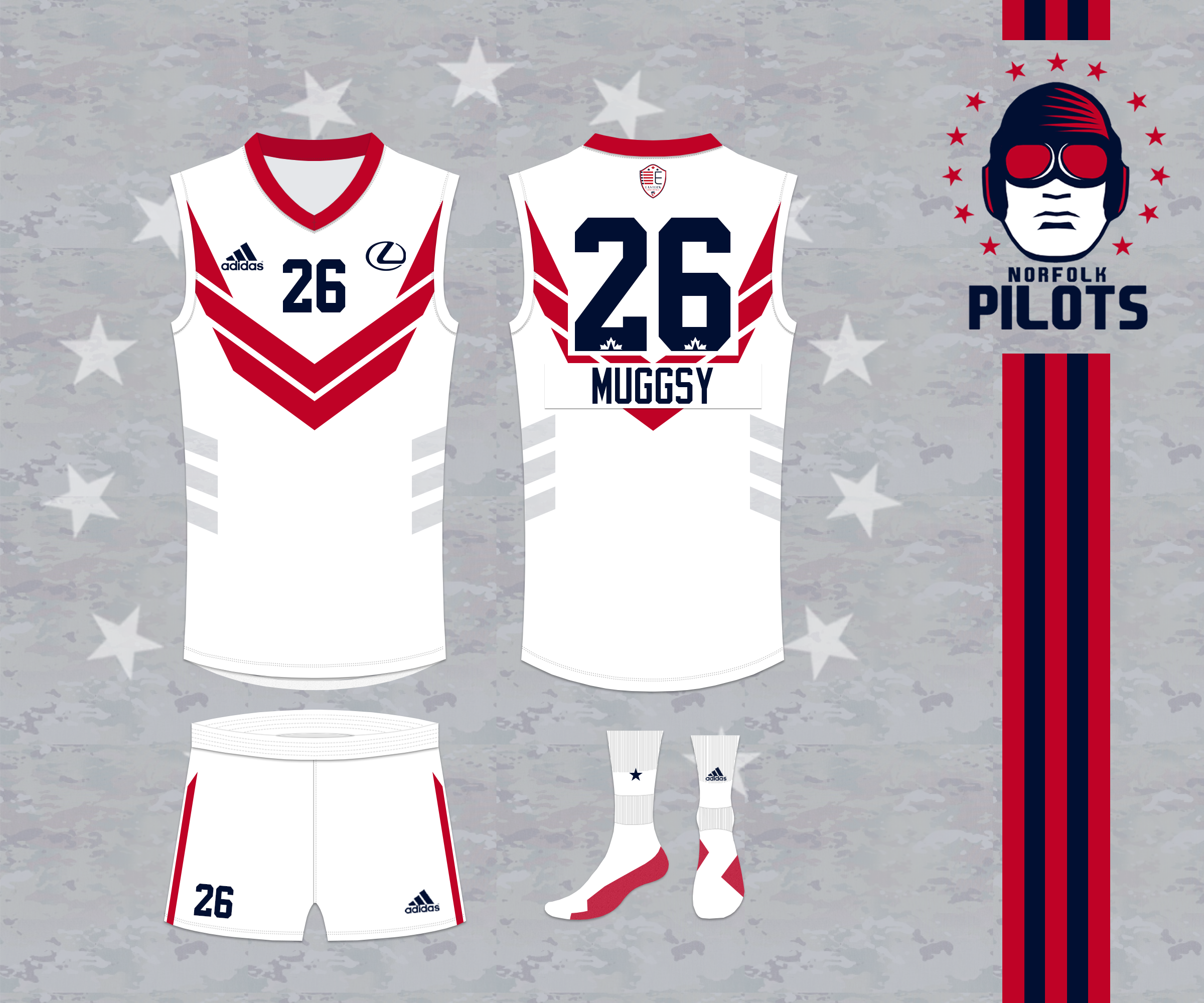
Charlotte Lightning
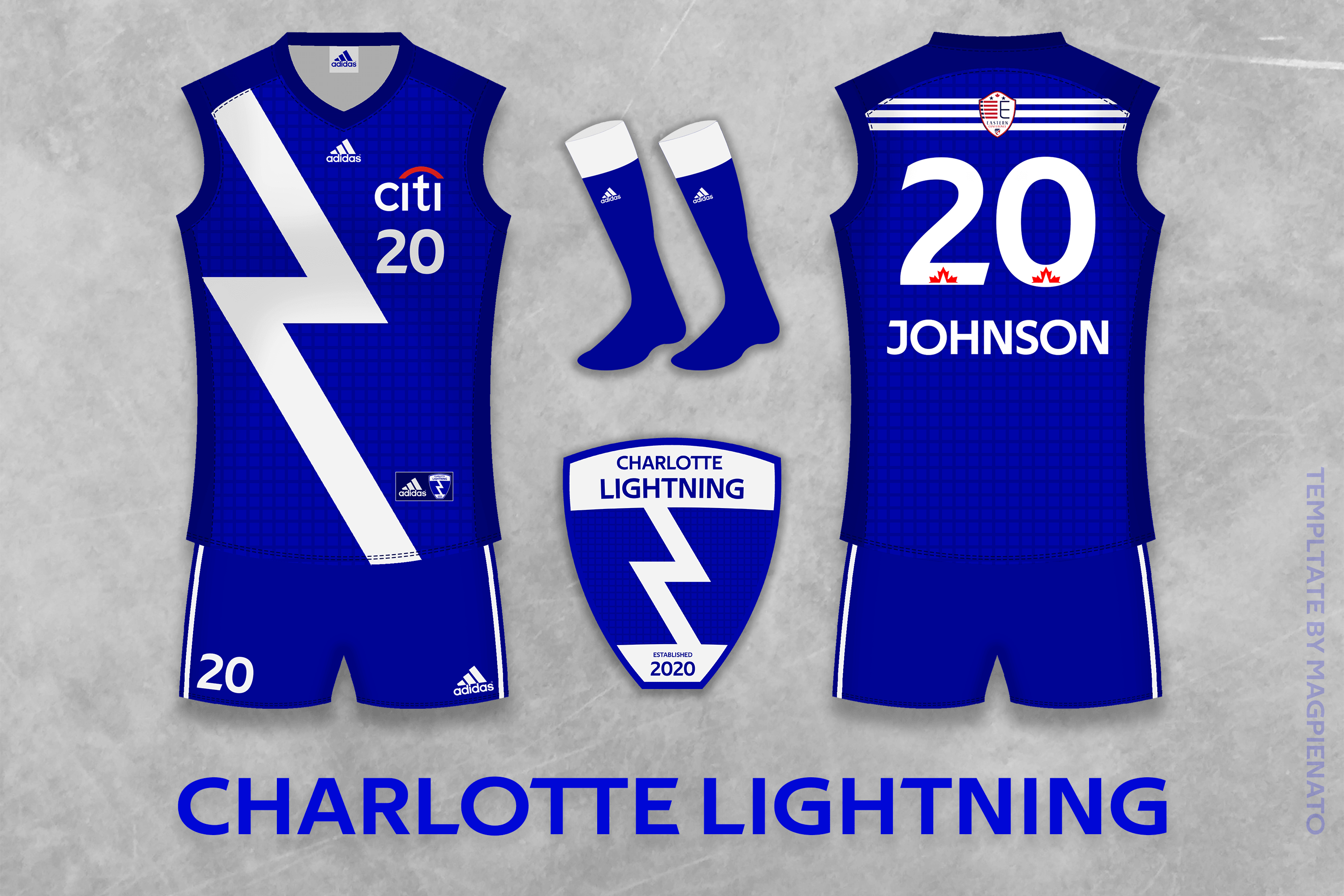
@ Norfolk Pilots
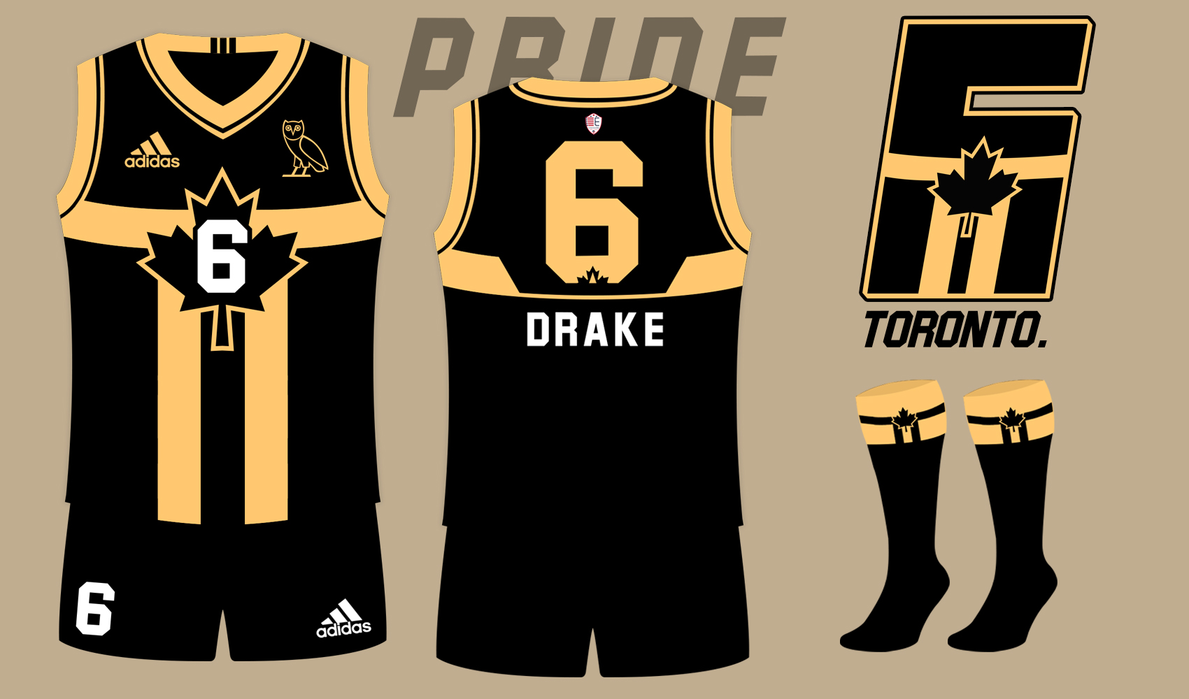
Toronto Sixers
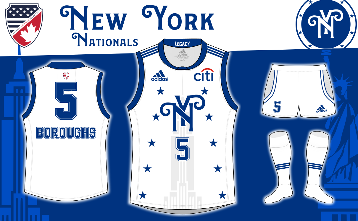
@ New York Nationals
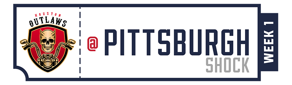
Houston Outlaws
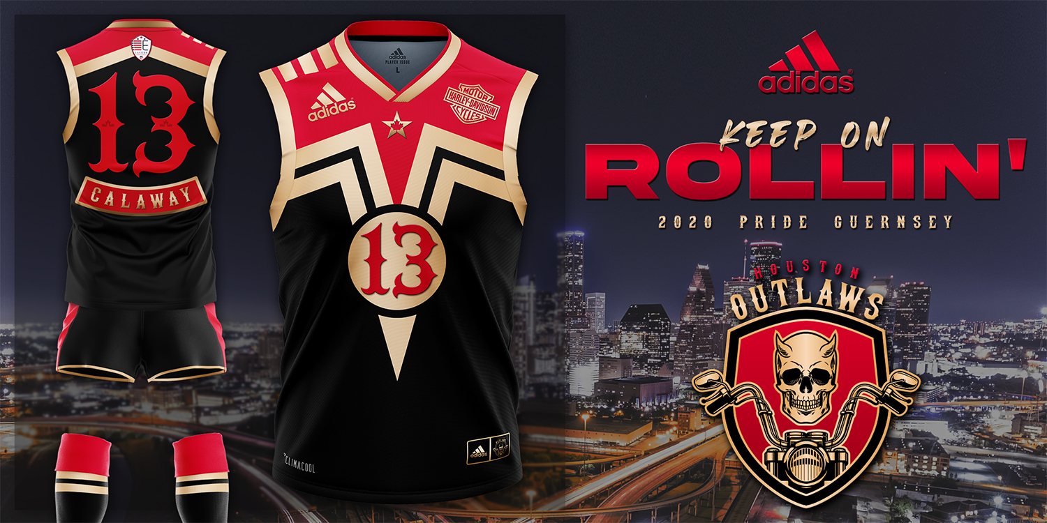
@ Pittsburgh Shock

Wisconsin Wild
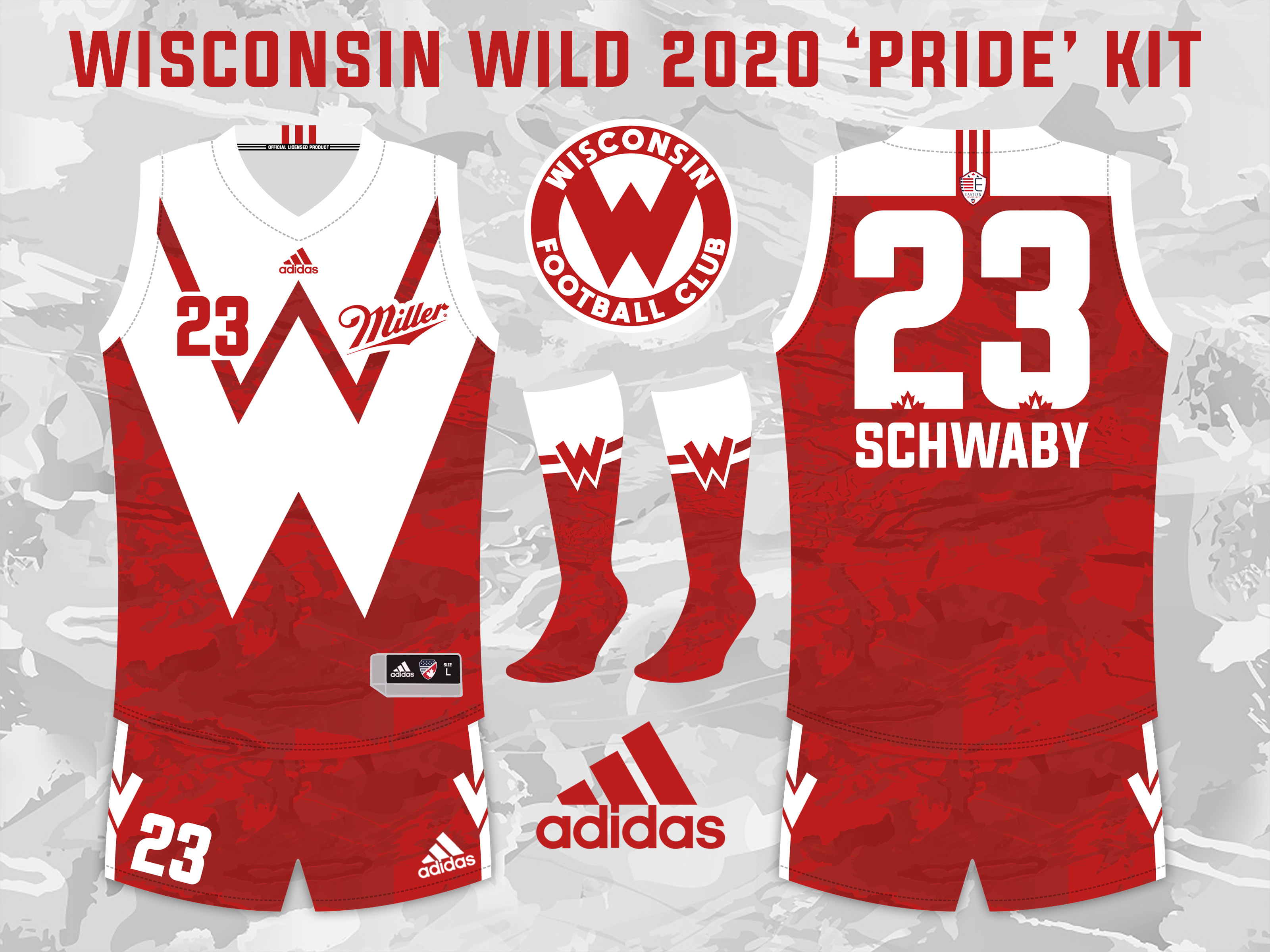
@ Indiana Bluebirds

Western Conference
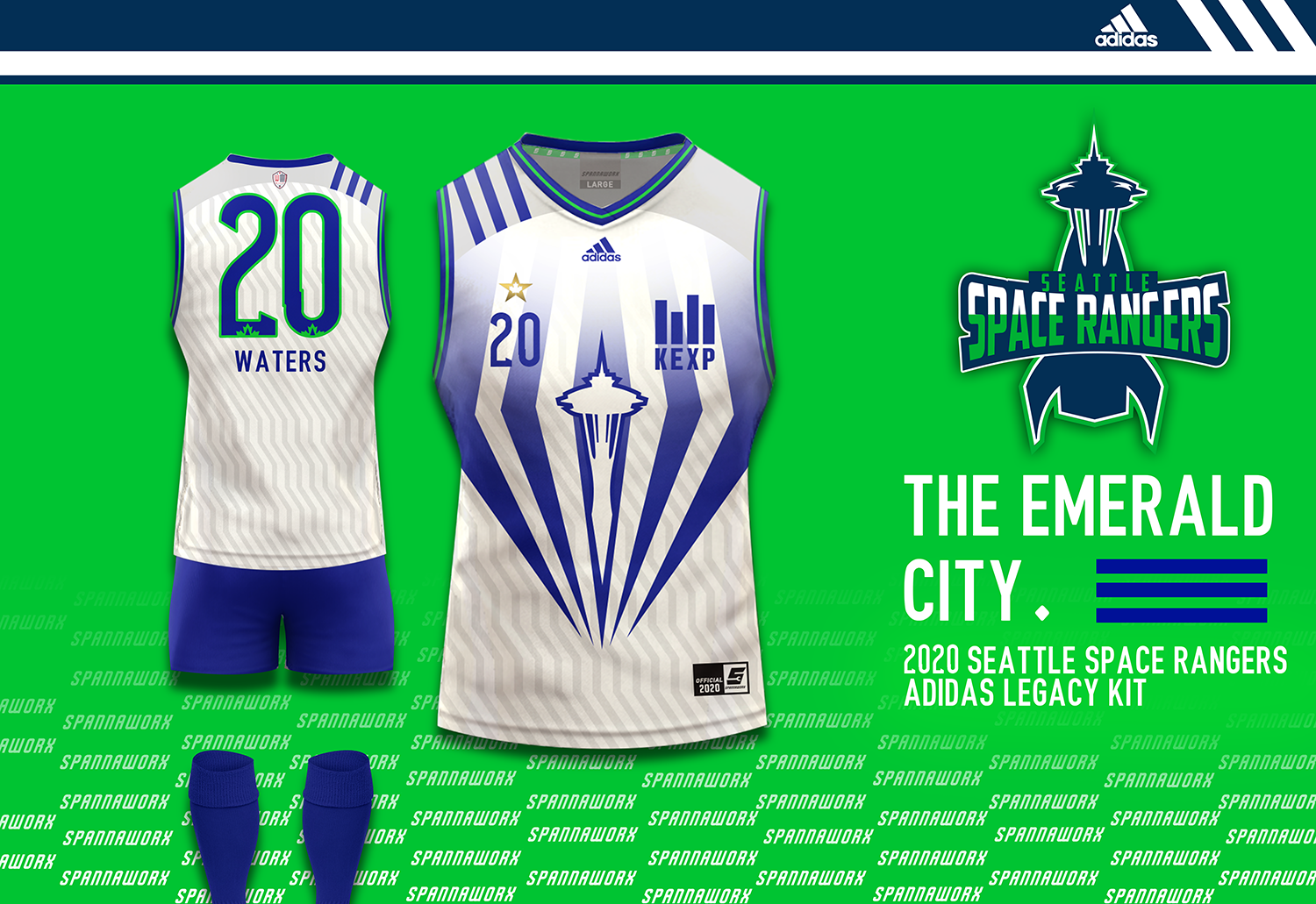
Las Vegas High Rollers
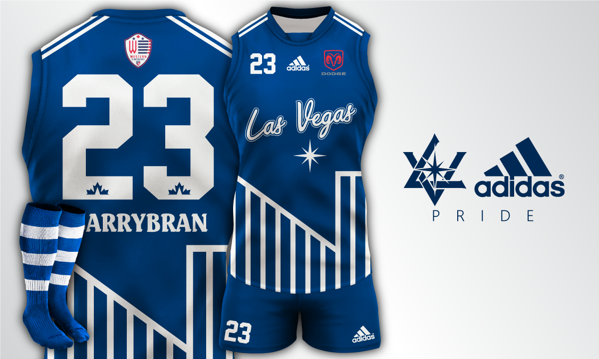
@ Seattle Space Rangers
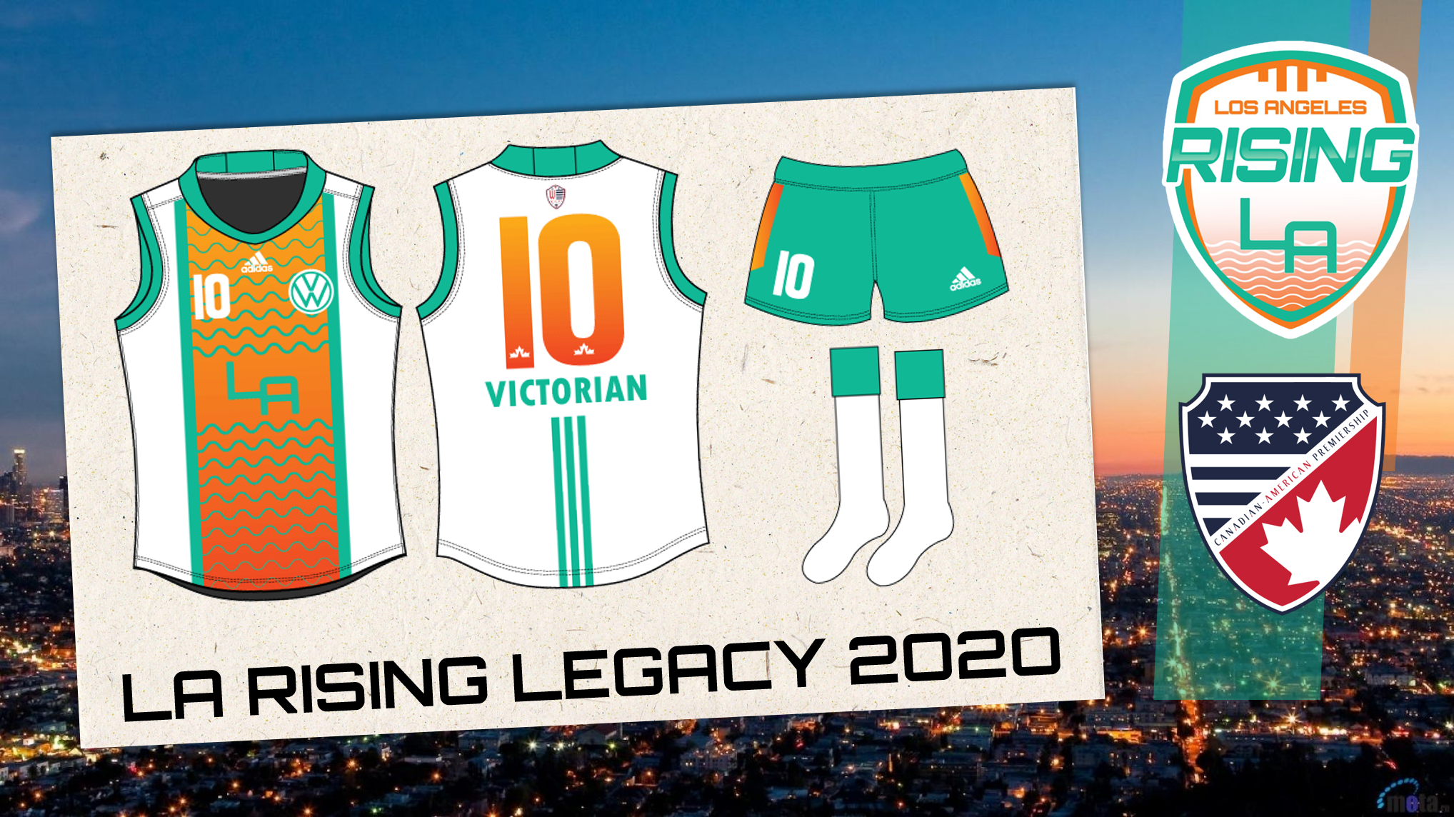
Vancouver Valhallan

@ Los Angeles Rising
Calgary Wolves
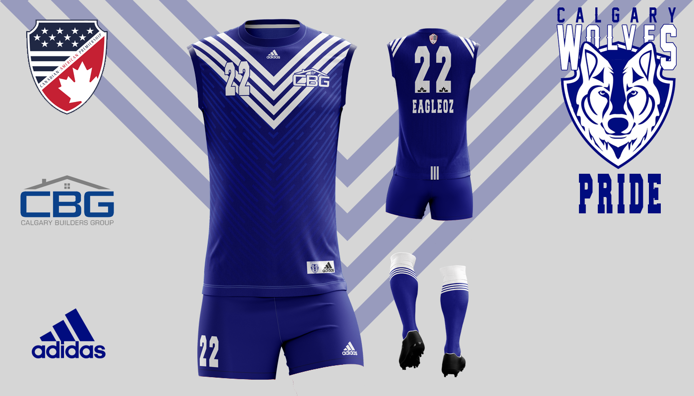
@ Kansas City Buffaloes
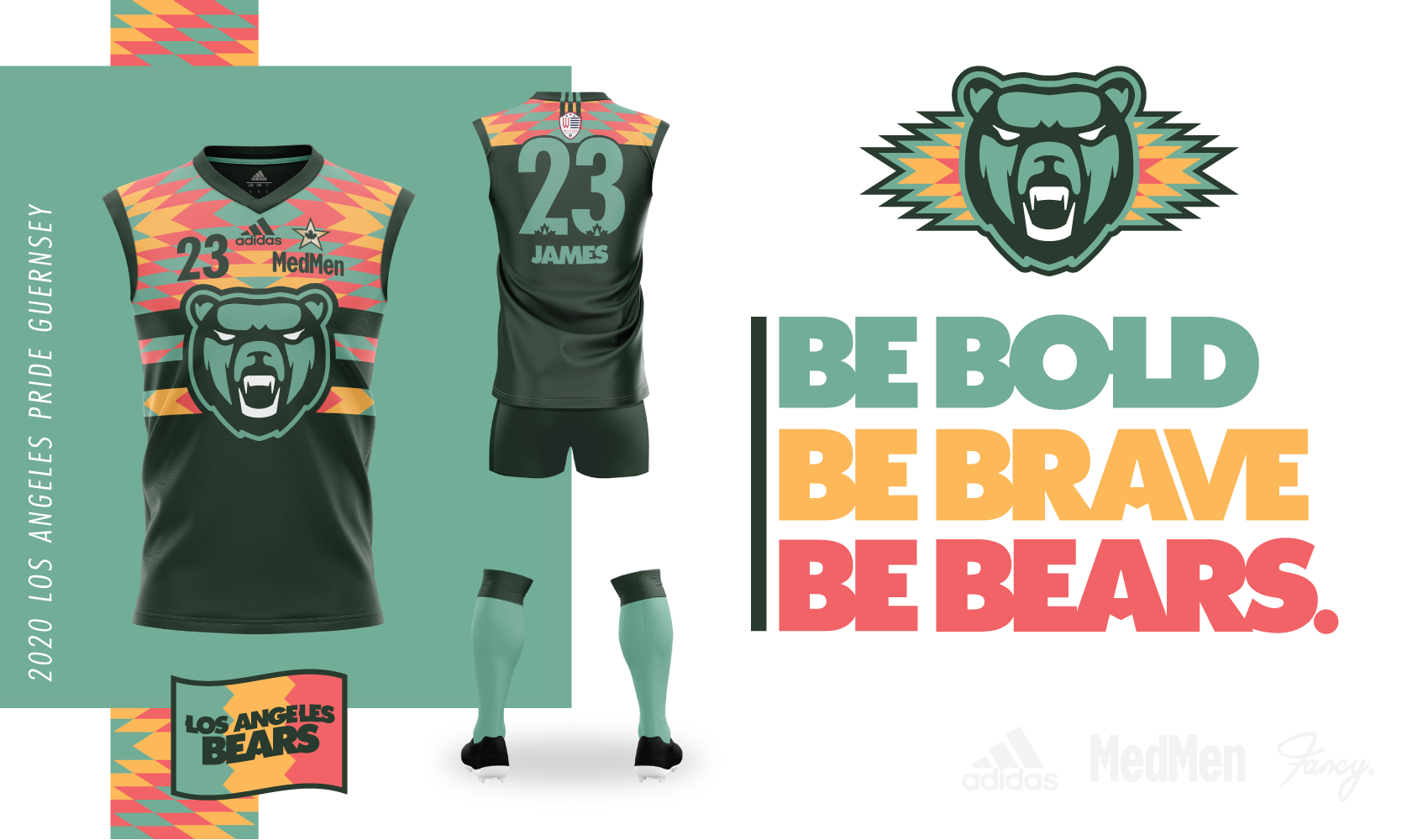
Los Angeles Bears
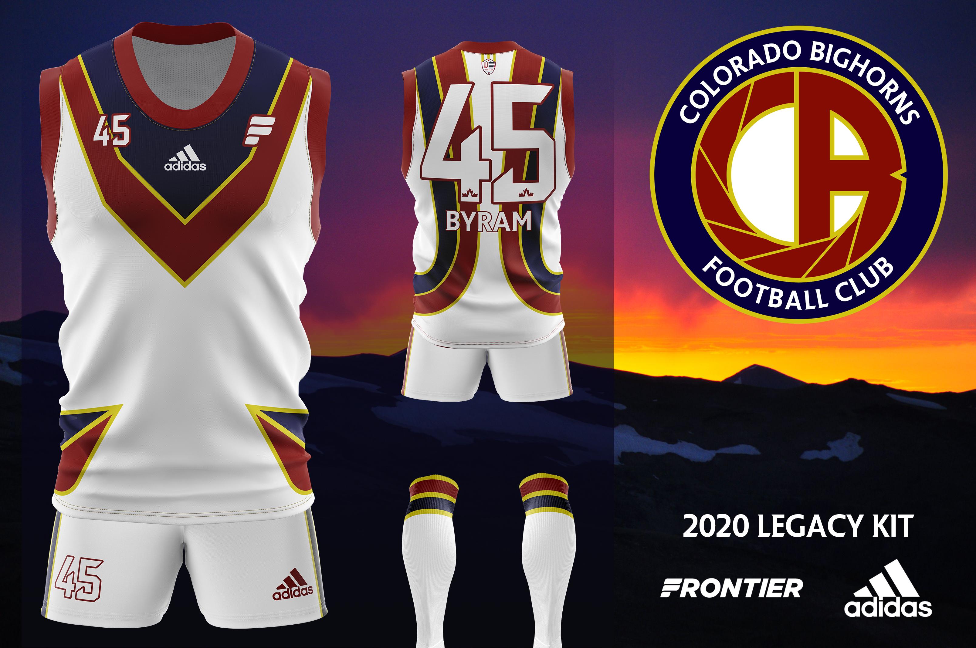
@ Colorado Bighorns
")

