Albuquerque has been stripped of the hosting rights for Can-Am Bowl VII after it was discovered that the mayor of the city secretly wanted the league to switch to playing baseball and to make a hostile takeover of whoever becomes this seasons champions re-branding them in the process to the Albuquerque Bears/Outlaws.
League officials discovered this plan during a meeting with the city where branded merchandise was found during the lunch break, and quickly stripped the city of the match.
Neither league officials or members of the Albuquerque organizing group could be contacted for comment.
The new location of the game will be unveiled following the current Can-Am Bowl match.
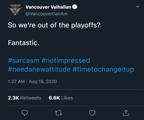
Now that the league is over I guess we can stand up and speak out.
We at the Vancouver Valhallan offices have been sitting here watching the events of Can-Am Bowl VI play out. And let us say that we are not happy, nah that is an understatement, we are pi**ed.
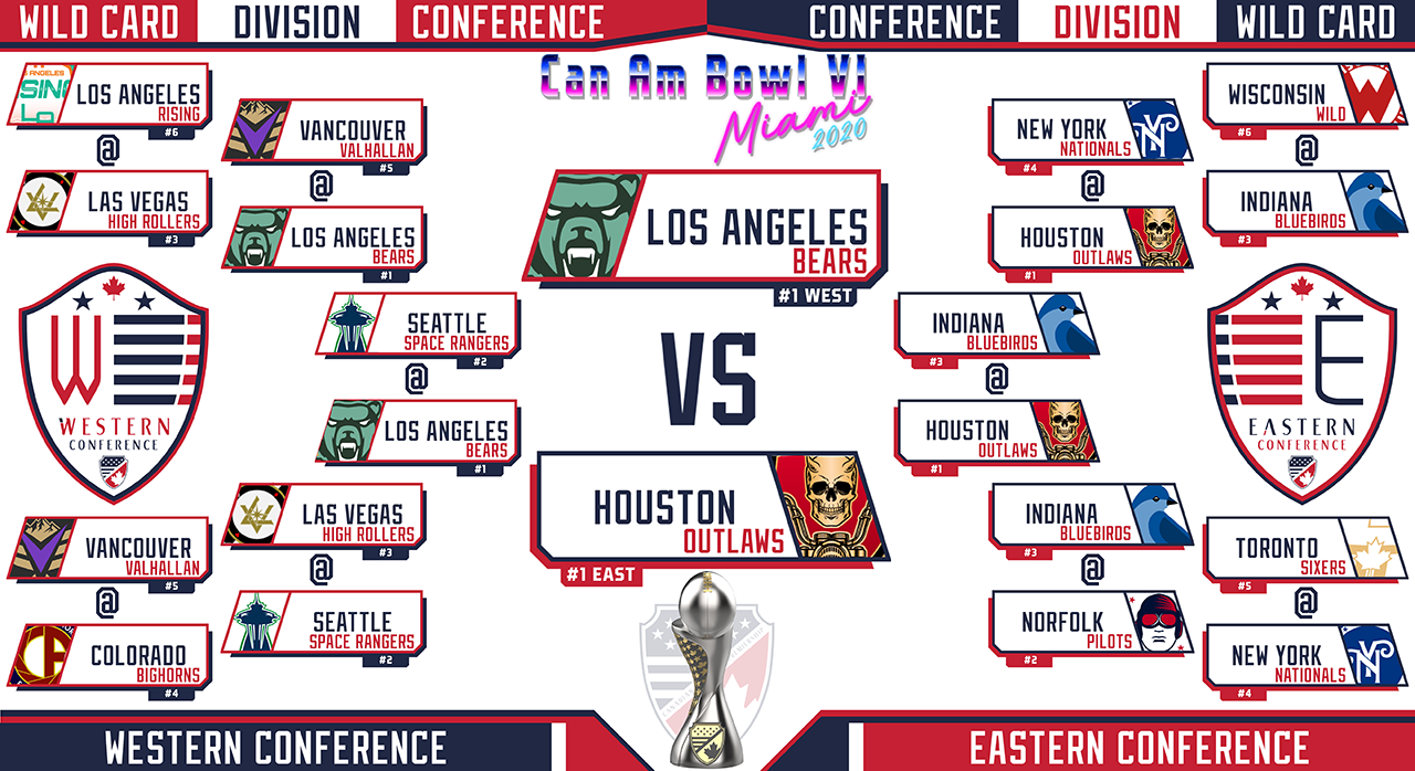
Another year, and another weak named team winning this league.
Six champions, five nothing named teams.
Really?
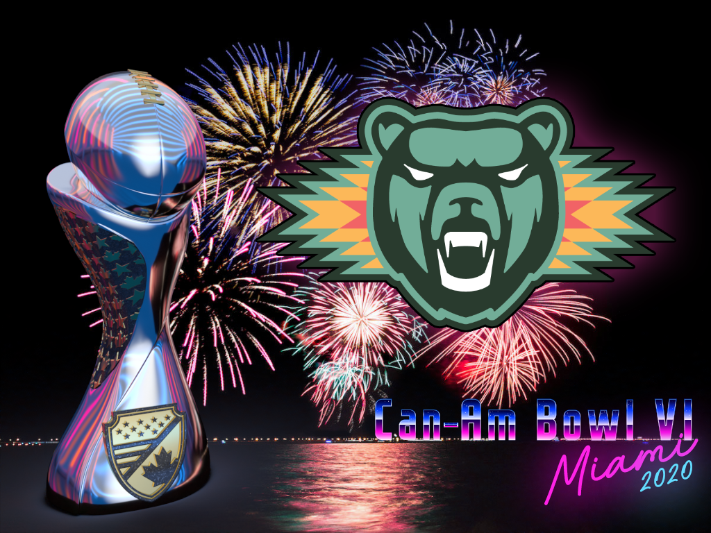
A tiny bird, fake tanned old people doing "naughty" things (twice), a children's movie toy, a set of puddles, and now teddy bears?
What a waste.
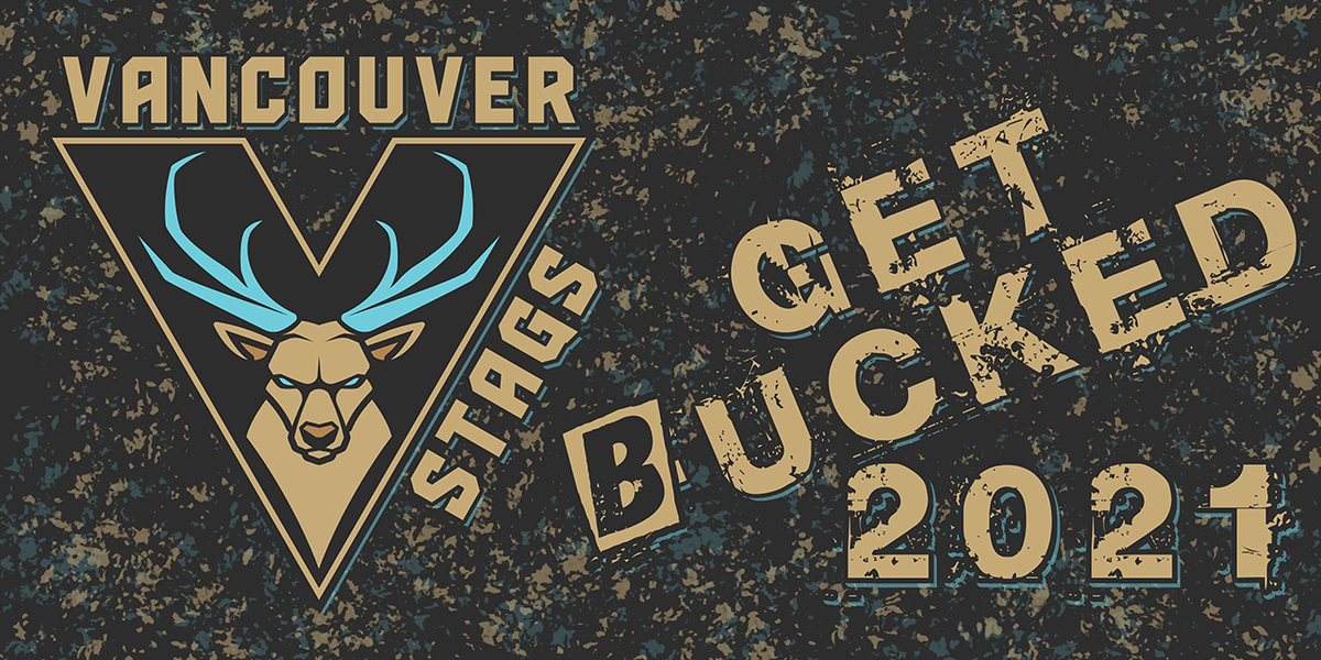
Well no longer. We have had enough of this. Our attempts at having a strong name based on those dead warriors is over. They are dead for a reason, and the Halls of Valhalla have fallen. We need a stronger brand, something that can kick this history of weakness into a raging fire.
Next season we are bringing up a brand that was given only a small show this season to the forefront, but with a new attitude. We are beefing up the brand and giving it an attitude to match.
We don't care who we offend or hurt, victory is all we want and everyone else can simply
Now that the league is over I guess we can stand up and speak out.
We at the Vancouver Valhallan offices have been sitting here watching the events of Can-Am Bowl VI play out. And let us say that we are not happy, nah that is an understatement, we are pi**ed.
Another year, and another weak named team winning this league.
Six champions, five nothing named teams.
Really?
A tiny bird, fake tanned old people doing "naughty" things (twice), a children's movie toy, a set of puddles, and now teddy bears?
What a waste.
Well no longer. We have had enough of this. Our attempts at having a strong name based on those dead warriors is over. They are dead for a reason, and the Halls of Valhalla have fallen. We need a stronger brand, something that can kick this history of weakness into a raging fire.
Next season we are bringing up a brand that was given only a small show this season to the forefront, but with a new attitude. We are beefing up the brand and giving it an attitude to match.
We don't care who we offend or hurt, victory is all we want and everyone else can simply
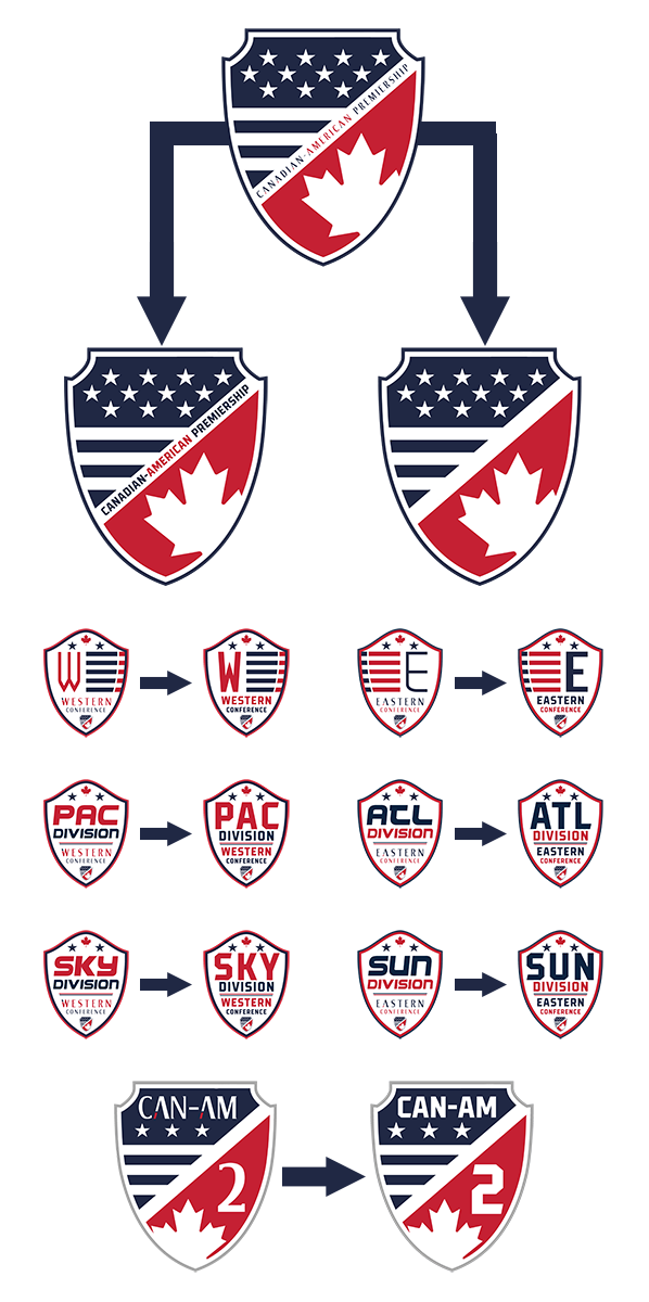
This season saw the Canadian-American Premiership and Can-Am 2 logos receive updates to their designs in a brand refresh. For 2021 this refresh continues with an update to the logo fonts as well as another slight tweak to the Can-Am 2 logo to bring the designs in line with the rest of the league branding that was seen dueing the 2020 season.
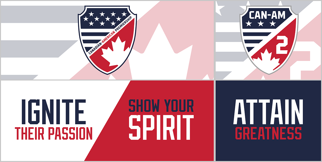
These changes also include a Can-Am logo variant that does not feature the text part of the logo. This textless version which was used on the conference and division logos for the 2020 season, will now be used in all smaller branding where the text is not as easy to read or any branding where the text is not required, and is also included on the Can-Am Bowl trophy. The text version will be used in larger versions and in branding where the text is deemed needed.
The Can-Am 2 logo also sees the new font and larger stars.
The conference and division logos also receive the new font upgrade to the Conference and Division text as well as new W and E segments on the conference designs.
This change is just another move showing the ever evolving look and feel of the Canadian-American Premiership, which in 2021 will also see a new Adidas linked manufacturer logo appear on Can-Am 2 Attain kits (further details on this will be released before the 2021 pre-season).
This season saw the Canadian-American Premiership and Can-Am 2 logos receive updates to their designs in a brand refresh. For 2021 this refresh continues with an update to the logo fonts as well as another slight tweak to the Can-Am 2 logo to bring the designs in line with the rest of the league branding that was seen dueing the 2020 season.
These changes also include a Can-Am logo variant that does not feature the text part of the logo. This textless version which was used on the conference and division logos for the 2020 season, will now be used in all smaller branding where the text is not as easy to read or any branding where the text is not required, and is also included on the Can-Am Bowl trophy. The text version will be used in larger versions and in branding where the text is deemed needed.
The Can-Am 2 logo also sees the new font and larger stars.
The conference and division logos also receive the new font upgrade to the Conference and Division text as well as new W and E segments on the conference designs.
This change is just another move showing the ever evolving look and feel of the Canadian-American Premiership, which in 2021 will also see a new Adidas linked manufacturer logo appear on Can-Am 2 Attain kits (further details on this will be released before the 2021 pre-season).
With the changes to the branding of the Canadian-American Premiership in 2021 there are also changes coming to the naming of the uniforms.
When the new uniform structure was introduced the Legacy and Pride uniforms were to be interchangeable throughout the regular season. However due to the complexities that are encountered in the structure of the league this was never utilised to its full potential and the two remained as home and away uniforms until the playoffs.
From 2021 the possibility of the two being interchanged during the regular season will officially be dropped and as such the two uniform sets names will be replaced.
As can be seen LEGACY will be replaced with IGNITE and PRIDE will be replaced with SPIRIT. No other changes to the uniform rules are expected, nor will there be any name change to the Can-Am 2's Attain uniform, however a change to the manufacturers logo will be taking place for that specific uniform.
This site uses cookies to help personalise content, tailor your experience and to keep you logged in if you register.
By continuing to use this site, you are consenting to our use of cookies.