Opinion Canterbury and our guernsey

Remove this Banner Ad

No ones gives a sh*t about Canterbury. fu** them and Puma. But we can do better.
Puma is trash organization and would be a disgrace to have on the jumper
Got a link for this stuff Tazaa? Puma have a pretty proud history - paying black athletes when Adidas wouldn't for eg.
Curious to hear what's going on to make them trash.
 

Log in to remove this ad.

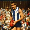
Obviously it's foolhardy of me to try and find any logic in the league's approach to jumper clashes, but the rules seem to be different now to what they were in 2016: if Geelong can now wear navy shorts at home against teams who aren't majority blue/navy/black, then presumably we can wear the white-with-blue-shorts combination against most sides in the league (exceptions being Geelong, West Coast, Western Bulldogs and maybe Fremantle; we should be fine against Carlton and Adelaide given we wore the blue strip against Carlton last season). I'd happily have us wear either white shorts (or the blue strip) in home games against those four clubs if it meant a return to our 'proper' home uniform for matches against the other thirteen.
 
I'm happy for us to wear not ideal outfits if away but only when home it's the above and no stupid white policy will sway me.

It's our home game. So we wear what we want.

Our rules and opposition wear as they are told to.
 
the problem, and the reason the jumper ended up being ruled too light to be worn with blue shorts is that the stripes are too thin. ever since they switched to printed jumpers in the 90s they've had tiny thin stripes with big white spaces on the sides. if you just widen the stripes again (like Collingwood's new jumper) it won't be a problem and you'll get close to 50/50 blue and white
 

(Log in to remove this ad.)

the problem, and the reason the jumper ended up being ruled too light to be worn with blue shorts is that the stripes are too thin. ever since they switched to printed jumpers in the 90s they've had tiny thin stripes with big white spaces on the sides. if you just widen the stripes again (like Collingwood's new jumper) it won't be a problem and you'll get close to 50/50 blue and white
I think they widened the stripes on what is now their away strip to make it closer to their 1990 premiership guernsey.

It would be interesting to get clarification from the AFL on the exact requirements.

Sent from my SM-A908B using Tapatalk
 
Yep, just widen the blue stripes and it becomes more of a blue jumper. Simple. Also, don't have massive white cutouts in the blue stripes for sponsors.
 
I think they widened the stripes on what is now their away strip to make it closer to their 1990 premiership guernsey.

It would be interesting to get clarification from the AFL on the exact requirements.

Sent from my SM-A908B using Tapatalk

that's true but it looks like they're keeping them that way. this is the new kit they just announced:
1611192637558.png 1611192657472.png

there's a few weird little things like the lack of cuffs, but the stripes look big and wide and there's a good balance between black and white. also note the pinstripes on the away jumper are thin and subtle, like pinstripes are supposed to be
 
that's true but it looks like they're keeping them that way. this is the new kit they just announced:
View attachment 1043676View attachment 1043677

there's a few weird little things like the lack of cuffs, but the stripes look big and wide and there's a good balance between black and white. also note the pinstripes on the away jumper are thin and subtle, like pinstripes are supposed to be

Not a fan of the cuffs or the back panel extending over the shoulders to the front of the jumper but the stripe width is good. The sponsor logo stretching across to the middle of the jumper also sucks.
 
collingwood's front sponsors have been like that for years. personally i prefer it to the mazda logo cutting a big chunk out of the stripe

Eddie had been pushing for years to remove the AFL logo so that another sponsored can be added. He won't be happy until we go the way of rugba league where every guernsey design is compromised by a massive logo.
 

Remove this Banner Ad

Back
Top