- Moderator
- #76
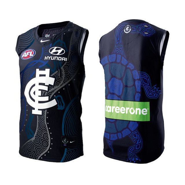
Can confirm.
What round will be wearing this monstrosity ?
Next week against Shitney (Rnd 11).
Follow along with the video below to see how to install our site as a web app on your home screen.
Note: This feature may not be available in some browsers.
Can confirm.
What round will be wearing this monstrosity ?
Thank dog I dont have to see it live.Next week against Shitney (Rnd 11).
Never seen a C look like a dick......well...maybe ThailandSorry, the C just looks like a dick.
So do I..........and anything is better than that crappy grey (longjohn underwear like) clash jumper Carlton has been wearing this season.......no wonder the team has been looking so bereft of confidence having to play in that outfit !!! At least this jumper has our colours on it............Really???

So do I..........and anything is better than that crappy grey (longjohn underwear like) clash jumper Carlton has been wearing this season.......no wonder the team has been looking so bereft of confidence having to play in that outfit !!! At least this jumper has our colours on it............
I like it. Nice conflation of club symbolism and cultural artefacts. Tip my hat to the designer.
I’d prefer to see the CFC logo a part of indigenous art.
This was such a nice design I think it's tough to match it.
God I miss that CFC monogram. So much better than the bullshit one we are wearing now
This was such a nice design I think it's tough to match it.
I thought the wolf grey jumper looked ok in the initial publicity photos just looked crappy when i saw the team run out wearing it.So do I..........and anything is better than that crappy grey (longjohn underwear like) clash jumper Carlton has been wearing this season.......no wonder the team has been looking so bereft of confidence having to play in that outfit !!! At least this jumper has our colours on it............
God I miss that CFC monogram. So much better than the bullshit one we are wearing now
Looked a lot better last night then the initial photos, its grown on me
Sent from my iPad using Tapatalk
Not sure if I'm missing something, but they've sold out entirely according the website
Match worn & player issued up for auction now:-
https://auctiondesq.sportstg.com/index.cfm?fuseaction=category&CategoryID=7456&OrgID=1745
Thanks Aph.
Unfortunately, limited by (mature age) student life
I was ignoring my guilty conscience and was going to make a 'speed purchase' of the $120 version before I could talk myself out of it