Omegaville
Club Legend
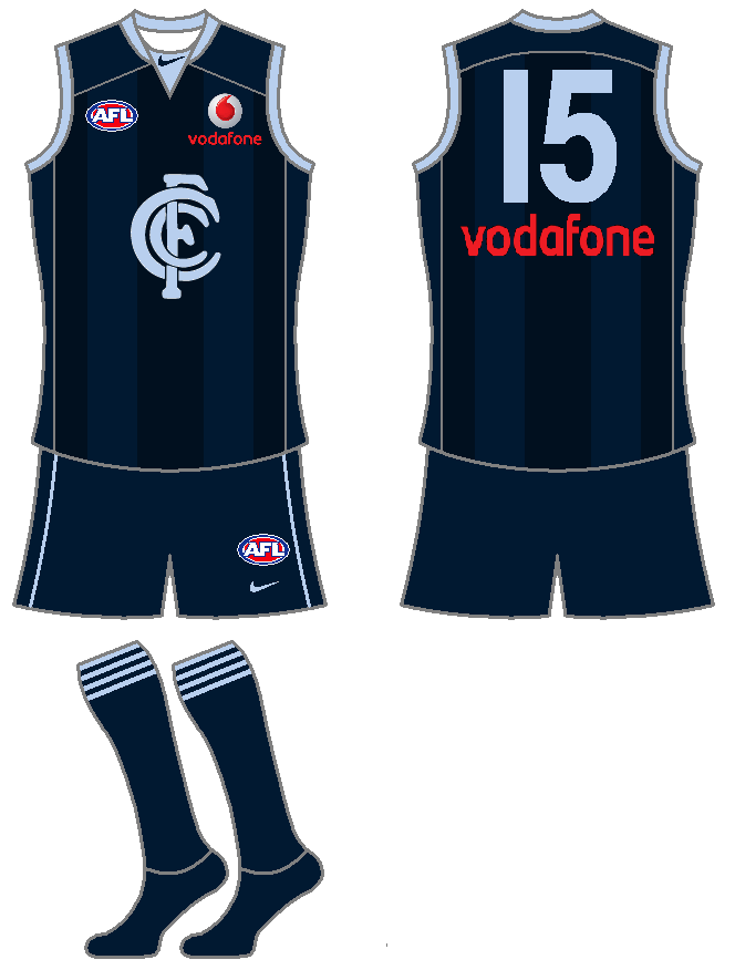
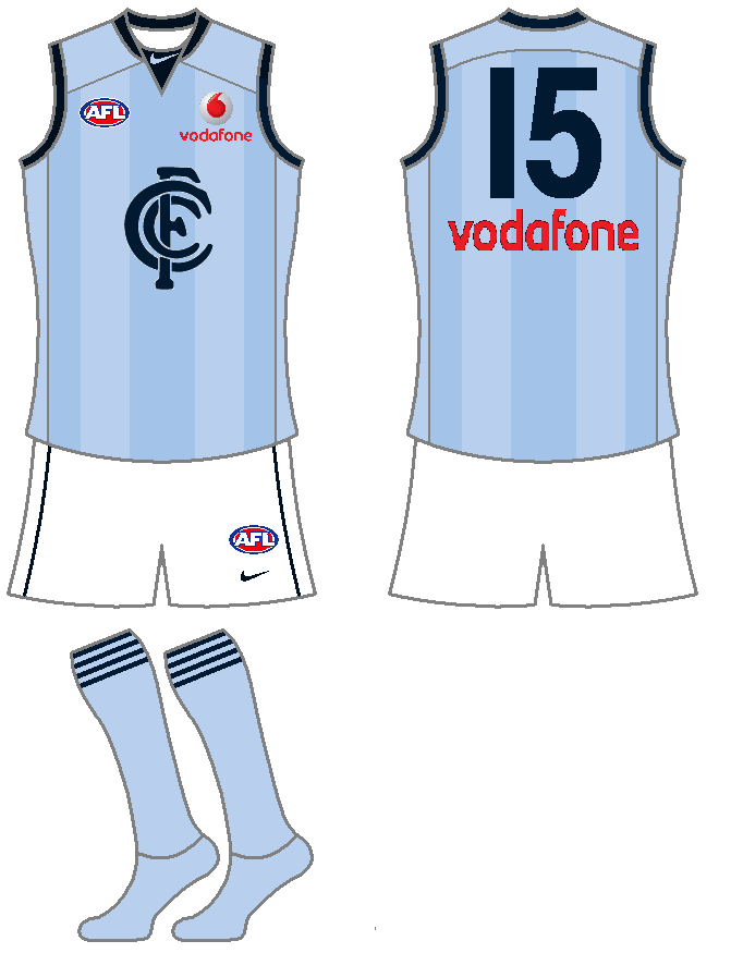
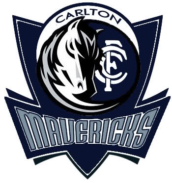
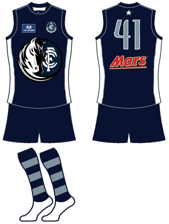
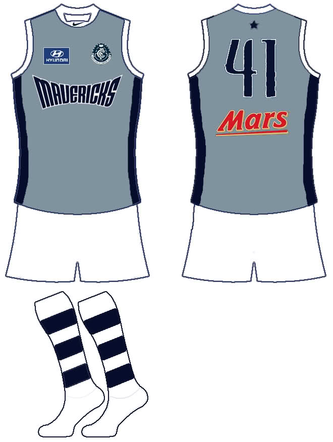
Carlton Athletic FC
Of all the people who had to do the same idea as me...
 even the same logo idea!!
At least you got it in early

Follow along with the video below to see how to install our site as a web app on your home screen.
Note: This feature may not be available in some browsers.
LIVE: Richmond v Melbourne - 7:25PM Wed
Squiggle tips Demons at 77% chance -- What's your tip? -- Team line-ups »
Carlton Athletic FC
even the same logo idea!!Got confused, thought you was talking about Smeagle's xD I'm a f***wit.ummmm Which design you talking about?
Haha don't worry I know the feelingOf all the people who had to do the same idea as me...
At least you got it in early
Got confused, thought you was talking about Smeagle's xD I'm a f***wit.
All the more reason to merger them!Some cool designs in here. Too bad I hate Carlton.
(Winfield) Blue Addicks
Charlton Athletic FC ("The Addicks")
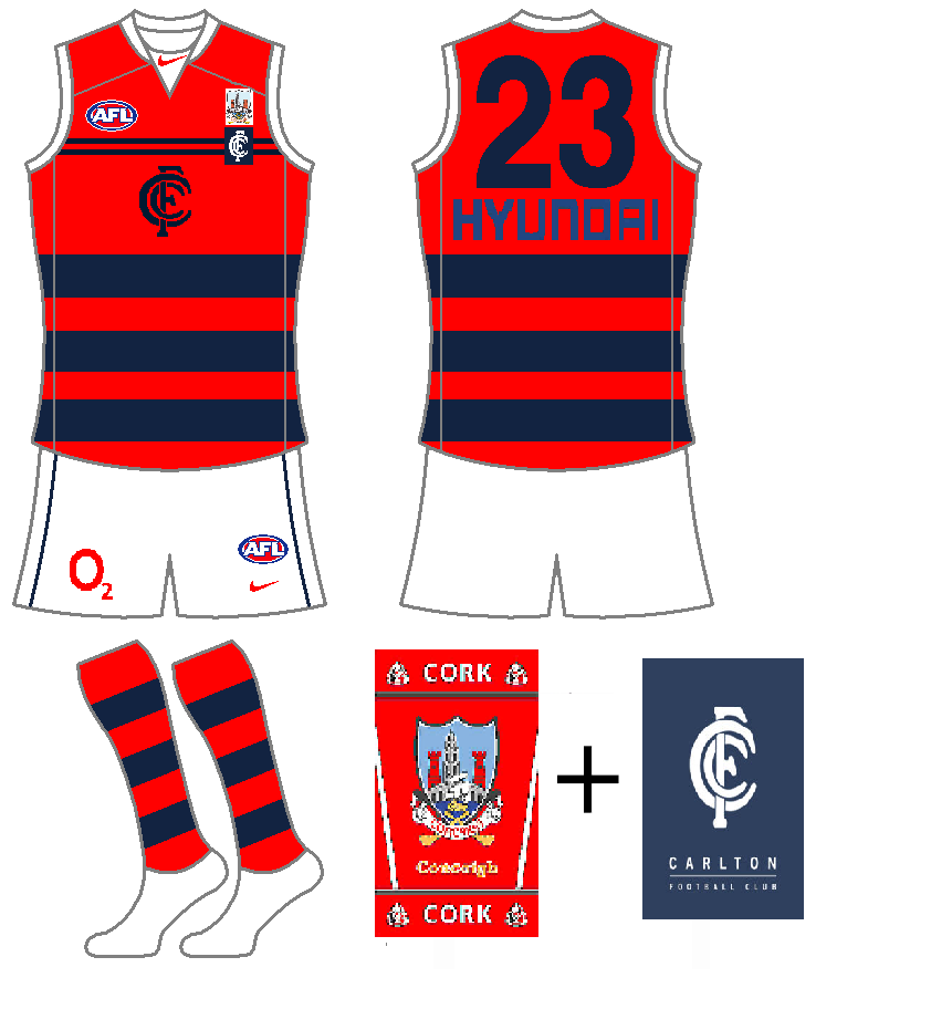
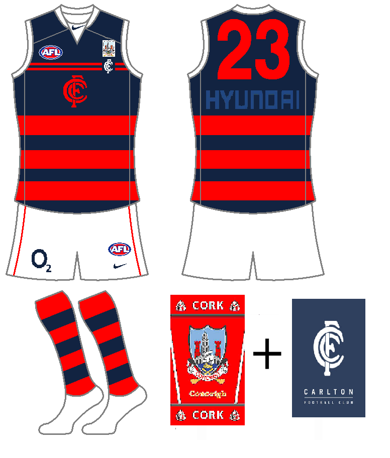
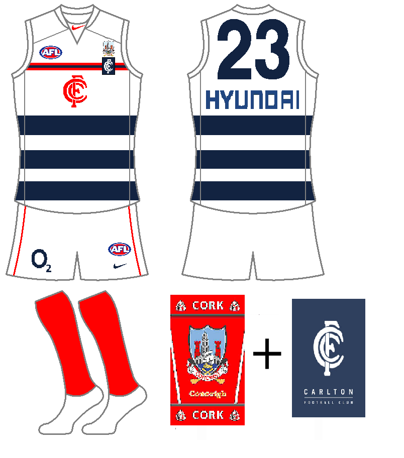
Carlton Athletic FC
Tried to do something a bit different with the logo/monogram here, looked a bit odd with half an arm on the middle of the guernsey.
The colours are a big change, but I think they fit in with the corporate-sponsorship nature of a Soccer-based merger, with the home in the colour of Mars (red) and the away in the light blue of Hyundai - also brings back memories of the M&M number.


Smeagle said:I honestly had no idea that Omegaville, or EastyEffect's for that matter, had even posted a jumper before I.


I should have made myself more clear that I know the feeling of having similar ideas as people, not that people "copy" me (intentionally or not).
I honestly had no idea that Omegaville, or EastyEffect's for that matter, had even posted a jumper before I.
As you could see from my description, I posted as if no one had seen it before.
I didn't mean to copy his idea or logo, these things just happen.
Sorry Omegaville
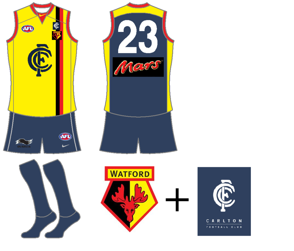
A fellow Watford fan?
Carlton + Watford FC. Link - CARLTON Palmer played on loan for Watford from 2000 - 2001.